 Mukesh1@gmail.com
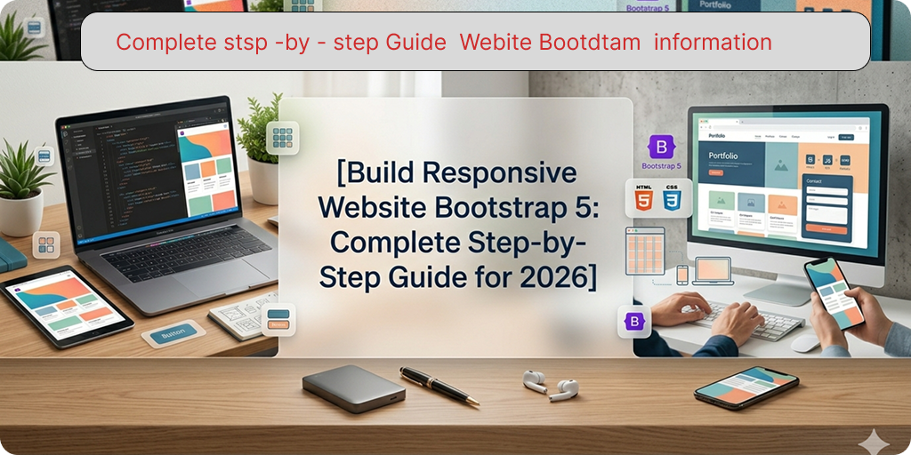
introduction
Every developer remembers their first responsive website. Mine looked decent on my laptop and completely broken on my phone. Getting layouts to work across screen sizes used to require writing a lot of CSS from scratch — media queries, flexbox rules, float hacks that nobody fully understood.
Bootstrap 5 changed that completely. If you want to build responsive website Bootstrap 5 style — where your layout automatically adapts from mobile to desktop without writing custom CSS for every breakpoint — this guide walks you through the entire process from an empty folder to a fully working responsive page. No prior Bootstrap experience needed. Just basic HTML knowledge and the willingness to follow along.
What You’ll Build in This Guide
Before writing a single line of code, it helps to know what the finished product looks like. By the end of this guide, you’ll have a complete single-page responsive website with a sticky navigation bar, a full-width hero section with a headline and call-to-action button, a three-column feature card section, a contact form, and a footer — all fully responsive across mobile, tablet, and desktop screens.
This is a realistic starter project. The same structure is used in countless real websites — portfolio pages, landing pages, small business sites, and product pages all follow this exact pattern. Learning to build responsive website Bootstrap 5 with this layout gives you a reusable foundation you can adapt for almost any project.
Step 1 — Setting Up Your Project
You don’t need Node.js, npm, or any build tools to build responsive website Bootstrap 5 at the beginner level. A plain HTML file and a CDN link is all you need to get started.
Create a new folder on your computer called my-bootstrap-site. Inside it, create one file: index.html.
Open index.html in your code editor and add this starter template:
html
<!DOCTYPE html>
<html lang="en">
<head>
  <meta charset="UTF-8">
  <meta name="viewport" content="width=device-width, initial-scale=1.0">
  <title>My First Bootstrap Website</title>

  <!-- Bootstrap 5 CSS -->
  <link
    href="https://cdn.jsdelivr.net/npm/bootstrap@5.3.0/dist/css/bootstrap.min.css"
    rel="stylesheet">

  <!-- Your custom CSS (optional) -->
  <style>
    /* Custom styles go here */
  </style>
</head>
<body>

  <!-- Your content goes here -->

  <!-- Bootstrap 5 JS Bundle (includes Popper.js) -->
  <script
    src="https://cdn.jsdelivr.net/npm/bootstrap@5.3.0/dist/js/bootstrap.bundle.min.js">
  </script>
</body>
</html>
Two things matter here. The <meta name="viewport"> tag in the <head> is required for Bootstrap’s responsive behavior to work on mobile devices — without it, mobile browsers render the page at desktop width and everything looks tiny. The Bootstrap JS bundle goes just before the closing </body> tag, never in the <head>.
Open this file in your browser. You should see a blank white page — that’s correct. Bootstrap is loaded and ready. Now the actual building begins.
Step 2 — Building the Responsive Navbar
The Navbar is the first thing visitors see and the first section every developer adds when they build responsive website Bootstrap 5 projects. Add this code inside <body>, before the closing </body> tag:
html
<!-- Navbar -->
<nav class="navbar navbar-expand-lg navbar-dark bg-dark sticky-top">
  <div class="container">
    <a class="navbar-brand fw-bold" href="#">MyBrand</a>

    <button class="navbar-toggler" type="button"
      data-bs-toggle="collapse"
      data-bs-target="#mainNav">
      <span class="navbar-toggler-icon"></span>
    </button>

    <div class="collapse navbar-collapse" id="mainNav">
      <ul class="navbar-nav ms-auto">
        <li class="nav-item">
          <a class="nav-link" href="#features">Features</a>
        </li>
        <li class="nav-item">
          <a class="nav-link" href="#contact">Contact</a>
        </li>
        <li class="nav-item">
          <a class="nav-link btn btn-primary text-white px-3 ms-lg-2"
            href="#contact">Get Started</a>
        </li>
      </ul>
    </div>
  </div>
</nav>
Save and refresh your browser. On a wide screen, you’ll see a dark navbar with your brand name on the left and navigation links on the right. Resize the browser window to a narrow width — the links collapse into a hamburger menu button automatically. Click that button and the menu drops down. That’s Bootstrap’s responsive Navbar working exactly as designed.
The sticky-top class keeps the navbar fixed at the top of the screen as the user scrolls — a standard pattern for modern websites. The navbar-expand-lg class means the navigation expands horizontally on large screens and collapses on medium and smaller screens.
Step 3 — Creating the Hero Section
The hero section is the large banner area at the top of most websites. It’s the first thing visitors see after the navbar, and it’s where you communicate your core message. Add this after the closing </nav> tag:
html
<!-- Hero Section -->
<section class="bg-dark text-white py-5">
  <div class="container">
    <div class="row align-items-center min-vh-75 py-5">
      <div class="col-lg-7">
        <h1 class="display-4 fw-bold mb-4">
          Build Beautiful Websites<br>
          <span class="text-primary">Faster Than Ever</span>
        </h1>
        <p class="lead mb-4 text-white-50">
          A clean, responsive landing page built entirely with Bootstrap 5.
          No custom CSS required. Works perfectly on every device.
        </p>
        <div class="d-flex gap-3 flex-wrap">
          <a href="#features" class="btn btn-primary btn-lg px-4">
            Explore Features
          </a>
          <a href="#contact" class="btn btn-outline-light btn-lg px-4">
            Get In Touch
          </a>
        </div>
      </div>
    </div>
  </div>
</section>
The display-4 fw-bold classes create a large, bold headline. The lead class makes the paragraph text slightly larger than normal body text. The d-flex gap-3 flex-wrap on the button container places the two buttons side by side on wide screens and stacks them on narrow screens automatically — no media query written.
This is a key benefit when you build responsive website Bootstrap 5 — behaviors that would require custom CSS and media queries in plain HTML are handled by utility classes.
Step 4 — Adding the Features Section With Cards
After the hero, most websites have a features or services section. This is where the Bootstrap grid and Card components work together. Add this after the hero section:
html
<!-- Features Section -->
<section id="features" class="py-5 bg-light">
  <div class="container">
    <div class="text-center mb-5">
      <h2 class="fw-bold">Why Choose Us</h2>
      <p class="text-muted lead">
        Everything you need to launch your project quickly and confidently.
      </p>
    </div>

    <div class="row row-cols-1 row-cols-md-3 g-4">

      <div class="col">
        <div class="card h-100 border-0 shadow-sm">
          <div class="card-body p-4">
            <div class="mb-3">
              <span class="badge bg-primary p-2 rounded-3">
                ⚡ Fast
              </span>
            </div>
            <h5 class="card-title fw-bold">Lightning Performance</h5>
            <p class="card-text text-muted">
              Optimized code and minimal dependencies mean your site
              loads quickly on every connection speed.
            </p>
          </div>
        </div>
      </div>

      <div class="col">
        <div class="card h-100 border-0 shadow-sm">
          <div class="card-body p-4">
            <div class="mb-3">
              <span class="badge bg-success p-2 rounded-3">
                📱 Responsive
              </span>
            </div>
            <h5 class="card-title fw-bold">Mobile First Design</h5>
            <p class="card-text text-muted">
              Every component adapts seamlessly from small phone screens
              to large desktop monitors without any extra work.
            </p>
          </div>
        </div>
      </div>

      <div class="col">
        <div class="card h-100 border-0 shadow-sm">
          <div class="card-body p-4">
            <div class="mb-3">
              <span class="badge bg-warning p-2 rounded-3">
                🎨 Flexible
              </span>
            </div>
            <h5 class="card-title fw-bold">Easy to Customize</h5>
            <p class="card-text text-muted">
              Override any Bootstrap style with minimal CSS or use
              Bootstrap's built-in utility classes for quick adjustments.
            </p>
          </div>
        </div>
      </div>

    </div>
  </div>
</section>
The row-cols-1 row-cols-md-3 class combination on the row is the cleanest way to build responsive website Bootstrap 5 card grids. On mobile, cards stack in a single column. On medium screens and above, they display in three equal columns. The g-4 adds consistent gutters between cards. The h-100 on each card makes all cards equal height regardless of content length.
Step 5 — Building the Contact Form Section
A contact form gives visitors a way to reach you and makes any landing page feel complete. Add this after the features section:
html
<!-- Contact Section -->
<section id="contact" class="py-5">
  <div class="container">
    <div class="row justify-content-center">
      <div class="col-lg-6">
        <div class="text-center mb-5">
          <h2 class="fw-bold">Get In Touch</h2>
          <p class="text-muted">
            Have a question or want to work together? Send us a message.
          </p>
        </div>

        <form>
          <div class="mb-3">
            <label for="nameInput" class="form-label fw-medium">
              Full Name
            </label>
            <input type="text" class="form-control form-control-lg"
              id="nameInput" placeholder="John Smith">
          </div>

          <div class="mb-3">
            <label for="emailInput" class="form-label fw-medium">
              Email Address
            </label>
            <input type="email" class="form-control form-control-lg"
              id="emailInput" placeholder="john@example.com">
          </div>

          <div class="mb-4">
            <label for="messageInput" class="form-label fw-medium">
              Your Message
            </label>
            <textarea class="form-control" id="messageInput"
              rows="5" placeholder="Tell us about your project..."></textarea>
          </div>

          <div class="d-grid">
            <button type="submit" class="btn btn-primary btn-lg">
              Send Message
            </button>
          </div>
        </form>

      </div>
    </div>
  </div>
</section>
The col-lg-6 with justify-content-center on the row centers the form and limits its width on large screens — a common pattern that prevents forms from stretching uncomfortably wide on desktop monitors. The d-grid on the button wrapper makes the submit button full-width, which is standard practice for form submission buttons.
Step 6 — Adding the Footer
Every complete website needs a footer. Add this just before the Bootstrap JS script tag:
html
<!-- Footer -->
<footer class="bg-dark text-white py-4">
  <div class="container">
    <div class="row align-items-center">
      <div class="col-md-6 text-center text-md-start mb-3 mb-md-0">
        <span class="fw-bold">MyBrand</span>
        <span class="text-white-50 ms-2">
          © 2026 All rights reserved.
        </span>
      </div>
      <div class="col-md-6 text-center text-md-end">
        <a href="#" class="text-white-50 text-decoration-none me-3">
          Privacy Policy
        </a>
        <a href="#" class="text-white-50 text-decoration-none">
          Terms of Service
        </a>
      </div>
    </div>
  </div>
</footer>
The text-center text-md-start and text-center text-md-end classes center both footer columns on mobile and align them to opposite sides on medium screens and above. This is mobile-first responsive alignment handled entirely through Bootstrap utility classes — a perfect example of how you build responsive website Bootstrap 5 without writing a single media query.
Step 7 — Testing Responsiveness Across Screen Sizes
Your website is structurally complete. Now test it properly before calling it done.
Open index.html in Chrome or Firefox. Press F12 to open DevTools. Click the device toggle icon (the phone/tablet icon near the top left of DevTools) to enter responsive testing mode.
Test at these common sizes as you build responsive website Bootstrap 5 projects: 375px width for iPhone SE, 768px for tablets, 1024px for small laptops, and 1440px for desktop monitors.
At each size, check that the navbar collapses and expands correctly, the card section stacks on mobile and shows three columns on desktop, the contact form stays centered and readable, and the footer columns stack on mobile and split on desktop. If anything looks off, check that your column numbers add up to 12 and that you haven’t accidentally nested a row outside a container.
Step 8 — Adding Small Custom Touches
The page looks clean but uses Bootstrap’s default styling throughout. A few lines of custom CSS can make it feel more unique without fighting Bootstrap’s system.
Add this inside your <style> tag in the <head>:
css
/* Smooth scrolling for anchor links */
html {
  scroll-behavior: smooth;
}

/* Custom hero minimum height */
.min-vh-75 {
  min-height: 75vh;
}

/* Slightly rounded card hover effect */
.card {
  transition: transform 0.2s ease, box-shadow 0.2s ease;
}

.card:hover {
  transform: translateY(-4px);
  box-shadow: 0 8px 24px rgba(0, 0, 0, 0.12) !important;
}

/* Form control focus color */
.form-control:focus {
  border-color: #0d6efd;
  box-shadow: 0 0 0 0.2rem rgba(13, 110, 253, 0.15);
}
These four additions — smooth scrolling, a minimum hero height utility, a card hover animation, and a custom form focus style — make the page feel noticeably more polished. And importantly, none of them fight Bootstrap’s system. They extend it cleanly.
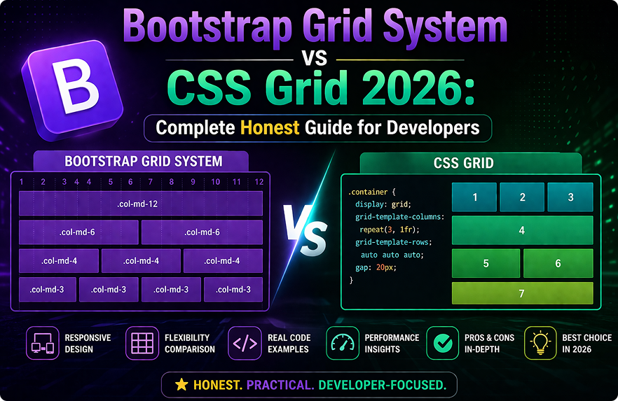
For a complete reference on Bootstrap 5’s utility classes used throughout this guide, the official Bootstrap 5 utilities documentation covers every available class. And for understanding how the responsive grid works at a deeper level, the Bootstrap 5 grid system documentation explains breakpoints, containers, and column behavior thoroughly.
If you’re also learning which Bootstrap components to use next as you grow beyond this starter project, our Bootstrap 5 components every developer guide covers the ten most important components in depth. And for developers considering whether Bootstrap or Tailwind CSS is the right long-term choice, our Bootstrap 5 vs Tailwind CSS comparison guide gives a complete honest breakdown.
Final Conclusion
Learning to build responsive website Bootstrap 5 from scratch is one of the most practical skills a web developer can develop in 2026. The combination of a well-structured HTML template, Bootstrap’s grid system, pre-built components, and utility classes means you can produce professional-looking, fully responsive layouts in a fraction of the time it would take with custom CSS alone.
What you’ve built in this guide — a sticky navbar, a hero section, a card grid, a contact form, and a footer — is the foundation that hundreds of real websites are built on every day. The layout is production-ready. The responsiveness is genuine. And every technique used throughout this guide scales directly to larger, more complex projects.
The best way to build responsive website Bootstrap 5 skills that actually stick is to keep building. Take this foundation, change the colors, swap the content, add new sections, and make it your own. Each iteration teaches you something the documentation alone never could.