 Mukesh1@gmail.com
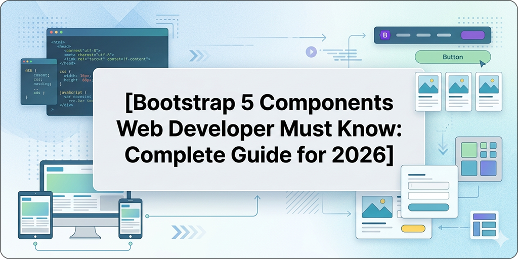
Bootstrap 5 ships with dozens of ready-made components. That’s genuinely useful — but it also means most beginners spend time learning components they’ll rarely use while missing the ones that appear in almost every real project.
Knowing the right Bootstrap 5 components web developer professionals rely on daily is what separates someone who just copies from the docs and someone who actually understands Bootstrap as a productive tool. This guide covers the ten components that show up in real projects constantly — how each one works, when to use it, and the practical details the official documentation sometimes buries.
Why These Ten Bootstrap 5 Components Web Developer Teams Use Most
Every web project is different, but certain UI patterns appear everywhere. Navigation headers. Popup dialogs. Content cards. Loading indicators. Form inputs. Notification messages. These aren’t advanced UI patterns — they’re the baseline of almost every website and web application built today.
The Bootstrap 5 components web developer teams need to know aren’t the most impressive or complex ones in the library. They’re the ones you’ll reach for on day one of a new project and keep using throughout. Master these ten and you’ll cover the majority of real-world UI requirements without writing custom CSS for most of it.
Component 1 — Navbar
The Navbar is arguably the single most used Bootstrap 5 components web developer professionals work with. Almost every website needs a navigation header, and Bootstrap’s Navbar handles responsive collapsing, branding, links, and dropdown menus completely out of the box.
html
<nav class="navbar navbar-expand-lg bg-body-tertiary">
  <div class="container">
    <a class="navbar-brand" href="#">MyApp</a>
    <button class="navbar-toggler" type="button"
      data-bs-toggle="collapse"
      data-bs-target="#navbarNav">
      <span class="navbar-toggler-icon"></span>
    </button>
    <div class="collapse navbar-collapse" id="navbarNav">
      <ul class="navbar-nav ms-auto">
        <li class="nav-item">
          <a class="nav-link active" href="#">Home</a>
        </li>
        <li class="nav-item">
          <a class="nav-link" href="#">About</a>
        </li>
        <li class="nav-item">
          <a class="nav-link" href="#">Contact</a>
        </li>
      </ul>
    </div>
  </div>
</nav>
The navbar-expand-lg class controls at which breakpoint the navigation collapses into a hamburger menu. Below large screens, the links hide and the toggle button appears. The ms-auto class pushes links to the right — a pattern used in nearly every Navbar implementation. Always wrap Navbar content in a .container to align it with the rest of your page layout.
Component 2 — Modal
The Modal is one of the Bootstrap 5 components web developer professionals encounter almost immediately on any project needing confirmations, forms, image lightboxes, or detailed content overlays.
html
<button type="button" class="btn btn-primary"
  data-bs-toggle="modal"
  data-bs-target="#exampleModal">
  Open Modal
</button>

<div class="modal fade" id="exampleModal" tabindex="-1">
  <div class="modal-dialog">
    <div class="modal-content">
      <div class="modal-header">
        <h5 class="modal-title">Confirm Action</h5>
        <button type="button" class="btn-close"
          data-bs-dismiss="modal"></button>
      </div>
      <div class="modal-body">
        Are you sure you want to delete this item?
      </div>
      <div class="modal-footer">
        <button type="button" class="btn btn-secondary"
          data-bs-dismiss="modal">Cancel</button>
        <button type="button" class="btn btn-danger">Delete</button>
      </div>
    </div>
  </div>
</div>
No JavaScript needed for basic open/close — Bootstrap handles it automatically through data attributes. For larger content, add modal-lg or modal-xl to the modal-dialog div. To prevent closing by clicking the backdrop, add data-bs-backdrop="static" to the modal element.
Component 3-Card
Cards are the most versatile of all Bootstrap 5 components web developer teams use regularly. Product listings, blog previews, user profiles, dashboard widgets — the Card component handles all of these with minimal markup.
html
<div class="card" style="max-width: 400px;">
  <img src="thumbnail.jpg" class="card-img-top" alt="Article image">
  <div class="card-body">
    <h5 class="card-title">Article Headline</h5>
    <p class="card-text text-muted">
      A short description or preview of the article content goes here.
    </p>
    <a href="#" class="btn btn-primary">Read More</a>
  </div>
  <div class="card-footer text-muted small">
    Published 2 days ago
  </div>
</div>
Cards work naturally inside Bootstrap’s grid system. Use row-cols-1 row-cols-md-3 g-4 on the row and h-100 on each card to create equal-height card grids without any custom CSS — a detail that makes card layouts look genuinely professional.
Component 4 -Grid System
The Grid is the foundation that every layout in Bootstrap is built on. It remains one of the essential Bootstrap 5 components web developer professionals must understand deeply, because misunderstanding the grid is the root cause of most Bootstrap layout problems.
html
<div class="container">
  <div class="row">
    <div class="col-md-8">Main Content</div>
    <div class="col-md-4">Sidebar</div>
  </div>

  <div class="row">
    <div class="col-12 col-md-4">Feature One</div>
    <div class="col-12 col-md-4">Feature Two</div>
    <div class="col-12 col-md-4">Feature Three</div>
  </div>
</div>
Three rules cover the majority of grid problems: columns must be direct children of a .row, rows must be inside a .container, and column numbers must add up to 12 or less per row. Bootstrap 5’s row-cols-{n} shorthand creates equal-width column grids without specifying column classes on each item — useful for card grids and feature sections.
Component 5 -Accordion
The Accordion is one of the Bootstrap 5 components web developer teams reach for when building FAQs, settings panels, or any content that benefits from progressive disclosure.
html
<div class="accordion" id="faqAccordion">
  <div class="accordion-item">
    <h2 class="accordion-header">
      <button class="accordion-button" type="button"
        data-bs-toggle="collapse"
        data-bs-target="#faq1">
        What is your return policy?
      </button>
    </h2>
    <div id="faq1" class="accordion-collapse collapse show"
      data-bs-parent="#faqAccordion">
      <div class="accordion-body">
        We offer a 30-day return policy on all items purchased directly.
      </div>
    </div>
  </div>
</div>
The data-bs-parent attribute ensures only one panel is open at a time. Remove it if you want multiple panels open simultaneously. The first panel uses show on the collapse div and omits collapsed on the button to display it open by default — every other panel does the opposite.
Component 6-Toast
Toasts are brief notification messages that appear temporarily on screen. Among Bootstrap 5 components web developer professionals should know, Toast is frequently overlooked by beginners until they need it urgently on a real project.
html
<div class="toast-container position-fixed bottom-0 end-0 p-3">
  <div id="successToast" class="toast align-items-center text-bg-success border-0"
    role="alert">
    <div class="d-flex">
      <div class="toast-body">
        Item saved successfully.
      </div>
      <button type="button" class="btn-close btn-close-white me-2 m-auto"
        data-bs-dismiss="toast"></button>
    </div>
  </div>
</div>

<script>
  const toastEl = document.getElementById('successToast');
  const toast = new bootstrap.Toast(toastEl);
  toast.show();
</script>
Unlike modals, Toasts require JavaScript initialization — new bootstrap.Toast(element) — before calling .show(). The toast-container with position-fixed places the notification in the corner of the screen, which is the standard pattern for modern notification UX.
Component 7 – Offcanvas
The Offcanvas component creates a sidebar panel that slides in from any screen edge. It is one of the Bootstrap 5 components web developer professionals working on mobile-first navigation, filter panels, or shopping cart drawers need to understand well.
html
<button class="btn btn-primary" type="button"
  data-bs-toggle="offcanvas"
  data-bs-target="#filterPanel">
  Show Filters
</button>

<div class="offcanvas offcanvas-start" id="filterPanel">
  <div class="offcanvas-header">
    <h5 class="offcanvas-title">Filter Results</h5>
    <button type="button" class="btn-close"
      data-bs-dismiss="offcanvas"></button>
  </div>
  <div class="offcanvas-body">
    <div class="mb-3">
      <label class="form-label">Category</label>
      <select class="form-select">
        <option>All Categories</option>
        <option>Electronics</option>
        <option>Clothing</option>
      </select>
    </div>
  </div>
</div>
offcanvas-start slides in from the left. Use offcanvas-end for right, offcanvas-top for top, and offcanvas-bottom for bottom. Particularly useful for mobile navigation when the standard Navbar collapse pattern doesn’t fit your design requirements.
Component 8 – Forms
Bootstrap 5 form components are among the Bootstrap 5 components web developer professionals use in almost every project — contact forms, login pages, search inputs, and checkout flows all depend on them.
html
<form>
  <div class="mb-3">
    <label for="emailInput" class="form-label">Email Address</label>
    <input type="email" class="form-control" id="emailInput"
      placeholder="name@example.com">
    <div class="form-text">We'll never share your email with anyone.</div>
  </div>
  <div class="mb-3">
    <label for="passwordInput" class="form-label">Password</label>
    <input type="password" class="form-control" id="passwordInput">
  </div>
  <div class="mb-3 form-check">
    <input type="checkbox" class="form-check-input" id="rememberMe">
    <label class="form-check-label" for="rememberMe">Remember me</label>
  </div>
  <button type="submit" class="btn btn-primary w-100">Sign In</button>
</form>
Always pair <label> elements with inputs using matching for and id attributes — Bootstrap’s form styling assumes this relationship and it’s required for accessibility. For validation feedback, Bootstrap 5 provides .is-valid, .is-invalid, .valid-feedback, and .invalid-feedback classes that display colored borders and helper text without any custom CSS.
Component 9-Tooltip
Tooltips provide contextual hints when users hover over or focus on elements. They’re one of the Bootstrap 5 components web developer professionals need eventually — for icon-only buttons, disabled elements, or abbreviations that need explanation.
html
<button type="button" class="btn btn-secondary"
  data-bs-toggle="tooltip"
  data-bs-placement="top"
  title="This action cannot be undone">
  Delete Account
</button>

<script>
  const tooltipTriggerList = document.querySelectorAll('[data-bs-toggle="tooltip"]');
  tooltipTriggerList.forEach(function (el) {
    new bootstrap.Tooltip(el);
  });
</script>
Tooltips do not auto-initialize — the JavaScript initialization block above is required on every page where you use them. A common mistake is adding the data attributes and wondering why nothing appears. Always include the initialization script. data-bs-placement accepts top, bottom, left, and right.
Component 10 – Spinner
The Spinner is one of the Bootstrap 5 components web developer professionals reach for when handling asynchronous operations — form submissions, data loading, file uploads. It communicates to users that something is happening, which is a basic requirement for any app with network activity.
html
<!-- Standard border spinner -->
<div class="spinner-border text-primary" role="status">
  <span class="visually-hidden">Loading...</span>
</div>

<!-- Spinner inside a button during loading state -->
<button class="btn btn-primary" type="button" disabled>
  <span class="spinner-border spinner-border-sm me-2" role="status"></span>
  Saving...
</button>
The visually-hidden span provides screen reader text without affecting visual layout — always include it for accessibility. The spinner-inside-button pattern is particularly effective for form submissions: disable the button, add the spinner and “Saving…” label, then restore the original button state when the operation completes.
Spinner size is controlled with spinner-border-sm for small. Color uses Bootstrap’s text utilities — text-primary, text-success, text-danger, and so on.
For complete reference on all ten of these components and their full API options, the official Bootstrap 5 components documentation covers every configuration with live examples. And for understanding how these components fit into real layouts, the Bootstrap 5 layout and grid documentation explains the grid system that underlies everything.
If you’re also working on avoiding common implementation errors with these components, our Bootstrap mistakes beginners guide covers the eight most frequent errors developers make with exactly these components. And for developers deciding between Bootstrap and Tailwind for their next project, our Bootstrap 5 vs Tailwind CSS comparison guide gives a complete honest breakdown.
Final Conclusion
The Bootstrap 5 components web developer professionals genuinely rely on aren’t the most obscure or technically impressive ones in the library. They’re the ones that solve real UI problems in real projects — navigation, dialogs, content cards, notifications, forms, loading states, and contextual help.
Master these ten components properly — understanding not just the HTML structure but the options, JavaScript requirements where they exist, and the common pitfalls — and Bootstrap becomes a genuinely fast and reliable tool rather than a source of confusion and layout frustration.
Build one small complete project using all ten of these Bootstrap 5 components web developer professionals depend on before moving to more advanced Bootstrap features. Hands-on repetition is what turns documentation knowledge into real productive skill that sticks.