 Mukesh1@gmail.com
Introduction
You’ve probably noticed that some websites look great on your phone and equally great on a desktop screen. The layout adjusts, text stays readable, and nothing feels out of place. That magic — that smooth, automatic resizing — happens because of CSS media queries.
If you’re learning web design or front-end development, understanding CSS media queries is not optional. It’s one of the most foundational skills you need to build websites that actually work across different devices. And yet, a lot of beginners (and even some experienced developers) use them incorrectly.
This guide is going to walk you through everything you need to know about CSS media queries in 2025 — what they are, how they work, when to use them, and most importantly, how to avoid the mistakes that silently break your layouts on real devices.
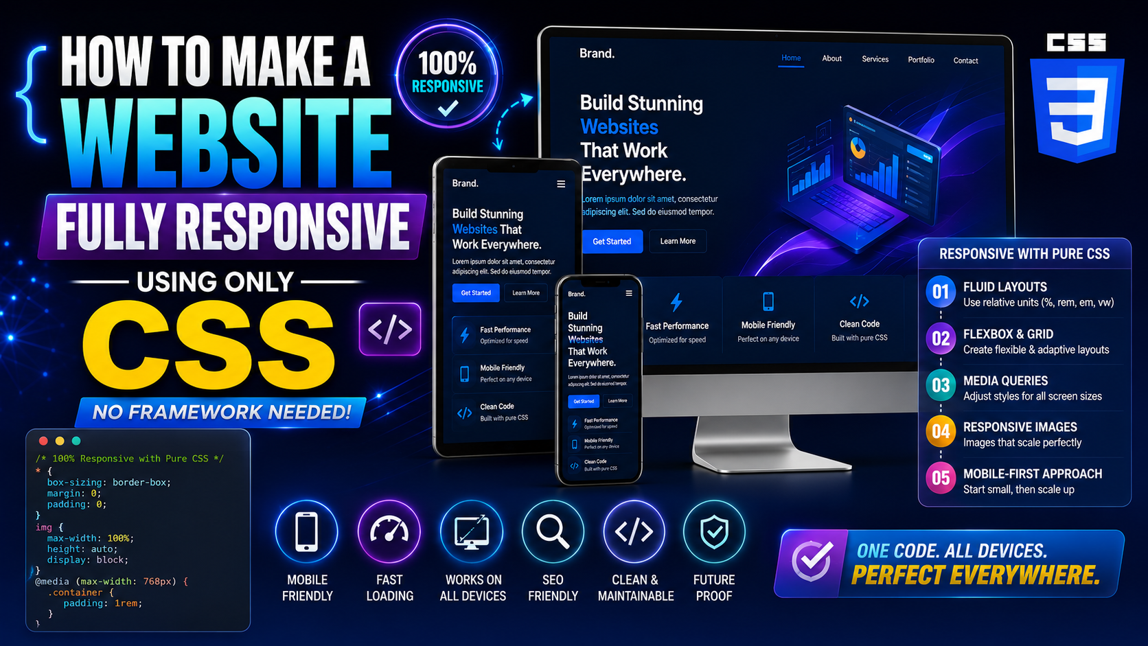
What Are CSS Media Queries?
CSS media queries are a feature of CSS that lets you apply different styles based on the conditions of the device or viewport showing your content. The most common condition is screen width — but they can check for much more than that.
Think of it this way: you have one website, but it needs to wear different outfits depending on the situation. On a small phone screen, it wears a minimal, clean outfit. On a wide desktop monitor, it wears something more spread out and feature-rich. CSS media queries are what control this wardrobe change.
Here’s what the basic syntax looks like:
@media (max-width: 768px) {
  body {
    font-size: 16px;
  }
}
This tells the browser: “If the screen width is 768 pixels or less, apply this font size to the body.” Simple as that at the surface level — but there’s a lot more depth once you go further.
The Core Syntax of CSS Media Queries
Before jumping into real-world examples, let’s get comfortable with how CSS media queries are structured.
Basic Structure
@media media-type and (condition) {
  /* CSS rules go here */
}
The @media keyword starts every query. After it, you define the media type (usually screen) and then the condition inside parentheses.
Most of the time, you’ll skip the media type and just write the condition:
@media (max-width: 600px) {
  .container {
    padding: 10px;
  }
}
This works because screen is the default assumed type.
The Two Most Used Conditions
max-width — Targets screens up to a certain width. Used in desktop-first design.
@media (max-width: 768px) {
  /* styles for screens 768px wide and below */
}
min-width — Targets screens from a certain width and above. Used in mobile-first design.
@media (min-width: 768px) {
  /* styles for screens 768px wide and above */
}
The difference between these two is actually huge in practice, and we’ll get to that shortly.
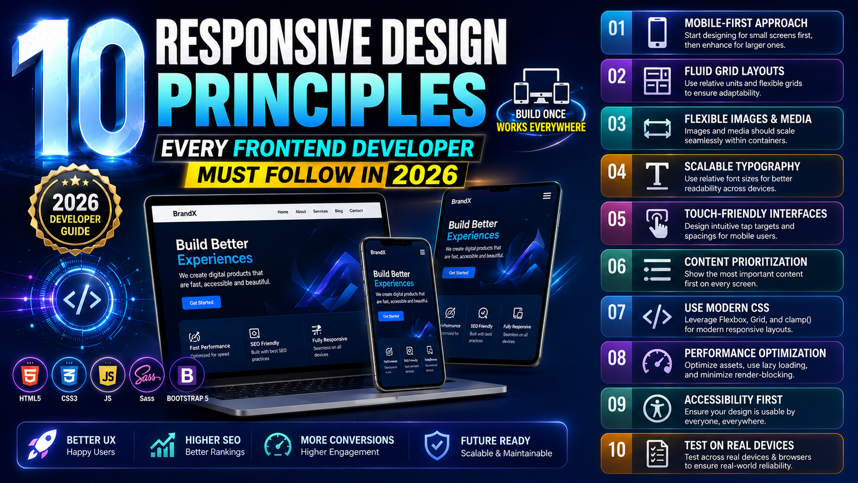
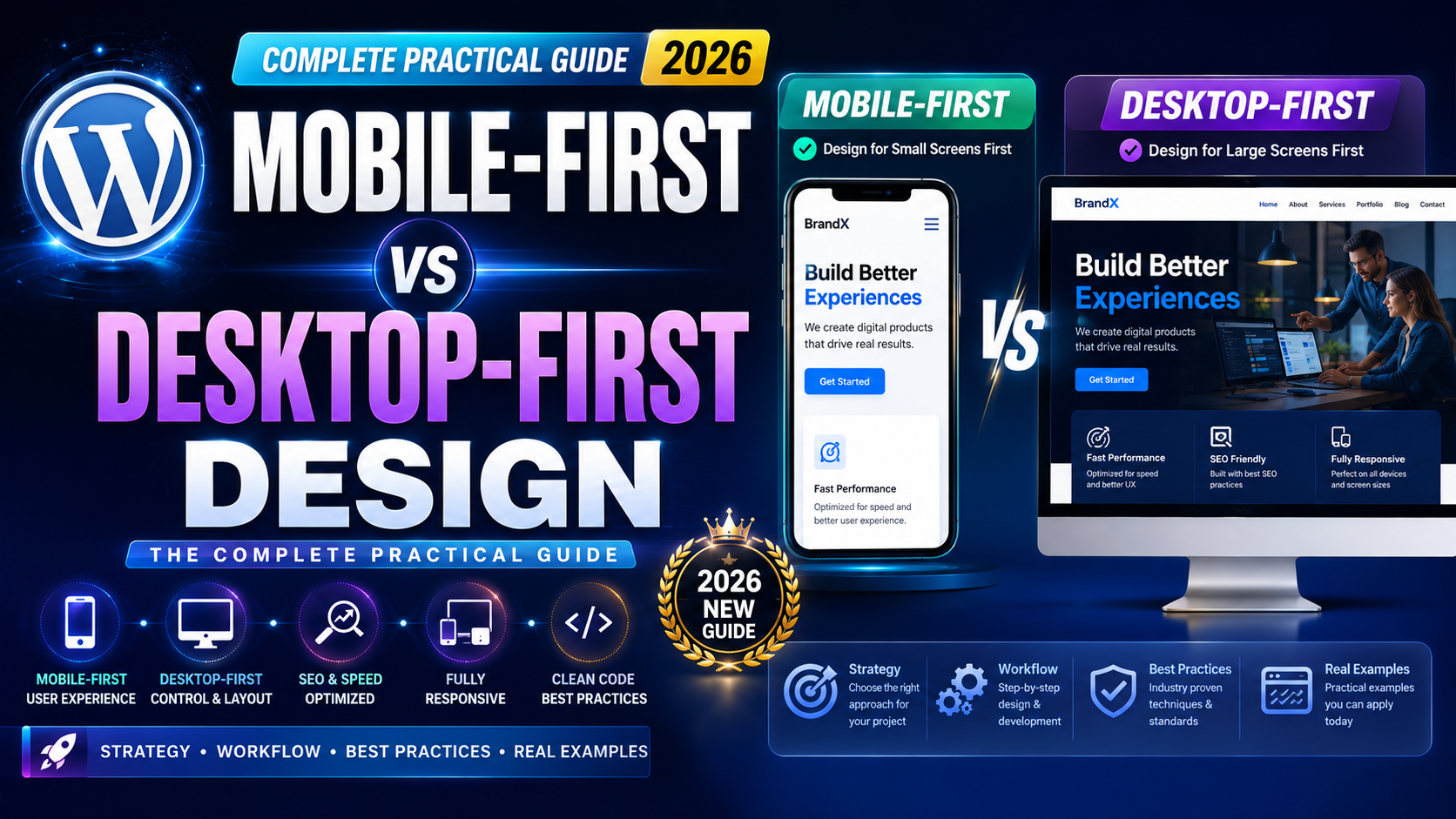
Mobile-First vs Desktop-First: Which Approach to Use With CSS Media Queries
This is where a lot of beginners go wrong. They mix max-width and min-width without a clear strategy, and the result is a mess of conflicting styles.
The cleaner approach in 2025 is mobile-first, which means you write your base CSS for small screens first, then use min-width in your CSS media queries to progressively add styles for larger screens.
Here’s an example:
/* Base styles — for mobile phones */
.card {
  width: 100%;
  padding: 16px;
  font-size: 15px;
}

/* Tablet and above */
@media (min-width: 768px) {
  .card {
    width: 48%;
    font-size: 16px;
  }
}

/* Desktop and above */
@media (min-width: 1024px) {
  .card {
    width: 30%;
    font-size: 17px;
  }
}
Notice how the code starts small and builds up. This is the mobile-first methodology, and it’s the default thinking behind frameworks like Tailwind CSS and Bootstrap 5.
If you use desktop-first instead, your base styles are for large screens, and you scale down with max-width. Both work — but mobile-first is generally cleaner, more performant, and more aligned with how Google evaluates your site today.
Common Breakpoints Used in 2025
A breakpoint is the specific screen width at which your layout changes. CSS media queries use breakpoints to trigger those changes.
There’s no single “correct” set of breakpoints — it depends on your design. But here are the ones most commonly used in real projects today:
/* Small phones */
@media (max-width: 480px) { }

/* Large phones / small tablets */
@media (min-width: 481px) and (max-width: 768px) { }

/* Tablets */
@media (min-width: 769px) and (max-width: 1024px) { }

/* Laptops / small desktops */
@media (min-width: 1025px) and (max-width: 1280px) { }

/* Large desktops */
@media (min-width: 1281px) { }
These aren’t magic numbers. They’re approximations based on common device sizes. The most important advice here: design your layout first, then add breakpoints where things actually break — not the other way around.
Real-World Example 1: Responsive Navigation Bar
Let’s look at a real use case. Navigation menus are one of the first things that break on small screens. Here’s how CSS media queries fix that.
/* Base: mobile nav — hidden menu, hamburger shows */
.nav-menu {
  display: none;
  flex-direction: column;
  background-color: #fff;
  width: 100%;
}

.nav-menu.active {
  display: flex;
}

.hamburger {
  display: block;
  cursor: pointer;
}

/* Desktop: show full nav, hide hamburger */
@media (min-width: 768px) {
  .nav-menu {
    display: flex;
    flex-direction: row;
  }

  .hamburger {
    display: none;
  }
}
On a phone (below 768px), the navigation links are hidden and a hamburger icon appears. On screens wider than 768px, the full horizontal menu shows and the hamburger disappears.
This is one of the most practical patterns you’ll use repeatedly in real projects.
Real-World Example 2: Card Grid Layout
If you’ve ever built a product page, a blog listing, or a portfolio section, you’ve needed a card grid. Here’s how to make it responsive with CSS media queries:
.grid {
  display: grid;
  grid-template-columns: 1fr; /* Single column on mobile */
  gap: 20px;
  padding: 16px;
}

@media (min-width: 600px) {
  .grid {
    grid-template-columns: 1fr 1fr; /* Two columns on tablets */
  }
}

@media (min-width: 1024px) {
  .grid {
    grid-template-columns: repeat(3, 1fr); /* Three columns on desktop */
  }
}
On a small Android screen, cards stack in a single column. As the screen widens, they automatically rearrange into two, then three columns. No JavaScript needed — pure CSS handles all of it.
Real-World Example 3: Typography Scaling
Text that’s perfectly readable on a desktop can become too small or too large on a phone. CSS media queries let you adjust typography intelligently.
body {
  font-size: 15px;
  line-height: 1.6;
}

h1 {
  font-size: 26px;
}

@media (min-width: 768px) {
  body {
    font-size: 16px;
  }

  h1 {
    font-size: 36px;
  }
}

@media (min-width: 1200px) {
  body {
    font-size: 18px;
  }

  h1 {
    font-size: 48px;
  }
}
This ensures text feels comfortable at every screen size — not too small on phones, not excessively large on widescreen monitors.
Using Multiple Conditions in CSS Media Queries
Sometimes one condition isn’t enough. You might need to target a specific range of screen widths. CSS media queries support combining conditions using and.
@media (min-width: 600px) and (max-width: 900px) {
  .sidebar {
    display: none;
  }
}
This hides the sidebar only on screens between 600px and 900px wide — like landscape phone screens and small tablets.
You can also use or logic with a comma:
@media (max-width: 480px), (min-width: 1400px) {
  .banner {
    display: none;
  }
}
This hides the banner on very small phones and very large monitors — useful when a design element only looks right at mid-range widths.
Beyond Screen Width: Other CSS Media Query Features
Most developers only use CSS media queries for screen width, but they can do much more. Here are some useful features worth knowing.
Orientation
@media (orientation: landscape) {
  .hero {
    height: 60vh;
  }
}
Useful for handling phone landscape mode, where the viewport becomes much shorter vertically.
Dark Mode Detection
This one is increasingly important in 2025. Users on Android and desktop can set their system to dark mode, and you can respond to that:
@media (prefers-color-scheme: dark) {
  body {
    background-color: #121212;
    color: #e0e0e0;
  }
}
This automatically switches your website’s color scheme to dark when the user has dark mode enabled — without any JavaScript.
Reduced Motion
Some users have vestibular disorders or simply prefer less animation. You can respect that:
@media (prefers-reduced-motion: reduce) {
  * {
    animation: none;
    transition: none;
  }
}
This disables all transitions and animations for users who prefer a calmer experience. It’s a small thing that makes a big accessibility difference.
Common Mistakes to Avoid With CSS Media Queries
Even experienced developers make these errors. Knowing them in advance will save you hours of debugging.
Mixing min-width and max-width Without Strategy
Using both without a clear plan leads to style conflicts. Pick one approach — mobile-first (min-width) or desktop-first (max-width) — and stay consistent throughout your stylesheet.
Forgetting the Viewport Meta Tag
CSS media queries won’t work correctly without this line in your HTML <head>:
<meta name="viewport" content="width=device-width, initial-scale=1.0">
Without it, mobile browsers render the page at a fake desktop width and then scale it down. Your media queries will fire at the wrong breakpoints, and your layout will look wrong on every phone.
This is probably the single most common beginner mistake.
Too Many Breakpoints
More breakpoints doesn’t mean better responsiveness. Every extra breakpoint adds complexity and maintenance overhead. Start with three or four key breakpoints. Add more only when the layout genuinely needs it — not because you think you should.
Writing Media Queries Before Testing
Always test your layout on real device sizes before adding breakpoints. Open Chrome DevTools, switch to device mode, and resize the viewport slowly. Add a media query where things actually start to look broken — not at some arbitrary number you read in a tutorial.
CSS Media Queries and Modern CSS: A Quick Note on Container Queries
In 2025, there’s a newer CSS feature worth knowing: Container Queries. They work similarly to CSS media queries but base styles on the size of a parent container rather than the full viewport.
@container (min-width: 400px) {
  .card-title {
    font-size: 20px;
  }
}
Container Queries are now well-supported in all modern browsers. They’re particularly useful for reusable components — like cards that might appear in a narrow sidebar on one page and a wide grid on another.
CSS media queries aren’t going away, but container queries are a powerful complement for component-level responsiveness. Learning both will put you ahead in modern front-end development.
How to Test Your CSS Media Queries Properly
Writing the code is only half the job. Testing it correctly matters just as much.
The fastest tool is Chrome DevTools. Press F12, click the device icon (or press Ctrl+Shift+M), and you can simulate different screen sizes instantly. Drag the viewport edge to see exactly where your layout breaks.
But DevTools isn’t a replacement for real device testing. Borrow or test on actual Android phones if you can — especially mid-range devices with smaller screens. Real devices sometimes behave differently from what emulators show, particularly with touch interactions and zoom behavior.
Also test your viewport meta tag is in place. Without it, your entire responsive design effort is effectively invisible to mobile browsers.
Final Conclusion
CSS media queries are one of those foundational skills that, once learned properly, make everything else in responsive web design click into place. They’re not complicated at their core — the syntax is clean, the logic is straightforward, and with a mobile-first mindset, they scale beautifully.
What makes the difference between developers who use them well and those who don’t isn’t talent — it’s knowing the fundamentals clearly. Understand the difference between min-width and max-width. Add breakpoints where the design actually needs them. Always include the viewport meta tag. Test on real screens.
In 2025, responsive design isn’t a bonus feature anymore. It’s the baseline expectation for every website you build. And CSS media queries are the primary tool that makes that possible. Learn them well, practice with real projects, and you’ll build better, more professional websites from day one.