 Mukesh1@gmail.com
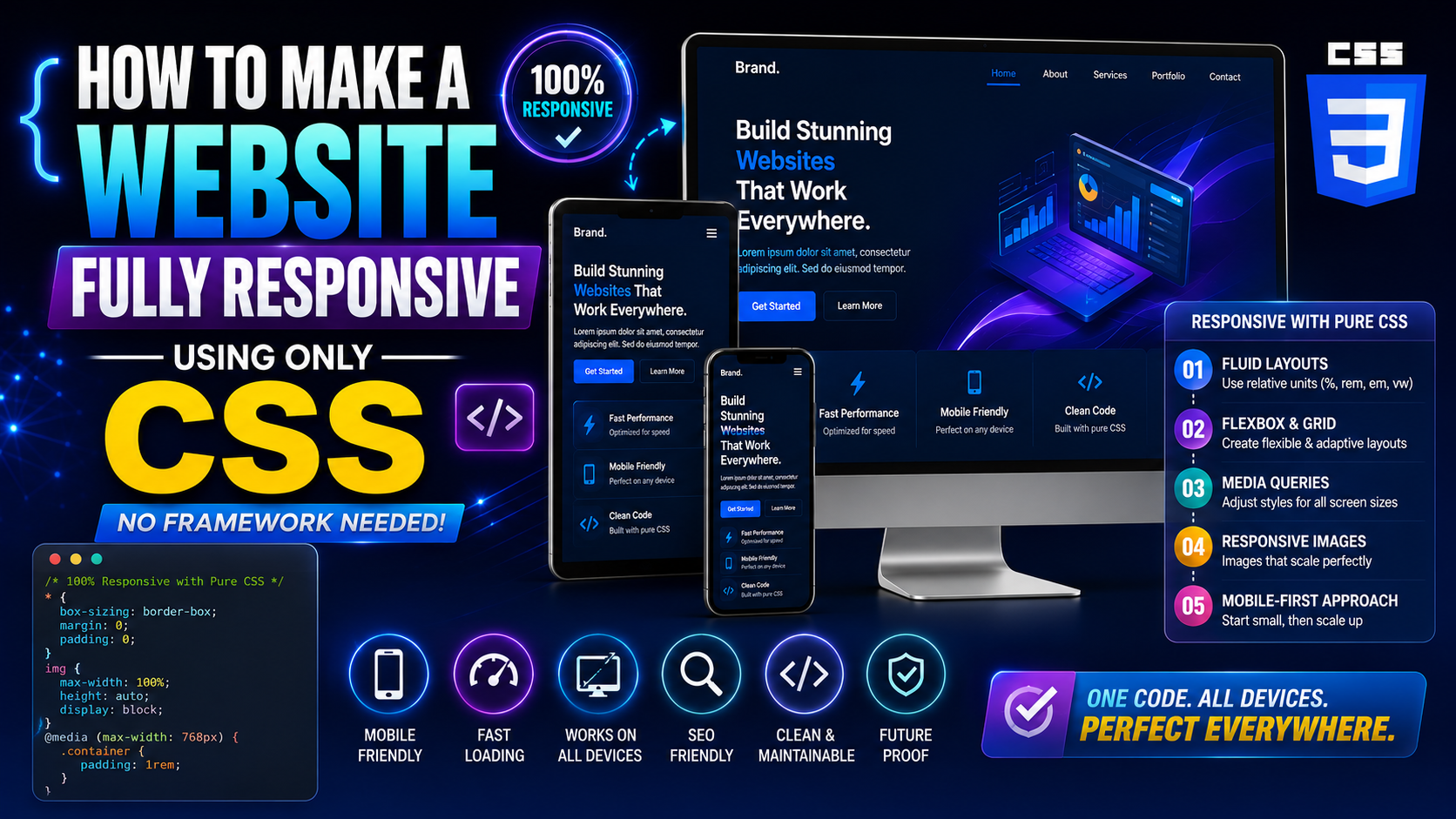
Introduction
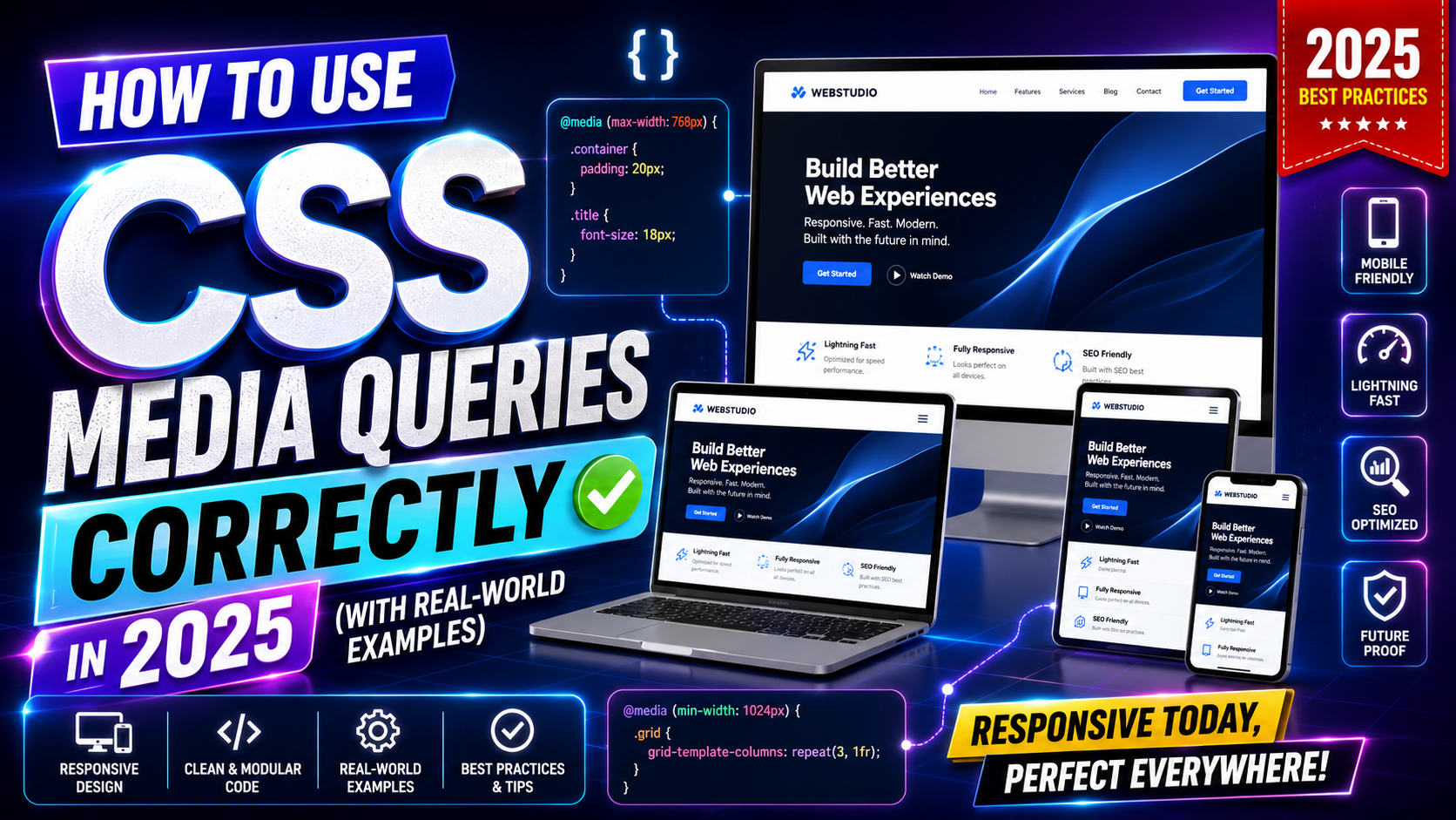
There is a common belief among newer developers that you need a CSS framework to build a responsive website. Bootstrap, Tailwind, Foundation — they get recommended everywhere, and for good reason. They are fast to get started with and come with responsive grids built in.
But here is something worth knowing: you do not actually need any of them. Native CSS in 2026 is powerful enough to make a website fully responsive using only CSS — no external dependencies, no extra class names, no learning a framework’s specific syntax. Just clean, standard CSS that runs in every modern browser.
This matters for several reasons. Framework-free CSS loads faster. It gives you complete control over your styles. It produces leaner HTML without dozens of utility classes cluttering every element. And honestly, understanding how to make a website fully responsive using only CSS makes you a stronger developer overall — because you understand what the frameworks are actually doing under the hood.
This guide walks you through the complete approach, step by step, with real code you can use right away.
Why Building Fully Responsive Using Only CSS Is Totally Realistic in 2026
A few years ago, rolling your own responsive layout without a framework was genuinely harder. Browser support for CSS Grid was inconsistent. clamp() was new. The gap property on Flexbox had limited support. You had to write more workarounds.
In 2026, that landscape has completely shifted. CSS Grid, Flexbox, custom properties (CSS variables), clamp(), min(), max(), container queries, and logical properties all enjoy excellent cross-browser support. The language itself has matured into a complete layout system.
Making a website fully responsive using only CSS today means taking advantage of these tools together. No polyfills, no hacks, no framework layer in between. Just CSS doing exactly what it was designed to do.
Step 1 – Set Up Your HTML Foundation Correctly
Before writing a single line of CSS, the HTML structure needs to be solid. Responsive CSS works best when the HTML is clean and semantic. That means using the right elements for the right content — <header>, <nav>, <main>, <section>, <article>, <aside>, <footer> — rather than wrapping everything in generic <div> elements.
Here is a basic semantic page structure to start with:
<!DOCTYPE html>
<html lang="en">
<head>
<meta charset="UTF-8">
<meta name="viewport" content="width=device-width, initial-scale=1.0">
<title>My Responsive Website</title>
<link rel="stylesheet" href="styles.css">
</head>
<body>
<header class="site-header">
<nav class="nav">
<a href="/" class="nav__logo">SiteName</a>
<ul class="nav__links">
<li><a href="/about">About</a></li>
<li><a href="/work">Work</a></li>
<li><a href="/contact">Contact</a></li>
</ul>
</nav>
</header>
<main class="main-content">
<section class="hero">
<h1>Welcome to My Site</h1>
<p>A short description goes here.</p>
<a href="/work" class="btn">See My Work</a>
</section>
<section class="cards">
<article class="card">Card One</article>
<article class="card">Card Two</article>
<article class="card">Card Three</article>
</section>
</main>
<footer class="site-footer">
<p>© 2026 SiteName</p>
</footer>
</body>
</html>
Notice the viewport meta tag in the <head>. That is not optional. Without it, mobile browsers render the page as a shrunken desktop layout and your effort to make the website fully responsive using only CSS will not work correctly.
Step 2 – Write a CSS Reset and Base Styles
Every browser has its own default styles. Margins on headings, padding on lists, box-sizing behavior — these vary between browsers and cause inconsistent rendering. A simple CSS reset levels the playing field before you start building.
/* Box sizing reset — applied globally */
*,
*::before,
*::after {
  box-sizing: border-box;
  margin: 0;
  padding: 0;
}

/* Base document styles */
html {
  font-size: 100%; /* Respects user browser font settings */
  scroll-behavior: smooth;
}

body {
  font-family: system-ui, sans-serif;
  line-height: 1.6;
  color: #222;
  background-color: #fff;
}

/* Responsive images by default */
img,
video {
  max-width: 100%;
  height: auto;
  display: block;
}

/* Remove list styles */
ul {
  list-style: none;
}

/* Links */
a {
  color: inherit;
  text-decoration: none;
}
The box-sizing: border-box rule is especially important. It makes width calculations include padding and borders, which is far more intuitive when building responsive layouts. The max-width: 100% on images ensures they never overflow their containers — a quick win that helps make the website fully responsive using only CSS with almost no effort.
Step 3 – Build a Fluid Layout Container
Every page needs a container that constrains the maximum width on large screens but remains fluid on smaller ones. This is a fundamental building block when you want to make a website fully responsive using only CSS.
.container {
  width: 100%;
  max-width: 1200px;
  margin-inline: auto;
  padding-inline: clamp(1rem, 5vw, 2rem);
}
What is happening here: width: 100% makes it fill its parent at small sizes. max-width: 1200px prevents it from growing too wide on large screens. margin-inline: auto centers it horizontally. And padding-inline: clamp(1rem, 5vw, 2rem) adds responsive side padding — tighter on phones, more generous on wide screens.
This single reusable class handles your content width across the entire site. Apply it to any section that needs centered, contained content.
Step 4 – Create the Navigation with Flexbox
A responsive navigation bar is one of the first things people notice on a website. Making it work cleanly on all screen sizes is an early test of your fully responsive using only CSS approach.
.site-header {
  background-color: #fff;
  border-bottom: 1px solid #eee;
  position: sticky;
  top: 0;
  z-index: 100;
}

.nav {
  display: flex;
  justify-content: space-between;
  align-items: center;
  padding: 1rem clamp(1rem, 5vw, 2rem);
  max-width: 1200px;
  margin-inline: auto;
}

.nav__logo {
  font-size: 1.25rem;
  font-weight: 700;
  letter-spacing: -0.02em;
}

.nav__links {
  display: flex;
  gap: 2rem;
}

.nav__links a {
  font-size: 0.95rem;
  font-weight: 500;
  transition: opacity 0.2s;
}

.nav__links a:hover {
  opacity: 0.6;
}

/* Stack nav vertically on small screens */
@media (max-width: 600px) {
  .nav {
    flex-direction: column;
    gap: 1rem;
    text-align: center;
  }
}
This gives you a horizontal nav on wide screens and a stacked, centered nav on small phones — all without a framework, all using standard CSS. The sticky positioning keeps it visible as users scroll, which is a common pattern in modern sites.
Step 5 – Build a Responsive Hero Section
The hero section is typically the first visual block below the nav. Making it fully responsive using only CSS means it needs to look good from a 320px wide phone to a 2560px wide monitor.
.hero {
  display: flex;
  flex-direction: column;
  align-items: center;
  justify-content: center;
  text-align: center;
  padding-block: clamp(3rem, 10vh, 8rem);
  padding-inline: clamp(1rem, 5vw, 2rem);
  background-color: #f8f8f8;
}

.hero h1 {
  font-size: clamp(2rem, 6vw, 4rem);
  line-height: 1.15;
  font-weight: 800;
  letter-spacing: -0.03em;
  margin-bottom: 1rem;
}

.hero p {
  font-size: clamp(1rem, 2.5vw, 1.25rem);
  color: #555;
  max-width: 55ch;
  margin-bottom: 2rem;
}

.btn {
  display: inline-block;
  padding: 0.8rem 2rem;
  background-color: #111;
  color: #fff;
  border-radius: 4px;
  font-size: 1rem;
  font-weight: 600;
  transition: background-color 0.2s;
}

.btn:hover {
  background-color: #333;
}
Notice clamp() being used throughout — for padding, heading size, and body text size. This is the core technique that makes text and spacing scale fluidly without needing a media query for every size change. The max-width: 55ch on the paragraph keeps line lengths readable on large screens (around 55 characters per line is comfortable for reading).
Step 6 – Create a Responsive Card Grid with CSS Grid
Card grids are everywhere — blog post listings, product grids, portfolio layouts, team sections. A fully responsive card grid using only CSS is one of the most satisfying things to build because a single line of CSS Grid handles the entire responsive behavior.
.cards {
  display: grid;
  grid-template-columns: repeat(auto-fit, minmax(280px, 1fr));
  gap: clamp(1rem, 3vw, 2rem);
  padding-block: clamp(2rem, 6vw, 4rem);
  padding-inline: clamp(1rem, 5vw, 2rem);
  max-width: 1200px;
  margin-inline: auto;
}

.card {
  background-color: #fff;
  border: 1px solid #e5e5e5;
  border-radius: 8px;
  padding: 1.5rem;
  transition: box-shadow 0.2s;
}

.card:hover {
  box-shadow: 0 4px 20px rgba(0, 0, 0, 0.08);
}
The magic is in repeat(auto-fit, minmax(280px, 1fr)). This tells the browser: create as many columns as will fit, each at least 280px wide, sharing available space equally. On a wide screen you get three or four cards per row. On a tablet you might get two. On a phone you get one. All automatically, with zero media queries.
This is what it truly looks like to make a website fully responsive using only CSS — one intelligent rule handling all the layout variations for you.
Step 7 – Build a Responsive Two-Column Layout
Many pages need a content-plus-sidebar type layout. Here is how to build it with CSS Grid so it collapses to a single column on mobile, all without a framework.
.two-column {
  display: grid;
  grid-template-columns: 1fr;
  gap: 2rem;
  max-width: 1200px;
  margin-inline: auto;
  padding: clamp(2rem, 5vw, 4rem) clamp(1rem, 5vw, 2rem);
}

@media (min-width: 768px) {
  .two-column {
    grid-template-columns: 1fr 300px;
  }
}
On mobile, both columns stack vertically. On screens wider than 768px, the main content takes all available space (1fr) and the sidebar stays at a fixed 300px. Clean, readable, fully responsive using only CSS.
Step 8 – Handle Responsive Typography System-Wide
Rather than setting font sizes individually on every element, set up a typography system in CSS custom properties (variables) that scales automatically.
:root {
  --text-xs: clamp(0.75rem, 1.5vw, 0.875rem);
  --text-sm: clamp(0.875rem, 2vw, 1rem);
  --text-base: clamp(1rem, 2.5vw, 1.125rem);
  --text-lg: clamp(1.125rem, 3vw, 1.5rem);
  --text-xl: clamp(1.5rem, 4vw, 2rem);
  --text-2xl: clamp(2rem, 5vw, 3rem);
  --text-3xl: clamp(2.5rem, 7vw, 4.5rem);
}

body {
  font-size: var(--text-base);
}

h1 { font-size: var(--text-3xl); }
h2 { font-size: var(--text-2xl); }
h3 { font-size: var(--text-xl); }
h4 { font-size: var(--text-lg); }
Define it once in :root, use it everywhere. This is how you make an entire site fully responsive using only CSS with a typography system that requires almost no maintenance. Change one variable and everything using it updates across the site.
Step 9 – Build a Responsive Footer
Footers often have multiple columns — links, social icons, copyright info. Here is a clean responsive footer that collapses gracefully.
.site-footer {
  background-color: #111;
  color: #ccc;
  padding-block: clamp(2rem, 5vw, 4rem);
  padding-inline: clamp(1rem, 5vw, 2rem);
}

.footer-inner {
  display: grid;
  grid-template-columns: repeat(auto-fit, minmax(180px, 1fr));
  gap: 2rem;
  max-width: 1200px;
  margin-inline: auto;
  margin-bottom: 2rem;
}

.footer-bottom {
  text-align: center;
  font-size: 0.875rem;
  color: #888;
  border-top: 1px solid #333;
  padding-top: 1.5rem;
  max-width: 1200px;
  margin-inline: auto;
}
Again, auto-fit with minmax() handles the column collapsing automatically. Multiple footer columns on desktop, stacked single column on mobile. Fully responsive using only CSS, no framework logic needed.
Step 10 – Use Container Queries for Component-Level Responsiveness
Container queries are one of the newer additions to CSS that make it even more powerful for building responsive layouts without a framework. Unlike media queries that respond to the viewport width, container queries let an element respond to the size of its own parent container.
This is incredibly useful for reusable components. A card component can be used in a narrow sidebar or a wide main content area — with container queries, it adapts to whichever context it is placed in, not just the screen size.
/* Define the container */
.card-wrapper {
  container-type: inline-size;
}

/* Style the card based on its container width */
.card {
  display: flex;
  flex-direction: column;
}

@container (min-width: 400px) {
  .card {
    flex-direction: row;
    align-items: center;
  }
}
When the container is narrower than 400px, the card stacks vertically. When wider, it goes horizontal. This works regardless of where on the page the component lives. Container queries represent a genuine advancement in how you can make a website fully responsive using only CSS at the component level.
Step 11 – Test and Audit Your Fully Responsive CSS Layout
Once you have built your layout, testing is non-negotiable. Here is a quick audit checklist:
- Open Chrome DevTools, click the responsive device icon, and drag the viewport from 320px to 1600px. Watch for layout breaks, overflow, and awkward wrapping.
- Test on at least one real Android and one real iOS device if possible.
- Run a Lighthouse audit from DevTools — check Performance, Accessibility, and Best Practices scores.
- Check Google PageSpeed Insights (web.dev/measure) for Core Web Vitals scores on mobile.
- Resize text in browser settings and verify your layout does not break when font size is increased.
- Tab through the page with your keyboard to verify focus order makes sense.
These steps are how you confirm that your work to make the website fully responsive using only CSS is actually delivering the experience you intended across real devices and real conditions.
What You Do Not Need a Framework For
After working through all of this, it is worth being direct: here is what native CSS handles perfectly well in 2026 without any framework.
Responsive grid layouts — CSS Grid auto-fit and minmax() handle this natively. Fluid typography — clamp() covers it completely. Responsive spacing — clamp() on padding and margin handles it. Flexbox navigation — native CSS Flexbox is all you need. Sticky headers — position: sticky is built into CSS. Dark mode — CSS custom properties and prefers-color-scheme media query handle it. Component-level responsiveness — container queries handle it.
The only thing frameworks genuinely add is speed of initial setup and pre-built component patterns. If you know the CSS tools covered in this guide, you can replicate those layouts from scratch — and you end up with cleaner, faster, more maintainable code as a result.
Two resources stand out for going further with framework-free responsive CSS.
MDN Web Docs at developer.mozilla.org has the most complete reference documentation for every CSS property mentioned in this guide. The pages on CSS Grid, Flexbox, clamp(), container queries, and custom properties are all accurate, clearly written, and kept up to date.
The Lea Verou-influenced CSS community work documented at web.dev/learn/css is a structured, free course covering modern CSS from the ground up. It covers all the responsive techniques here and goes deeper into areas like cascade layers and logical properties.
Final Conclusion
Making a website fully responsive using only CSS is not a compromise or a workaround — in 2026 it is a legitimate, professional choice that produces faster, leaner, and more maintainable websites than many framework-dependent alternatives.
The tools are all there. Viewport-relative units, clamp() for fluid scaling, CSS Grid’s auto-fit behavior, Flexbox alignment, container queries for components, and CSS custom properties for a coherent design system — these cover every common responsive layout challenge without a single line of framework code.
What makes this approach work is understanding each tool well enough to reach for the right one at the right time. The viewport meta tag ensures your CSS actually runs correctly on mobile. The reset creates a consistent baseline. Fluid containers, responsive grids, and scalable typography build up the layout. Real-device testing confirms it all works the way you intended.
Start with a small project. Apply these techniques one at a time. Within a few builds, making a website fully responsive using only CSS will feel like the natural default — because it genuinely is.