 Mukesh1@gmail.com
Introduction
You spent hours building your website. It looks great on your laptop. Clean layout, nice fonts, smooth navigation. Then you pull it up on your phone — and it’s a mess. Text too small to read. Buttons that are nearly impossible to tap. Images spilling off the screen. Something is clearly broken.
The truth is, most of these problems trace back to a handful of specific responsive design mistakes that developers and designers keep making — even in 2026. And the scary part is that many of these mistakes are subtle enough that you don’t notice them until real users start bouncing off your site.
Responsive design mistakes aren’t just cosmetic issues. They affect your SEO rankings, your bounce rate, your conversions, and ultimately how people feel about your brand. Google has been using mobile-first indexing for years now, which means your mobile experience is essentially your primary experience. If it’s broken on mobile, you’re losing.
Why Responsive Design Mistakes Still Happen in 2026
You’d think by now, with all the tools available — CSS frameworks, browser developer tools, Lighthouse audits — people would have this figured out. But responsive design mistakes are still incredibly common, and the reasons are understandable.
Most developers test on a resized browser window, not an actual phone. Resizing a desktop browser doesn’t perfectly simulate how a real device renders a page. Touchscreens behave differently. Fonts scale differently. System UI takes up space.
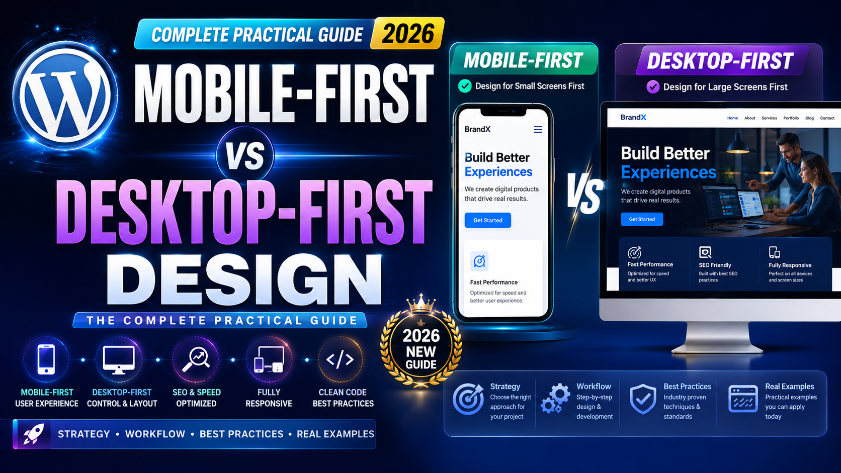
Also, a lot of designers still think desktop-first. They build the big screen version and then try to “adapt it down.” That backwards approach is one of the root causes of several mistakes on this list.
Let’s get into the specifics.
Mistake 1 — Missing or Incorrect Viewport Meta Tag
This is possibly the most foundational of all responsive design mistakes, and somehow it still shows up in the wild in 2026.
The viewport meta tag tells the browser how to scale and size the page for the device it’s displayed on. Without it, mobile browsers will render your page as if it’s a full desktop page and then zoom it out to fit the screen. Everything looks tiny. Nothing is readable.
The correct tag looks like this:
<meta name="viewport" content="width=device-width, initial-scale=1.0">
That single line of code tells the browser: match the page width to the device width, and start at normal zoom. It sounds simple, but a missing or incorrect viewport tag is one of those responsive design mistakes that breaks everything downstream — even if the rest of your CSS is perfect.
Always double-check this tag exists in the <head> of every page you build. It’s easy to forget when you’re working from a template someone else created.
Mistake 2 — Using Fixed Pixel Widths for Layout
Setting elements to fixed pixel widths like width: 960px or width: 1200px is one of the classic responsive design mistakes that beginners make. It works fine on large screens, but the moment you view that page on a 375px wide phone screen, those elements overflow, break the layout, and create that awful horizontal scrollbar situation.
The fix is to switch to relative units. Use percentages, em, rem, or the newer ch unit for widths. Better yet, lean on Flexbox and CSS Grid — both are built to handle fluid resizing naturally.
A quick rule to keep in mind: if you ever type a pixel value for a layout width on a container element, ask yourself if that container needs to be flexible. Most of the time, the answer is yes.
For max widths, it’s totally fine to use pixels — something like max-width: 1200px with width: 100% gives you a contained layout on large screens that still shrinks gracefully on smaller ones.
Mistake 3 — Touch Targets That Are Too Small
This one affects real users directly. Touch targets — buttons, links, form fields, icons — need to be large enough for a human finger to tap reliably. One of the most frustrating responsive design mistakes is having interactive elements that are just too small to hit accurately on a touchscreen.
Google and Apple both recommend a minimum touch target size of around 44×44 pixels or 48×48 pixels for comfortable interaction. But so many websites still have tiny navigation links, small social icons, or close buttons on modals that require pinpoint precision to tap.
The problem gets worse when touch targets are placed close together. Even if each button is technically large enough, clustering them together means users frequently tap the wrong one.
Fix this by reviewing every interactive element on your mobile layout. Give buttons generous padding — not just a height value. Use min-height and min-width in your CSS. Leave breathing room between links and icons.
This is one of those responsive design mistakes that’s quick to fix but makes an immediate difference in how people experience your site on their phone.
Mistake 4 — Ignoring Font Sizes and Line Spacing on Small Screens
Text legibility is everything on mobile. Yet poor font sizing remains one of the most overlooked responsive design mistakes in web development today.
The problem usually happens in one of two ways. Either the base font size is too small (anything below 16px for body text on mobile is generally too small for comfortable reading), or the font size is technically fine but the line height is too tight, making paragraphs feel cramped and hard to scan.
Another related issue is using viewport units like vw for font sizes without proper constraints. Something like font-size: 3vw might look fine on a desktop but renders as tiny text on a small phone.
A better approach is to use CSS clamp() for fluid typography:
font-size: clamp(1rem, 2.5vw, 1.5rem);
This keeps text within a readable minimum and maximum range while still scaling fluidly between breakpoints. It’s one of the most practical improvements you can make to avoid text-related responsive design mistakes.
Also check your line height. A value around 1.5 to 1.7 for body text makes reading easier, especially on small screens where people are reading in more variable lighting conditions.
Mistake 5 — Relying Only on Hover States for Interactivity
This is a sneaky one. On desktop, hover states are great. You hover over a navigation item and a dropdown appears. You hover over an image and an overlay with info slides in. It feels natural with a mouse.
On mobile, there is no hover. Touchscreens don’t support hover the way a mouse does. So any interactivity that depends on :hover simply doesn’t work for mobile users — and this is one of those responsive design mistakes that can make entire sections of your interface completely inaccessible.
Navigation menus built entirely on hover-triggered dropdowns will often behave erratically on mobile. Some browsers try to simulate hover on first tap, which means users have to tap twice to follow a link — once to “hover” and once to actually click. That’s a confusing experience.
The fix: design interactive patterns that work with tap and click, not just hover. Use click-triggered dropdowns. Make sure important information isn’t hidden behind hover-only reveals. Test everything by touching the screen, not moving a cursor over it.
Treating hover as the only interaction model is one of those responsive design mistakes that often comes from designing and testing exclusively on desktop.
Mistake 6 — Unoptimized Images Breaking Performance and Layout
Images cause two types of problems in responsive design — layout problems and performance problems. Both qualify as genuine responsive design mistakes that can seriously hurt your site.
The layout problem: using images without defined dimensions (width and height attributes) causes layout shift. The page loads, the text appears, then the image loads and suddenly everything jumps down. This is called Cumulative Layout Shift (CLS), and Google measures it as part of Core Web Vitals. High CLS scores hurt your rankings.
The performance problem: serving a 3000px wide image to a phone that only displays it at 400px is wasteful. It slows down page load dramatically. Users on mobile data connections feel this the most.
The solution involves a few things. Always set width and height on your <img> elements, even if you’re styling them with CSS. Use the srcset attribute to serve appropriately sized images at different screen widths. And consider modern formats like WebP or AVIF, which compress significantly better than JPEG or PNG.
<img
  src="photo-400.webp"
  srcset="photo-400.webp 400w, photo-800.webp 800w, photo-1200.webp 1200w"
  sizes="(max-width: 600px) 400px, (max-width: 1000px) 800px, 1200px"
  width="800"
  height="500"
  alt="Description here"
>
It looks like more code, but this pattern alone can dramatically improve mobile performance and layout stability — two of the most impactful things you can fix from a list of responsive design mistakes.
Mistake 7 — Writing Media Queries as an Afterthought
This might be the most conceptually deep of all the responsive design mistakes on this list. A lot of developers write their full desktop CSS first, then bolt on media queries at the end to “make it work on mobile.” That approach creates fragile, hard-to-maintain code — and it usually results in a mobile experience that feels patched together rather than properly designed.
The better approach is mobile-first CSS. Write your base styles for the smallest screen, then use min-width media queries to progressively enhance the layout for larger screens.
/* Base styles — mobile first */
.container {
  display: flex;
  flex-direction: column;
  gap: 1rem;
}

/* Tablet and up */
@media (min-width: 768px) {
  .container {
    flex-direction: row;
  }
}

/* Desktop and up */
@media (min-width: 1200px) {
  .container {
    max-width: 1200px;
    margin: 0 auto;
  }
}
This structure is cleaner, more logical, and avoids the messy overrides that come from trying to reverse-engineer a desktop layout into a mobile one.
Beyond the architecture, also avoid having too few breakpoints. Two breakpoints — one for tablet, one for desktop — isn’t always enough. Content behaves differently at 320px, 375px, 414px, and 768px. Testing at multiple real device widths rather than just a couple of arbitrary breakpoints is how you catch the edge cases before your users do.
Treating media queries as an afterthought is one of those responsive design mistakes that feels harmless in a small project but becomes a real maintenance problem as your site grows.
How to Audit Your Site for Responsive Design Mistakes
Now that you know the seven issues, here’s a practical way to check your own site.
Chrome DevTools has a responsive design mode (press F12, then click the device icon). You can test at different screen widths and even simulate real device models. It’s not a perfect substitute for testing on actual hardware, but it catches most layout problems.
Google Lighthouse (also built into Chrome DevTools) runs an automated audit that flags performance issues, image problems, accessibility violations, and more. It will catch several of the responsive design mistakes covered in this article.
PageSpeed Insights at web.dev gives you a real-world performance score and specific recommendations. It’s free and takes about 30 seconds to run.
For font sizes and touch targets specifically, the Accessibility section of a Lighthouse audit will flag elements that are too small. Pay attention to those warnings — they’re not just about accessibility. They’re about usability for everyone.
Final Conclusion
Responsive design mistakes are easy to make and sometimes surprisingly hard to spot until real users encounter them. Missing viewport tags, fixed pixel widths, tiny touch targets, unreadable text, hover-only interactions, bloated images, and desktop-first media queries — these seven issues cover a wide range of problems but share a common root: the site wasn’t truly designed with mobile users in mind.
In 2026, mobile traffic makes up the majority of web visits across almost every category. Your mobile experience isn’t a secondary concern. It is the primary concern. Getting these fundamentals right doesn’t require a complete redesign — most of these fixes are practical changes you can make incrementally, starting today.
Go check your site. Open it on your phone right now. Tap around. Read a paragraph. Try to click the small stuff. That direct experience will tell you more about your responsive design mistakes than any tool can.