 Mukesh1@gmail.com
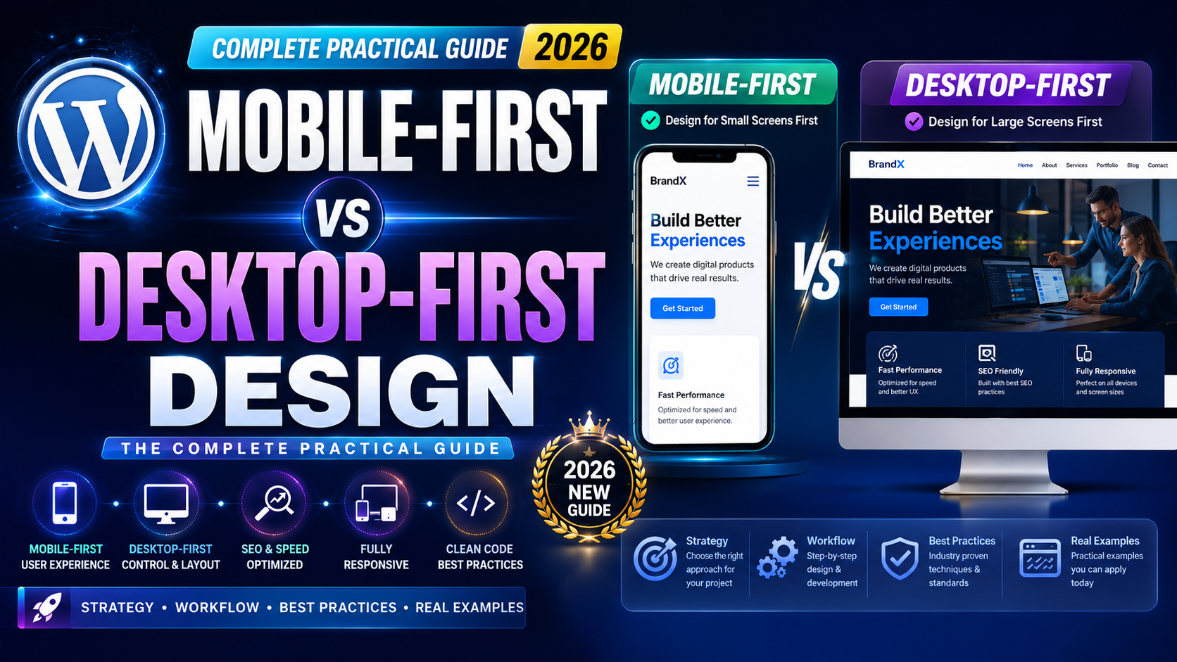
Introduction
If you’ve ever opened a website on your Android phone and had to pinch, zoom, or scroll sideways just to read a paragraph — you’ve already felt the pain of poor design decisions. That frustration isn’t accidental. It comes from how the website was built in the first place.
The debate around Mobile-First vs Desktop-First Design has been going on for years. But in 2026, with smartphones being the primary device for billions of people worldwide, this question carries more weight than ever before. Whether you’re a beginner learning web design or someone trying to understand why your website feels clunky on a phone, this guide breaks it all down in simple, practical terms.
Let’s start from the beginning and build our way up to a clear answer.
What Is Mobile-First Design?
Mobile-First Design means you start designing a website or app for the smallest screen first — usually a smartphone. Once that version looks good and works properly, you then scale it up for tablets and desktops.
Think of it like designing a tiny apartment. Every inch matters. You only include what’s essential, and then when you move to a bigger space, you add more features.
On Android phones like a Samsung Galaxy or a Redmi device, a mobile-first website loads faster, buttons are easy to tap, and text doesn’t need zooming. The experience just feels natural.
The concept was officially popularized by designer Luke Wroblewski back around 2009, but it became a serious standard when Google announced that it would use mobile-first indexing for all websites. That changed everything.
What Is Desktop-First Design?
Desktop-First Design is the older, more traditional approach. Designers start by creating the full layout for a wide monitor screen — with sidebars, large images, and complex navigation menus. After that, they try to compress and adjust the design to fit on mobile screens.
This approach made sense back when most internet traffic came from desktop computers. Designers had more screen space to work with, and they used it.
But here’s the problem: squeezing a large desktop layout into a small phone screen is tricky. Elements often overlap, text becomes tiny, and touch targets — like buttons or links — end up too small to tap properly.
If you’ve used an older government website or a legacy banking portal on your phone, you know exactly what this feels like.
Mobile-First vs Desktop-First Design: The Core Difference
The main difference between Mobile-First vs Desktop-First Design isn’t just about screen size — it’s about design philosophy and priority.
With Mobile-First, you ask: “What does a user absolutely need to accomplish this task on a small screen?” That forces clarity and focus.
With Desktop-First, you ask: “How do we fit everything on a big screen?” That often results in cluttered interfaces that don’t translate well to phones.
In simple words:
Mobile-First builds up. Desktop-First scales down. Building up is easier and more effective than tearing down.
Why Mobile-First Design Became the Standard
Google’s Mobile-First Indexing Changed Everything
Around 2019, Google completed its shift to mobile-first indexing. This means Google now primarily looks at the mobile version of your website when deciding how to rank it in search results.
If your website’s mobile version is broken or missing content, your SEO rankings will suffer — regardless of how great your desktop version looks.
For anyone building a website in 2026, ignoring Mobile-First vs Desktop-First Design principles could mean your site simply doesn’t get found on Google.
Most People Browse on Phones Now
Global data shows that over 60% of web traffic now comes from mobile devices. In countries like India, that number is even higher. Most users are opening websites on Android phones with 4G or 5G connections, not on desktop computers.
If your website isn’t built with mobile in mind, you’re designing for a minority of your users — which is simply bad strategy.
Performance and Load Time
Mobile-First Design encourages developers to keep things lightweight. Fewer heavy images. Simpler animations. Faster load times.
On an Android phone with a mid-range processor, a heavy desktop-first website can take 6–10 seconds to load. A properly built mobile-first website? Often under 2 seconds. That difference directly affects how long users stay on your site.
When Desktop-First Design Still Makes Sense
Despite everything said above, Desktop-First Design hasn’t become completely irrelevant. There are specific situations where it still works well.
Complex Productivity Tools
Applications like video editing software, data dashboards, spreadsheet tools, or coding editors are naturally used on large screens. Designing these for mobile first would be awkward and counterproductive.
If you’re building a project management dashboard or a financial analytics platform for office workers, desktop-first is often the more practical starting point.
Internal Business Tools
Many companies build internal tools for employees who work on desktop computers all day. HR portals, inventory management systems, or CRM dashboards fall into this category. Here, mobile-first might add unnecessary complexity without much benefit.
Legacy Systems
Some existing websites were built years ago on a desktop-first model. Completely rebuilding them from scratch isn’t always possible due to budget or time constraints. In those cases, improving mobile responsiveness gradually — without rebuilding from zero — is a realistic option.
Mobile-First vs Desktop-First Design: Pros and Cons
Pros of Mobile-First Design
Starting with mobile forces you to think clearly. You only include what’s truly necessary, which keeps the design clean and fast. It aligns with Google’s ranking preferences, which helps with SEO. It also creates a better experience for the majority of today’s users.
When you eventually scale up to desktop, you have a strong foundation. Adding features to a clean mobile design is easier than removing cluttered elements from a desktop design.
Cons of Mobile-First Design
Mobile-first can feel limiting during the early stages of design, especially for feature-rich applications. Designers sometimes struggle to reimagine complex desktop interactions — like hover states, dropdown menus, or side panels — for touchscreen interfaces.
It may also require more initial planning, since you’re essentially designing multiple versions of the same interface systematically.
Pros of Desktop-First Design
For certain industries and tools, desktop-first still provides a more natural design workflow. Designers have more creative freedom on large screens, and complex layouts are easier to visualize and test.
It’s also familiar. Many older designers and developers are more comfortable thinking in desktop dimensions first.
Cons of Desktop-First Design
The biggest downside is the difficulty of adapting complex desktop layouts for smaller screens. Media queries can patch things up, but they rarely produce the smooth, intuitive mobile experience that mobile-first design delivers naturally.
In 2026, a poor mobile experience can directly hurt your business or project — through lower SEO rankings, higher bounce rates, and frustrated users.
Understanding Responsive Design in This Context
It’s worth clarifying something: both approaches use responsive design. Responsive design just means the layout adjusts based on screen size. The question of Mobile-First vs Desktop-First Design is about where you start your design process — not whether you make it responsive.
In CSS terms, mobile-first uses min-width media queries (starting small, building up), while desktop-first uses max-width media queries (starting large, scaling down). This is a technical difference with real practical consequences in how code is written and maintained.
Most modern CSS frameworks like Tailwind CSS and Bootstrap 5 are built with a mobile-first mindset by default.
How to Choose the Right Approach for Your Project
Choosing between Mobile-First vs Desktop-First Design depends on a few honest questions about your project.
Who Is Your Primary User?
If your users are mostly on phones — a food delivery app, a news blog, an e-commerce store — mobile-first is the obvious choice. If your users are office workers on computers — an analytics tool, a code editor, a CRM — desktop-first might serve you better.
What Is the Purpose of the Product?
Content consumption (reading articles, watching videos, scrolling social media) happens predominantly on phones. Complex creation and data tasks (writing documents, analyzing reports) still happen mostly on desktops.
Match your design starting point to where the core actions of your product actually happen.
What Are Your Development Resources?
Mobile-first development can require more upfront planning. If you have a small team or tight timeline, it’s worth knowing which approach your developers are more comfortable with — though in 2026, most developers default to mobile-first naturally.
Practical Tips for Mobile-First Design in 2026
If you’re convinced that Mobile-First is the right path, here are some practical pointers to get started on the right foot.
Keep Navigation Simple
On a phone screen, complex navigation menus with multiple dropdowns don’t work well. Hamburger menus, bottom navigation bars, and tab-based layouts are better suited for touch interfaces.
Look at how apps like YouTube or Swiggy handle their navigation on Android. Simple, thumb-friendly, and clear.
Design for Touch, Not Mouse
Buttons should be large enough to tap without zooming in. The recommended minimum touch target size is 48×48 pixels. Links placed too close together are a common mobile usability mistake that drives users away.
Think About Content Hierarchy
On a small screen, users scroll vertically. This means your most important content should appear first. In desktop-first design, sidebars are common for secondary content — but on mobile, sidebars don’t exist in the same way. Everything stacks.
Planning your content hierarchy properly from the beginning prevents a lot of redesign work later.
Test on Real Android Devices
Emulators are helpful, but they don’t always capture real-world performance. Test your designs on actual Android phones — different screen sizes, different browsers, different network speeds. Chrome’s DevTools device mode is useful for quick checks, but real device testing reveals issues that emulators miss.
The 2026 Reality: Where Things Stand
In 2026, Mobile-First vs Desktop-First Design isn’t really a balanced debate anymore for most projects. Mobile-first has become the default, expected standard for anything consumer-facing.
Progressive Web Apps (PWAs), fast-loading mobile experiences, and Google’s search ranking system all strongly favor mobile-first implementations. New design tools like Figma have built-in mobile frame templates that designers reach for first.
That said, desktop-first still has a legitimate home in specific, professional tool categories. The key is knowing your audience and making an informed choice — not blindly following a trend.
The smartest approach many teams now take is a hybrid: design mobile-first for all consumer-facing screens, but acknowledge and plan for desktop enhancements from the beginning rather than treating them as an afterthought.
Final Conclusion
After going through everything above, the honest answer is this: for most websites and apps in 2026, Mobile-First vs Desktop-First Design is a decision that leans heavily toward mobile-first. The data supports it. Google’s algorithms support it. Your users’ habits support it.
But “most” isn’t “all.” If you’re building tools where desktop is genuinely the primary environment, starting there still makes practical sense.
What matters most is understanding your users deeply, starting from where they actually are, and building an experience that serves them well — whether that’s on a five-inch Android screen or a 27-inch monitor. Design is ultimately about people, not devices.