 Mukesh1@gmail.com
Bootstrap is one of the easiest CSS frameworks to get started with — and that’s exactly what makes it deceptively tricky. Because you can build something that looks decent within your first hour, it’s easy to build habits that work just well enough to ship but create real problems as your project grows.
Most Bootstrap mistakes beginners make aren’t about misunderstanding CSS fundamentally. They’re about misunderstanding how Bootstrap’s system is designed to be used. Fix these eight errors early and you’ll write cleaner, faster, and more maintainable Bootstrap code from this point forward.
Why Bootstrap Mistakes Are So Easy to Make
Bootstrap’s documentation is good, but it assumes you’ll read it carefully before building. Most beginners don’t — and that’s completely understandable. You want to build something, not read documentation.
The result is a pattern that repeats across thousands of beginner projects: copy a component from the docs, paste it in, tweak it until it looks right, repeat. That approach works until it doesn’t. And when it stops working — broken layouts on mobile, components that refuse to align, custom styles that override nothing — the debugging is genuinely confusing because the root cause is usually a misunderstanding of how Bootstrap works, not a CSS syntax error.
These eight Bootstrap mistakes beginners make most frequently are the ones that cause those exact frustrations.
Mistake 1 — Not Using the Container Class Correctly
This is the most common of all Bootstrap mistakes beginners make, and it breaks layouts in ways that are hard to diagnose if you don’t know what to look for.
Bootstrap’s grid system only works correctly inside a container. The .container, .container-fluid, or .container-{breakpoint} classes set up the horizontal padding and max-width constraints that the grid rows and columns depend on.
html
<!-- Wrong — row directly in the body with no container -->
<div class="row">
  <div class="col-md-6">Content</div>
  <div class="col-md-6">Content</div>
</div>

<!-- Correct — row properly wrapped in a container -->
<div class="container">
  <div class="row">
    <div class="col-md-6">Content</div>
    <div class="col-md-6">Content</div>
  </div>
</div>
Without a container, your rows and columns produce unexpected horizontal scrollbars, misaligned content, and layouts that look fine on your screen but break on other devices. Always wrap your grid rows in a container — this is non-negotiable in Bootstrap’s system.
Use .container for fixed-width centered layouts. Use .container-fluid when you want full-width content that stretches edge to edge. Use .container-md or similar breakpoint containers when you want fluid layout below a certain screen size and fixed-width above it.
Mistake 2 — Mixing Bootstrap Versions
This is one of the Bootstrap mistakes beginners make that causes the most confusing errors — because the HTML looks correct, the class names look right, but nothing works as expected.
Bootstrap 4 and Bootstrap 5 have different class names, different JavaScript APIs, and different dependency requirements. Bootstrap 4 requires jQuery. Bootstrap 5 does not. Bootstrap 4 uses data-toggle attributes. Bootstrap 5 uses data-bs-toggle. They are not interchangeable.
html
<!-- Bootstrap 4 modal trigger — won't work with Bootstrap 5 CSS/JS -->
<button data-toggle="modal" data-target="#myModal">Open</button>

<!-- Bootstrap 5 modal trigger — correct for Bootstrap 5 -->
<button data-bs-toggle="modal" data-bs-target="#myModal">Open</button>
The fix is straightforward: pick one version and use it exclusively throughout your project. Check which version of Bootstrap CSS and JS you’ve linked in your <head> and match all your HTML attributes and class names to that version.
If you’re starting a new project in 2026, use Bootstrap 5. It’s the current standard, it doesn’t need jQuery, and all new Bootstrap development and community support is focused on it.
Mistake 3 — Writing Custom CSS to Override Bootstrap Without Using Specificity Correctly
Almost every beginner hits this wall. You add a custom class to a Bootstrap component, write your CSS, and nothing changes. So you add !important everywhere. Now some things work but others break in unexpected ways. This cycle is one of the classic Bootstrap mistakes beginners fall into repeatedly.
The problem is CSS specificity. Bootstrap’s component styles are often written with multiple classes, giving them higher specificity than a simple single-class selector you write yourself.
css
/* Your custom CSS — too low specificity to override Bootstrap */
.my-button {
    background-color: purple;
}

/* Higher specificity — this wins */
.btn.my-button {
    background-color: purple;
}

/* Even better — use Bootstrap's own CSS custom properties */
:root {
    --bs-btn-bg: purple;
}
The cleanest approach for overriding Bootstrap in 2026 is using Bootstrap 5’s CSS custom properties (CSS variables). Bootstrap 5 exposes its design tokens as CSS variables, and overriding them at the :root level affects all components cleanly without specificity battles.
Avoid !important as a solution to specificity problems. It’s a band-aid that creates cascading problems as your stylesheet grows. Fix the specificity instead.
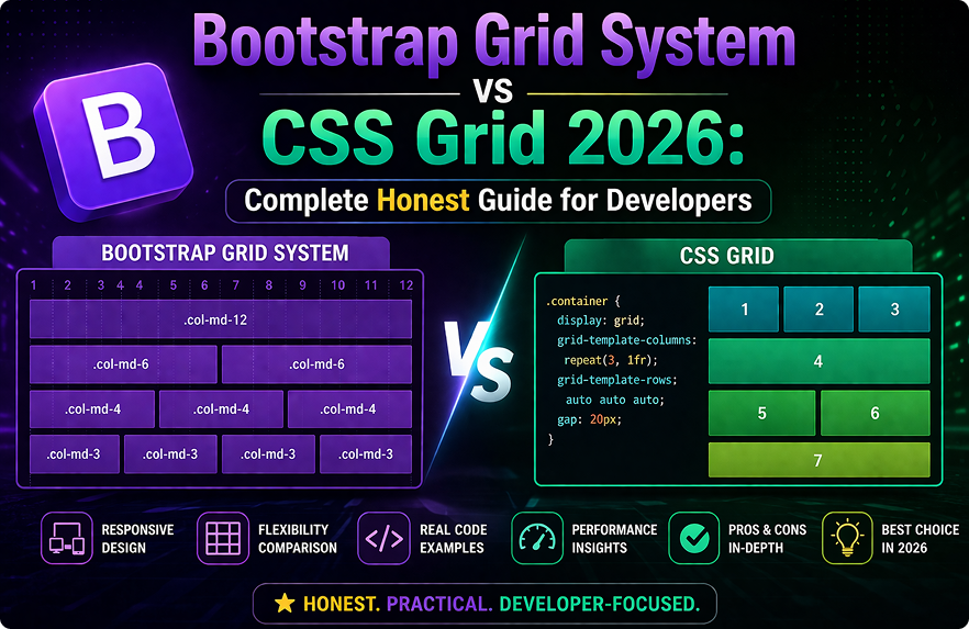
Mistake 4 — Using the Wrong Column Numbers
Bootstrap’s grid is based on 12 columns. Columns within the same row should add up to 12. This seems obvious, but it’s one of the most frequent Bootstrap mistakes beginners make — and the results range from subtle misalignment to completely broken layouts.
html
<!-- Wrong — columns add up to 14, not 12 -->
<div class="row">
  <div class="col-md-8">Main Content</div>
  <div class="col-md-6">Sidebar</div>
</div>

<!-- Correct — columns add up to exactly 12 -->
<div class="row">
  <div class="col-md-8">Main Content</div>
  <div class="col-md-4">Sidebar</div>
</div>
When columns overflow beyond 12, Bootstrap wraps the extra columns to the next line — which looks like a layout bug but is actually the grid working exactly as designed.
Also remember that different breakpoint column classes can be combined on the same element. col-12 col-md-6 col-lg-4 means full width on mobile, half width on medium screens, one-third width on large screens. This is how responsive layouts work in Bootstrap — not by writing separate CSS, but by combining breakpoint-specific column classes on each element.
Mistake 5 — Ignoring the Mobile-First Approach
Bootstrap is mobile-first by design. This means breakpoint classes apply from that breakpoint and upward — not just at that exact screen size. Misunderstanding this is one of the Bootstrap mistakes beginners make that produces the most confusing responsive behavior.
html
<!-- This means: col-6 on medium screens and larger, full width on mobile -->
<div class="col-md-6">Content</div>

<!-- This means: col-12 always, col-md-6 on medium and up -->
<div class="col-12 col-md-6">Content</div>
The first example already gives you mobile behavior — col-md-6 means full width below medium, half width on medium and up. You don’t need to add col-12 unless you want to be explicit.
Where beginners go wrong is writing desktop-targeted column sizes and then being surprised when mobile looks different than expected. Always design your column structure thinking mobile-first — start with the smallest screen behavior and add breakpoint classes to change the layout on larger screens.
Mistake 6 — Loading Bootstrap CSS and JavaScript Incorrectly
This sounds basic, but incorrect loading is responsible for a significant portion of Bootstrap mistakes beginners encounter — specifically broken JavaScript components like modals, dropdowns, and tooltips that simply don’t respond to clicks.
html
<!-- Wrong — JS loaded before the DOM elements exist -->
<head>
  <script src="bootstrap.bundle.min.js"></script>
  <link rel="stylesheet" href="bootstrap.min.css">
</head>

<!-- Correct — CSS in head, JS bundle at end of body -->
<head>
  <link rel="stylesheet" href="https://cdn.jsdelivr.net/npm/bootstrap@5.3.0/dist/css/bootstrap.min.css">
</head>
<body>
  <!-- Your content here -->
  <script src="https://cdn.jsdelivr.net/npm/bootstrap@5.3.0/dist/js/bootstrap.bundle.min.js"></script>
</body>
Always load Bootstrap CSS in the <head>. Always load Bootstrap JS — specifically bootstrap.bundle.min.js, which includes Popper.js for dropdowns and tooltips — just before the closing </body> tag.
The bundle version is important. If you accidentally load bootstrap.min.js without the bundle, dropdowns and tooltips will silently fail because Popper.js is missing. The bundle file includes everything you need in a single request.
Mistake 7 — Adding Unnecessary Custom CSS Instead of Using Bootstrap Utilities
This is one of the Bootstrap mistakes beginners make that creates the most long-term maintenance problems. Bootstrap 5 ships with an extensive utility system — spacing, typography, flexbox, display, color, border, shadow utilities — that handles the vast majority of common styling needs without writing any custom CSS.
css
/* Custom CSS beginners write unnecessarily */
.my-card {
    margin-bottom: 16px;
    padding: 24px;
    border-radius: 8px;
    display: flex;
    align-items: center;
}
html
<!-- The same result using Bootstrap utilities — no custom CSS needed -->
<div class="mb-3 p-4 rounded d-flex align-items-center">
  Content
</div>
Before writing any custom CSS, ask yourself: does Bootstrap already have a utility class for this? The spacing scale (m-1 through m-5, p-1 through p-5), the flexbox utilities (d-flex, align-items-center, justify-content-between), and the display utilities (d-none, d-md-block) cover an enormous range of common needs.
Custom CSS should be reserved for genuinely custom design requirements that Bootstrap’s utility system can’t handle. For everything else, utilities keep your project lean and consistent.
Mistake 8 — Not Initializing JavaScript Components Properly
Bootstrap 5’s JavaScript components — tooltips, popovers, and toasts specifically — are not automatically initialized. They require explicit JavaScript initialization. This catches many beginners off guard and is one of the most common Bootstrap mistakes beginners report when components “don’t work.”
html
<!-- The HTML is correct but the tooltip won't show -->
<button data-bs-toggle="tooltip" title="This is a tooltip">Hover me</button>

<!-- You must also initialize tooltips with JavaScript -->
<script>
  // Initialize all tooltips on the page
  const tooltipTriggerList = document.querySelectorAll('[data-bs-toggle="tooltip"]');
  tooltipTriggerList.forEach(function (tooltipTriggerEl) {
    new bootstrap.Tooltip(tooltipTriggerEl);
  });
</script>
Modals and dropdowns initialize automatically from their data-bs-toggle attributes. But tooltips and popovers require the JavaScript initialization shown above — by design, because initializing every tooltip automatically on page load would affect performance.
Always check the Bootstrap documentation for the specific component you’re using. Each component’s documentation clearly states whether it requires manual JavaScript initialization. Missing this step is one of the easiest Bootstrap mistakes beginners can avoid simply by reading the component’s “Usage” section before implementing it.
For a complete reference on Bootstrap 5’s component initialization, the official Bootstrap 5 JavaScript documentation covers every component’s API and initialization requirements. And for understanding Bootstrap’s utility system in depth, the Bootstrap 5 utilities documentation explains every available utility class and how to extend the system with your own.
If you’re also working through the broader Bootstrap 5 vs Tailwind CSS decision alongside fixing these Bootstrap mistakes beginners commonly make, our Bootstrap 5 vs Tailwind CSS comparison guide gives a complete framework-level comparison. And for beginners solidifying their HTML and CSS fundamentals before going deeper into Bootstrap, our HTML CSS complete beginners guide covers the core concepts Bootstrap builds on.
A Quick Reference: All 8 Bootstrap Mistakes Beginners Make
Before wrapping up, here’s a fast summary of all eight Bootstrap mistakes beginners make most frequently, so you can use it as a checklist on your next project:
Always wrap grid rows in a .container, .container-fluid, or .container-{breakpoint} class. Never mix Bootstrap 4 and Bootstrap 5 syntax in the same project. Fix specificity properly instead of using !important to override Bootstrap styles. Make sure column numbers within every row add up to exactly 12. Remember that Bootstrap is mobile-first — breakpoint classes apply upward, not at just that one screen size. Load Bootstrap CSS in the <head> and the JS bundle just before the closing </body> tag. Use Bootstrap’s utility classes for spacing, flexbox, and display before reaching for custom CSS. Manually initialize tooltips and popovers with JavaScript — they don’t auto-initialize like modals do.
Final Conclusion
The Bootstrap mistakes beginners make most often aren’t signs of poor ability — they’re signs of learning a system by building before fully understanding how it’s designed to work. Every experienced Bootstrap developer has made every one of these mistakes at some point.
The difference between a beginner who stays frustrated and one who improves quickly is developing the habit of checking the Bootstrap documentation for each component before implementing it, understanding the grid system at a conceptual level before tweaking it, and resisting the urge to override Bootstrap with custom CSS before exhausting the built-in utility system.
Fix these eight Bootstrap mistakes beginners commonly make, build a few real projects with that understanding, and Bootstrap will start feeling like a genuinely productive tool rather than a source of mysterious layout bugs.