 Mukesh1@gmail.com
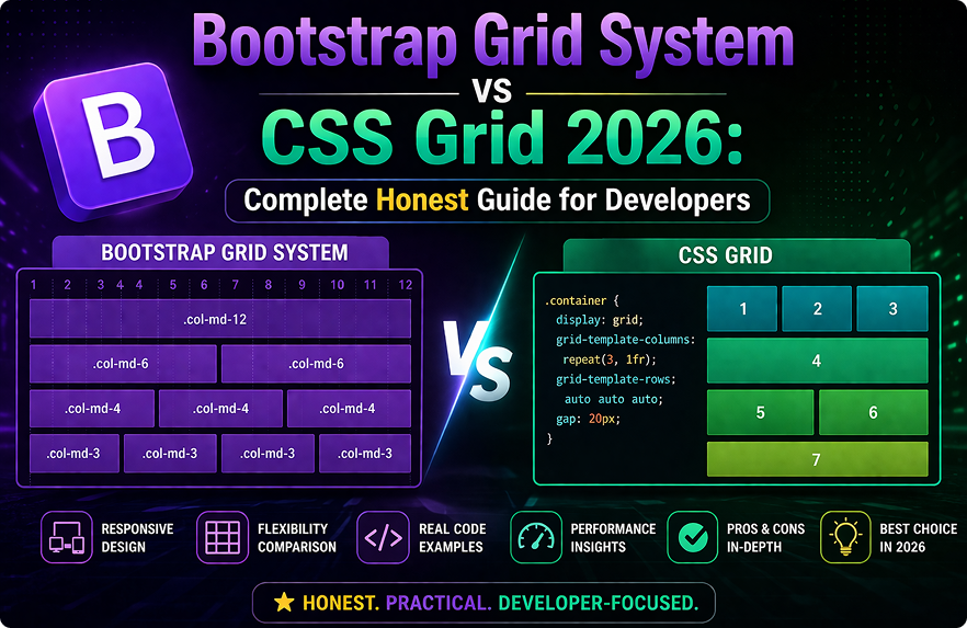
Layout decisions don’t get talked about enough before a project starts. Most developers just reach for whatever they used last time. But if you’re making a deliberate choice in 2026, the Bootstrap Grid System vs CSS Grid debate is worth understanding properly — not as a tribal argument between framework loyalists, but as a practical question with context-dependent answers.
The Bootstrap Grid System vs CSS Grid comparison isn’t about which one is technically superior in an abstract sense. It’s about which one fits your team, your project requirements, and your timeline better. Both are capable. Both have real limitations. And both are actively used in production projects in 2026.
This guide works through the actual differences — how each system thinks about layout, where each one excels, where each one creates unnecessary friction, and how to make the decision without regretting it three months into the project.
Two Different Ways of Thinking About Layout
Before comparing specifics, it helps to understand that Bootstrap Grid System vs CSS Grid isn’t just a syntax difference. These two approaches represent genuinely different mental models for how layouts are constructed.Bootstrap Grid System vs CSS Grid
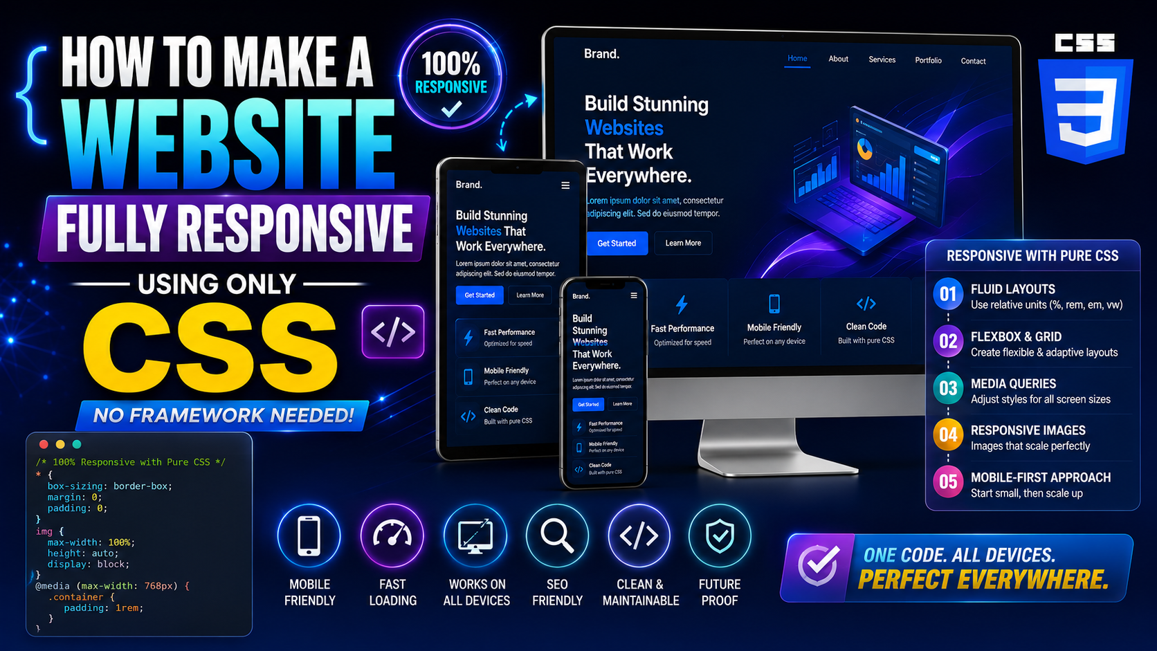
Bootstrap’s grid is class-based and column-first. You define a row, place columns inside it, and assign each column a width using numbered classes like col-md-6 or col-lg-4. The system is twelve-column by default, and responsive behavior is controlled by adding breakpoint-specific classes to your HTML elements.
CSS Grid is property-based and two-dimensional. You define a grid container in CSS, specify row and column structure using grid-template-columns and grid-template-rows, and place items using grid-column and grid-row properties. Nothing goes in the HTML markup — layout logic lives entirely in stylesheets.
Neither approach is wrong. They reflect different priorities. Bootstrap prioritizes predictability and fast implementation through class conventions. CSS Grid prioritizes layout power and separation of concerns through pure CSS.
How Bootstrap’s Grid System Actually Works
The Twelve-Column Foundation
Bootstrap’s grid divides available width into twelve equal columns. A col-6 element takes half the width. A col-4 takes one third. A col-3 takes one quarter. The math is intuitive once you internalize the twelve-column model, and most common layout patterns — two-column, three-column, sidebar-plus-content — translate cleanly into it.Bootstrap Grid System vs CSS Grid
html
<div class="container">
  <div class="row">
    <div class="col-md-8">Main Content</div>
    <div class="col-md-4">Sidebar</div>
  </div>
</div>
That’s a sidebar layout. Three lines of HTML, no CSS to write. On screens smaller than the md breakpoint, both columns stack to full width automatically. The responsive behavior is built in and requires no additional CSS.
Responsive Breakpoints Built Into Classes
Bootstrap’s five breakpoints — xs, sm, md, lg, xl, and xxl — are baked into the class naming convention. You control layout at each breakpoint by combining classes on the same element.
html
<div class="col-12 col-sm-6 col-lg-4">Card</div>Full width on mobile, half width on small screens, one-third on large screens. All of that responsive behavior is expressed in the HTML class attribute with no CSS file open.
This is the core appeal of Bootstrap’s grid for teams with mixed frontend experience. Responsive layout decisions are visible directly in the markup without needing to trace through stylesheet media queries.
How CSS Grid Actually Works
Two-Dimensional Layout Control
CSS Grid’s fundamental advantage over Bootstrap’s approach — and over flexbox — is genuine two-dimensional control. You can place items precisely in both rows and columns simultaneously, which Bootstrap’s grid simply cannot do.
css
.dashboard {
  display: grid;
  grid-template-columns: 240px 1fr 1fr;
  grid-template-rows: 60px 1fr auto;
  grid-template-areas:
    "sidebar header header"
    "sidebar main aside"
    "sidebar footer footer";
}
css
.header { grid-area: header; }
.sidebar { grid-area: sidebar; }
.main { grid-area: main; }
That CSS defines a complete dashboard layout — fixed sidebar, header spanning the top, main content area, and an aside — without any layout-specific classes in the HTML. The HTML elements just need their semantic class names. Layout logic lives entirely in the stylesheet.
This separation is meaningful on complex projects. Changing the layout means editing CSS, not hunting through HTML for the right combination of column classes to update.
Modern Responsive Without Media Queries
CSS Grid introduced auto-fill and auto-fit with minmax() — a responsive pattern that doesn’t require breakpoint media queries at all.
css
.card-grid {
  display: grid;
  grid-template-columns: repeat(auto-fill, minmax(280px, 1fr));
  gap: 1.5rem;
}
This creates a card grid that automatically adjusts the number of columns based on available space. Cards are at minimum 280px wide. The browser figures out how many fit. No breakpoints defined, no media queries written. It just works responsively across any screen size.
Bootstrap’s grid can’t do this. You’re always defining explicit column counts at specific breakpoints.
Bootstrap Grid System vs CSS Grid: Direct Comparison
Implementation Speed
For standard layouts — sidebar plus content, card grids at common breakpoints, multi-column forms — Bootstrap is faster to implement. The class conventions handle responsive behavior without writing CSS. A developer who knows Bootstrap’s breakpoint classes can build a responsive layout in minutes without opening a stylesheet.
CSS Grid takes longer to get right initially, especially for developers who haven’t internalized grid-template-areas or the minmax() function. The payoff comes on complex layouts where CSS Grid’s expressiveness saves time compared to Bootstrap’s more constrained approach.
Advantage: Bootstrap for standard layouts on tight timelines.
Layout Complexity Ceiling
Bootstrap’s twelve-column system handles a wide range of layouts, but it has a ceiling. Overlapping elements, items that span rows and columns simultaneously, asymmetric grids that don’t divide evenly into twelve — these require CSS workarounds on top of Bootstrap that partially defeat the purpose of using it.
CSS Grid has no practical layout ceiling for two-dimensional arrangements. Complex dashboard layouts, magazine-style editorial layouts, application interfaces with multiple independently sized regions — CSS Grid handles these natively.
Advantage: CSS Grid for complex, non-standard layouts.
HTML Cleanliness
Bootstrap’s grid requires structural HTML — containers, rows, and column divs that exist purely for layout purposes and carry no semantic meaning. A five-column card grid in Bootstrap means five col divs inside a row div inside a container div. That’s layout logic embedded in markup.
CSS Grid keeps layout in CSS. Your HTML can be semantically clean — a ul of cards, a section with child article elements — with grid behavior applied entirely in the stylesheet.
Advantage: CSS Grid for semantic HTML and clean separation of concerns.
Team Learning Curve
On teams where not everyone is a frontend specialist — backend developers contributing to UI, junior developers, full-stack developers whose primary skill is server-side — Bootstrap’s explicit class system is easier to use correctly without deep CSS knowledge.
CSS Grid requires understanding a genuinely new layout model. grid-template-areas, implicit versus explicit grid tracks, alignment properties — these take real time to learn and use confidently. On a mixed-skill team, incorrect CSS Grid usage produces confusing layout bugs that are harder to debug than Bootstrap column math issues.
Advantage: Bootstrap for mixed-skill teams.
Performance and Bundle Size
Using Bootstrap’s grid means including Bootstrap’s CSS. The grid module alone is relatively lightweight compared to Bootstrap’s full bundle, but if you’re only using Bootstrap for the grid and nothing else, you’re carrying overhead that a pure CSS Grid approach eliminates entirely.
CSS Grid is native browser functionality — zero additional CSS to ship. On performance-sensitive projects with tight CSS budgets, this matters.
Advantage: CSS Grid for performance-sensitive projects.
When Bootstrap Grid Still Makes Clear Sense in 2026
Despite CSS Grid’s technical advantages in several areas, there are specific situations where Bootstrap’s grid is still the practical right choice for Bootstrap Grid System vs CSS Grid decisions.
You’re already using Bootstrap for components. If your project uses Bootstrap’s navbar, modals, forms, and buttons, using Bootstrap’s grid is consistent and adds no additional payload. There’s no reason to introduce a hybrid approach.
Your team includes non-frontend specialists. Backend developers, junior developers, and full-stack developers who aren’t CSS-fluent will make fewer mistakes with Bootstrap’s explicit column classes than with CSS Grid properties. The predictability of Bootstrap’s approach has real value in this context.
Standard responsive layouts with common breakpoints. Card grids, sidebar layouts, multi-column forms, dashboard panels — these are Bootstrap’s grid’s strongest use cases. If your layouts fit these patterns, Bootstrap’s grid is faster and requires less custom CSS than implementing the same thing in CSS Grid.
Prototype speed matters more than production optimization. For early-stage products, internal tools, and admin interfaces where getting to a working UI quickly matters more than optimal performance, Bootstrap’s grid delivers faster results.
When CSS Grid Is Clearly the Better Choice
You’re building without Bootstrap or a CSS framework. If your project isn’t using Bootstrap for components, using Bootstrap’s grid just for layout adds unnecessary dependency overhead. CSS Grid is native and costs nothing.
Your layouts are genuinely complex. Two-dimensional placement, overlapping elements, items spanning multiple rows and columns, layouts that change structure dramatically between breakpoints — CSS Grid handles these cases cleanly where Bootstrap requires workarounds.
You want responsive behavior without defined breakpoints. The auto-fill / auto-fit / minmax() pattern creates intrinsically responsive layouts that adapt to any container size. This is something Bootstrap’s grid simply cannot replicate.
HTML semantics and separation of concerns matter. For public-facing content sites, accessibility-focused projects, or codebases where clean HTML is a priority, keeping layout out of markup is a meaningful architectural benefit.
Using Both Together (It’s Not Wrong)
One thing that doesn’t get said enough in the Bootstrap Grid System vs CSS Grid debate is that these approaches aren’t mutually exclusive. Plenty of production projects use Bootstrap’s grid for page-level layout and CSS Grid for specific component-level arrangements.
Bootstrap’s column system handles the overall page structure — the sidebar, the main content area, the header and footer regions. CSS Grid handles specific UI components where two-dimensional layout or intrinsic responsiveness is needed — a photo gallery, a complex card layout, a feature grid with varying item sizes.
This hybrid approach takes the best of both without forcing an all-or-nothing decision.
The CSS Grid complete guide on MDN is the most thorough reference for understanding CSS Grid’s full capabilities. For Bootstrap’s grid documentation, the official Bootstrap grid docs cover every breakpoint and column option in detail.
Final Conclusion
The Bootstrap Grid System vs CSS Grid question doesn’t have a universal answer in 2026 — and that’s actually useful to know rather than frustrating. Bootstrap’s grid wins on team accessibility, implementation speed for standard layouts, and consistency within Bootstrap-based projects. CSS Grid wins on layout power, HTML cleanliness, intrinsic responsiveness, and zero additional overhead.
The practical decision process is straightforward. If you’re already using Bootstrap, use its grid. If you’re building without Bootstrap or need layouts that Bootstrap’s twelve-column system can’t express cleanly, use CSS Grid. If you need both, use both — there’s no rule against it and plenty of production projects do exactly that.
Understanding both systems makes you a more capable developer regardless of which one you reach for on any given project.