 Mukesh1@gmail.com
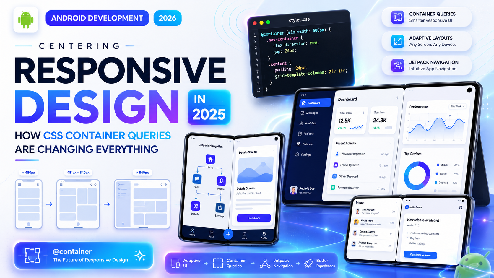
For a long time, responsive design meant one thing: media queries. You’d check the viewport width, apply some styles, and call it done. It worked — mostly. But anyone who’s built a complex component-based UI knows the limitations that come with it.
The problem was never really about screen size. It was about component size. And that’s exactly what CSS Container Queries fix.
This is one of those features that sounds like a minor addition on paper, but once you start using it, you realize how much of your old CSS was a workaround for something that should’ve existed years ago.
What Was Wrong With Media Queries for Component Design?
Media queries were designed to respond to the viewport — the full browser window. That made sense when pages were mostly static documents. But modern web interfaces aren’t documents. They’re collections of reusable components — cards, sidebars, widgets, panels — that get placed in different contexts across the same page.
Here’s the real-world problem: imagine you’ve built a product card component. On a wide screen, you want the card to show the image on the left and the text on the right. On a narrow screen, you want them stacked vertically. Simple enough.
But what if that same card appears inside a full-width section and inside a narrow sidebar — on the same page, at the same viewport width?
With media queries, you’re stuck. You can’t tell the card “lay out based on how much space your parent gives you.” You can only say “lay out based on how wide the browser window is.” That’s a fundamental mismatch.
Container Queries solve this directly. Instead of watching the viewport, a container query watches the element’s own container.
How Container Queries Actually Work
The syntax is cleaner than most people expect. There are two steps: define a containment context on the parent, then write queries against it on the child.
css
/* Step 1: Define the container */
.card-wrapper {
  container-type: inline-size;
  container-name: card;
}

/* Step 2: Query the container */
@container card (min-width: 500px) {
  .card {
    display: flex;
    flex-direction: row;
  }
}
That’s it. The .card component now responds to the width of .card-wrapper, not the viewport. If that wrapper is inside a sidebar that’s 300px wide, the card stacks. If it’s inside a full-width section, it goes horizontal. Same component, same CSS, different behavior based on actual available space.
This is genuinely different from anything media queries could do.
The container-type Property: What Your Options Are
When you declare container-type, you’re telling the browser what dimensions this element should be trackable for.
inline-size — the most commonly used value. It enables querying the container’s width (or the inline dimension in writing modes other than horizontal). This covers the majority of layout use cases.
size — enables querying both width and height. Use this carefully — height containment has implications for how the element participates in layout flow and can cause unexpected behavior if you’re not deliberate about it.
normal — the default. It makes the element a container for style queries (more on those later) but not for dimensional queries.
For most responsive component work, container-type: inline-size is what you’ll reach for.
Container Queries vs Media Queries: Not a Replacement
This is worth being clear about, because some articles have framed this the wrong way.
Container Queries don’t replace media queries. They handle a different job. Media queries are still the right tool when you’re responding to viewport-level changes — adjusting font sizes, switching a multi-column page to a single column, hiding or showing navigation. These are decisions that depend on the overall screen context.
Container Queries are the right tool when you’re building components that need to adapt based on where they’re placed. A card, a widget, a table, a media block — anything that gets reused in multiple layout contexts.
In practice, the two work together. You might use a media query to switch your page from a two-column layout to one column on mobile, and then container queries let your components adapt sensibly within whichever column they end up in.
A Real Example: The Card Component Problem, Solved
Let’s walk through a proper implementation. Say you have a blog post preview card. It contains a thumbnail image, a title, a short description, and a read-more link.
In a wide container (sidebar expanded, full-width grid), you want the image left, text right — like a horizontal media object. In a narrow container (sidebar collapsed, mobile-width grid cell), you want the image on top, text below.
css
.post-card-wrapper {
  container-type: inline-size;
}

.post-card {
  display: flex;
  flex-direction: column;
}

.post-card img {
  width: 100%;
  height: 200px;
  object-fit: cover;
}

@container (min-width: 480px) {
  .post-card {
    flex-direction: row;
    align-items: flex-start;
  }

  .post-card img {
    width: 160px;
    height: 120px;
    flex-shrink: 0;
    margin-right: 16px;
  }
}
Now this component will work correctly whether it’s dropped into a sidebar, a wide content area, or a narrow grid column. You write the logic once, and the browser figures out the rest based on available space.
That’s the practical power here — less duplication, more reusable components.
Container Style Queries: The Lesser-Known Half
Most of the attention has gone to size-based container queries, but there’s another side to this feature worth knowing about: style queries.
Style queries let you query the computed style of a container element — not its dimensions, but things like custom property values.
css
@container style(--card-variant: compact) {
  .card-body {
    padding: 8px;
    font-size: 0.875rem;
  }
}
This opens up a pattern where parent components can set a CSS custom property to signal what “mode” or “variant” they want, and child components respond automatically. It’s a kind of design token communication through CSS — no JavaScript needed.
Style queries are newer and browser support is still catching up compared to size queries, but they’re worth understanding because they open up component theming patterns that were previously only possible with class-based logic.
Browser Support in 2025
This is where things have improved considerably. As of 2025, container queries with inline-size are supported in all major evergreen browsers — Chrome, Edge, Firefox, and Safari. This covers the vast majority of real-world users.
Can I Use tracks exact support percentages, but global support is well above 90% for the core feature set.
Style queries have slightly spottier support depending on the browser version, so check before using them in production without a fallback.
The short version: for most projects in 2025, you can use container queries without hesitation on the size side. Style queries warrant a bit more caution.
How Container Queries Fit Into Modern CSS Frameworks
If you use Tailwind CSS, support for container queries arrived through the @tailwindcss/container-queries plugin a while back, and the core library has been moving to integrate it more natively. You can now write things like @lg:flex-row on elements inside a designated container — similar to how responsive variants work, but scoped to the container rather than the viewport.
For other frameworks and component libraries, container query support has been growing steadily. If you’re building a design system or a component library in 2025, it’s worth reviewing how your tooling handles containment.
MDN’s CSS Container Queries reference remains the most thorough technical documentation available and is kept up to date as browser implementations evolve.
Common Mistakes to Avoid
A few patterns trip people up when they first start using container queries.
Forgetting to set containment on the right element. The container has to be an ancestor of the element you’re targeting — not the element itself. You can’t query a container on the same element that’s being styled.
Using size when you only need inline-size. The size value applies both-axis containment, which removes the element from normal block sizing behavior. Unless you’re querying height, stick with inline-size.
Nesting containers without naming them. When you have nested containment contexts, queries will resolve against the nearest ancestor container by default. If you have complex nesting, using container-name gives you precise control over which container a query targets.
Expecting style queries everywhere. Style queries are powerful, but they’re not as widely supported yet. Test thoroughly before shipping.
What This Means for How You Write Components Going Forward
Container queries are changing the way experienced front-end developers think about component architecture. The old model was: build a component, then write media-query overrides for every context you need it to work in. That created a lot of context-specific CSS that wasn’t reusable.
The new model is: build a component that responds to its container, drop it anywhere, and let it figure out its own layout. This aligns much better with how component-based frameworks like React and Vue encourage you to think — isolated, reusable pieces of UI that manage their own appearance.
It also makes design systems more coherent. A component documented in isolation behaves the same way in production because it’s responding to its immediate context, not making assumptions about where it’ll be placed.
Final Conclusion
CSS Container Queries aren’t just a new syntax to learn — they represent a genuine shift in how responsive design works at the component level. Media queries answered the question “how big is the screen?” Container queries answer a more useful question: “how much space does this component actually have?”
For years, front-end developers worked around this gap with JavaScript, complex class logic, and duplicated CSS. That gap is now closed. In 2025, with broad browser support and growing framework integration, there’s no practical reason to avoid container queries for new projects.
If you haven’t used them yet, start small — pick one component that already has responsive complexity and refactor it. The clarity you’ll gain from writing layout logic that actually reflects how components work will be immediately obvious.