 Mukesh1@gmail.com
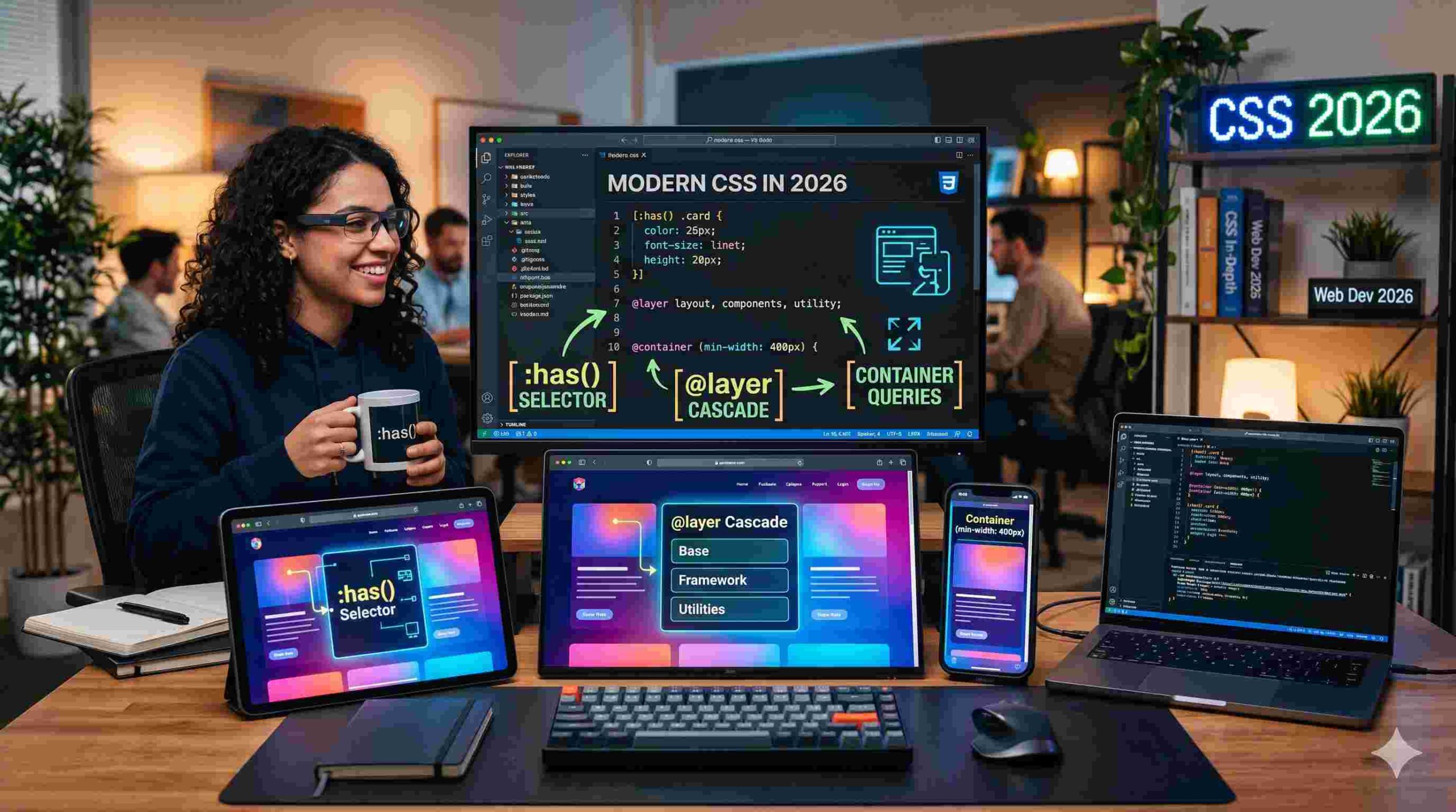
Introduction
If you’ve ever tried building a simple website and felt like you were fighting the code instead of creating with it — you’re not alone. CSS has always had this reputation of being tricky. You could change colors, adjust padding, move boxes around. But making those elements react to each other? That usually meant dragging in extra JavaScript.
Things have changed. The modern CSS features landing in browsers over the last couple of years — specifically :has(), @layer, and Container Queries — have quietly shifted how frontend development actually feels. Not just for senior developers, but especially for beginners trying to build clean, responsive layouts without losing their mind.
It’s a bit like switching from an old budget Android phone to a current flagship. Everything just responds faster, thinks smarter, and gets out of your way.
This article walks through each of these modern CSS features in plain English — what they do, why they matter, and how they come together in real projects.
Why CSS Needed to Evolve
Before jumping into the features themselves, it helps to understand the frustration they’re solving.
Traditional CSS worked on a pretty rigid mental model. Elements could only “know” about things above them in the document — their parents, their containers. They couldn’t look inside themselves to make decisions. You’d end up writing JavaScript just to detect what was inside a div and then apply a class. That felt backwards.
On top of that, the “cascade” — the thing CSS is literally named after — became a source of stress. Styles would conflict. One rule would overwrite another in unexpected ways. Developers started throwing !important everywhere, which is basically giving up and hoping for the best.
The modern CSS features introduced in recent browser versions fix these exact pain points. Let’s go through them one by one.
The :has() Selector — Finally, a Parent Selector
What It Actually Does
The :has() selector is probably the most talked-about addition to CSS in years. For context: CSS has always let you style children based on their parent. But going the other direction — styling a parent based on what’s inside it — was simply not possible.
:has() changes that completely.
With :has(), you can write logic like: “If this card contains an image, give it a different background.” Or: “If this form has an error message inside it, highlight the whole form in red.” Without any JavaScript. Without any extra class toggling.
A Real-World Example
Imagine you’re building a blog post list. Some posts have a video thumbnail, others just have text. With :has(), you can say: if this article container has a .video-icon inside, add a subtle glow effect to the whole card. The browser handles this on its own — no event listeners, no DOM manipulation.
On a mobile Android browser, this is especially nice because it means the browser’s engine handles the logic natively. Your phone’s processor isn’t running a separate JavaScript function to “detect” and “respond.” It just happens, cleanly and efficiently.
Why Developers Are Excited
The :has() selector is one of those modern CSS features that once you start using, you can’t imagine going back. It makes CSS feel genuinely intelligent — like it understands the context of your content, not just the structure of your code.
@layer — Bringing Order to the Cascade
The Specificity Headache
Here’s a situation every web developer has been in: you write a style rule, it looks right, you save the file — and nothing changes. You refresh, you inspect, you discover that some other rule buried in a different stylesheet is winning the specificity battle. So you add !important. Then something else breaks.
This is the specificity war. And it’s exhausting.
@layer — or Cascade Layers — is one of the modern CSS features that directly solves this architectural problem.
How @layer Works
The idea is simple: you divide your CSS into named layers, and you decide which layers have priority. Think of it like organizing apps into folders on your Android home screen. One folder for basics, one for components, one for overrides.
A typical setup looks like this:
- Base layer — resets, typography defaults, color variables
- Components layer — buttons, cards, form elements
- Utilities layer — small helper classes, spacing tweaks
You declare the order once at the top, and that order determines which layer “wins” when rules conflict. A rule in the Utilities layer will override the same rule in the Base layer — regardless of how specific the selectors are.
Why This Matters for Teams
On a solo project, this might feel like overkill. But on any project with multiple developers, or any codebase that grows over time, @layer is genuinely useful. It removes the guesswork. Everyone knows where styles live and why certain rules override others.
No more !important. No more specificity detective work. Just clear, intentional hierarchy.
Container Queries — Elements That Understand Their Environment
The Problem With Media Queries
Media Queries have been around for over a decade, and they’re still useful. The basic idea: check the screen width, apply styles accordingly. Phone screen? Stack the columns. Wide monitor? Put them side by side.
But here’s the flaw. Media Queries only look at the viewport — the full screen size. They have no idea how much space an individual element actually has.
Say you build a “Contact Form” component. On one page, it sits in a narrow sidebar. On another, it’s in a wide full-width section. With Media Queries, you can’t make the form itself respond to its own container size. You’d need completely separate style rules for each context.
Container Queries solve this.
How Container Queries Work
With Container Queries — one of the most practical modern CSS features — an element can look at its immediate parent container and adjust based on that width, not the screen width.
The best way to picture this is Android widgets. If you put a weather widget on your home screen and make it small, it shows just the temperature. Make it wider, and it shows the full 5-day forecast. The widget responds to the space it’s been given — not to the whole screen.
Container Queries bring this exact behavior to web elements.
A Practical Use Case
Back to the travel app example. You have a “Destination Card” that appears in two places — a wide featured section at the top and a smaller grid further down.
With Container Queries, the card checks its container width. In the wide featured section, it automatically arranges the photo on the left with text on the right. In the narrow grid, it stacks vertically with the photo on top. Same component. Same CSS. Totally different layouts depending on context.
This is what truly modular design looks like — and it’s one of the modern CSS features making design systems much easier to build and maintain.
How These Three Features Work Together
Let’s put all three modern CSS features together in one scenario to see the real power.
You’re building a travel booking interface. There’s a card for each destination — photo, title, price, and a favourite button.
Container Queries handle the layout. The card knows whether it’s in a wide or narrow space and changes its arrangement automatically.
:has() handles the state. When a user marks a destination as a favourite, a small heart icon appears. The card “sees” that heart icon and automatically applies a gold border to itself — no JavaScript needed.
@layer keeps the styling organized. The favourite styles live in a specific layer, so they never accidentally get overridden by base card styles, even as the codebase grows.
The result? Code that’s cleaner, more logical, and — honestly — more satisfying to write. It feels less like solving a puzzle and more like describing what you actually want.
Performance and Mobile Impact
One thing worth mentioning: these modern CSS features are all handled by the browser’s native rendering engine. That’s different from JavaScript-based solutions, which have to be interpreted and executed separately.
On an Android phone — where battery and memory are always a consideration — this matters. Native CSS processing is significantly lighter than running JavaScript to achieve the same visual effect. Faster load times, smoother scrolling, less drain.
This is why the evolution of CSS isn’t just a developer concern. It directly improves the experience for the person holding the phone.
For a deeper understanding of how browser rendering works and why it affects performance, the MDN Web Docs on CSS performance are genuinely worth reading.
Browser Support in 2026
A reasonable question: do all browsers actually support these things?
In 2026, yes — across the board. Chrome on Android, Firefox, Safari on iOS, and Edge all have solid support for :has(), @layer, and Container Queries. The rollout happened gradually over the past two to three years, and by now, they’re considered stable, production-ready features.
For older devices that haven’t received browser updates in a while, developers still use fallback styles. But the gap is closing quickly. Can I Use is the go-to reference for checking current browser support on any CSS feature.
If you want to see these features in action on your own device, making sure your Android browser is updated is the first step — it’s worth it.
What This Means for Beginners
If you’re just starting out with CSS, this might all feel like a lot. But here’s the encouraging part: these modern CSS features actually make CSS easier to learn than it was before.
Before @layer, beginners had to deeply understand specificity just to avoid accidental style conflicts. Before Container Queries, building responsive components required messy workarounds. Before :has(), dynamic styling meant learning JavaScript before you felt comfortable with CSS.
Now, the tools are more logical. They match how you think about design — if this, then that. The patterns make sense.
Start by understanding the basics of the box model, flexbox, and grid. Then explore these newer tools as natural extensions of that foundation. You can also check out this guide to learning CSS architecture to understand how to structure stylesheets as your projects grow.
Final Conclusion
The modern CSS features that have matured by 2026 — :has(), @layer, and Container Queries — represent more than just new syntax to memorize. They represent a smarter, more intuitive way of describing how interfaces should behave.
:has() gives elements the ability to react to their own contents. @layer brings genuine architectural clarity to stylesheets that used to become tangled fast. Container Queries finally let components be truly self-aware about their surrounding space.
Together, they make web development more approachable, more efficient, and — at least in practical experience — a lot more enjoyable. For anyone learning frontend development in 2026, these aren’t advanced topics to save for later. They’re core tools worth getting comfortable with early.
The web is catching up to the fluid, responsive feel of native Android apps. And honestly, it’s about time.