 Mukesh1@gmail.com
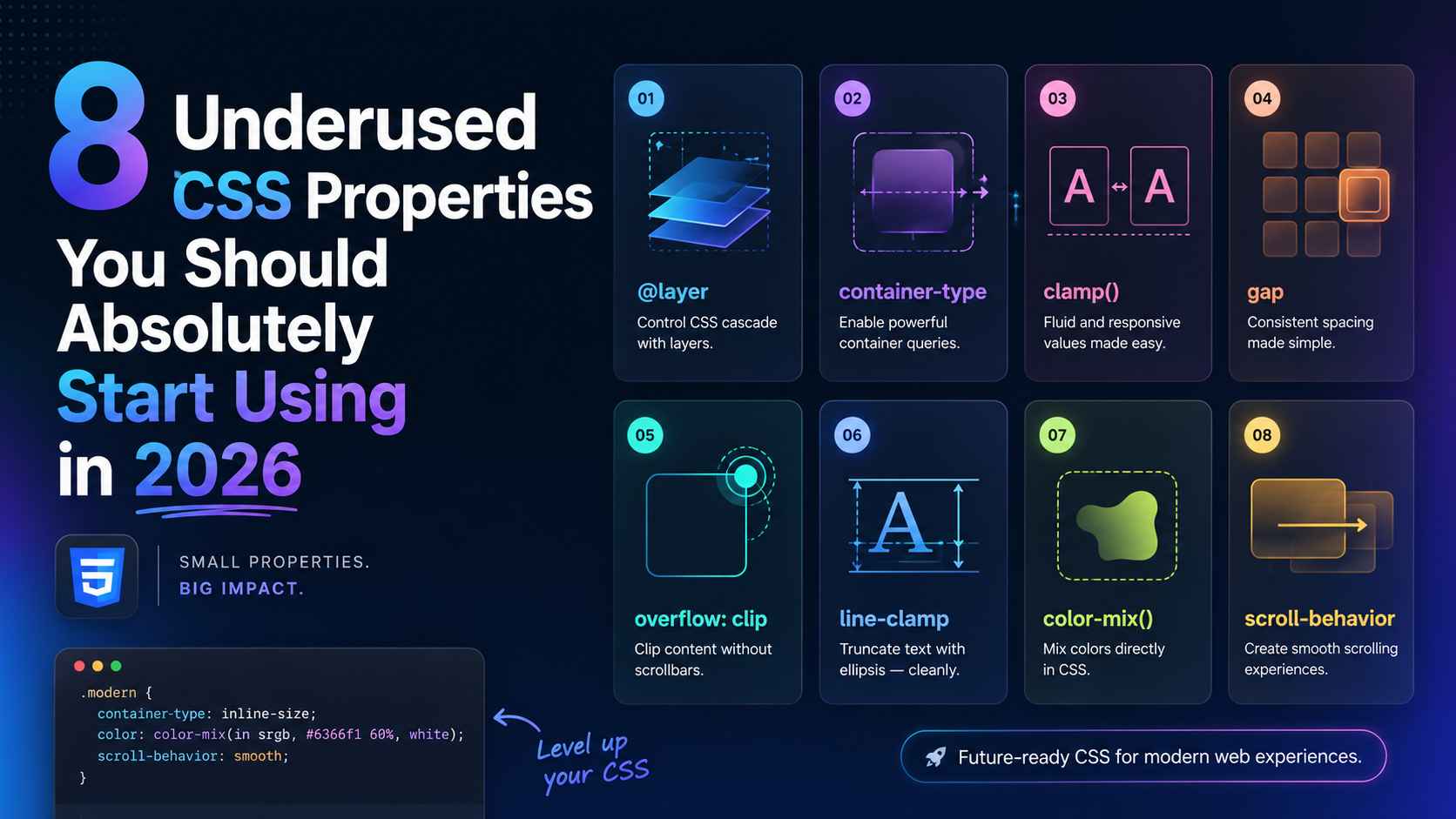
Most developers learn the same CSS properties and stick with them. margin, padding, display, position — the usual set. And those work fine for a lot of things. But CSS has grown a lot over the past few years, and there’s a solid collection of underused CSS properties sitting right there in the spec that could save you time, reduce your code, and make your UIs genuinely better.
This article isn’t about obscure tricks for the sake of it. Every property in this list is practical, browser-supported, and something you can actually start using in a real project today — whether that’s a web app, an Android WebView interface, or a simple landing page.
Let’s get into it.
Why Developers Keep Missing These Properties
It’s worth asking — why do these underused CSS properties stay underused in the first place?
Part of it is habit. If you learned CSS a few years ago, you built up a mental toolkit and kept using it. Part of it is that browser support used to be patchy for some of these, so developers avoided them. And part of it is that they just don’t come up in most beginner tutorials.
In 2026, most of these have full support across Chrome, Firefox, Safari, and Android WebView. The excuses have run out.
1. aspect-ratio – Stop Calculating Padding Hacks Forever
If you’ve ever tried to make a responsive video embed or a square image card, you’ve probably used the old padding-top percentage trick. Something like padding-top: 56.25% for a 16:9 ratio. It works, but it’s unintuitive and fragile.
aspect-ratio replaces all of that cleanly.
css
.video-wrapper {
  width: 100%;
  aspect-ratio: 16 / 9;
}

.avatar {
  width: 60px;
  aspect-ratio: 1 / 1;
}
Set the width — or let it be flexible — and aspect-ratio maintains the proportions automatically. No more math. No more padding-based workarounds.
This is one of those underused CSS properties that genuinely makes you wonder why it took so long to land in the spec. For Android web developers especially, keeping image and media containers proportional across different screen sizes is a constant task. This simplifies it considerably.
2. gap (Outside of Grid) – Consistent Spacing Without Margin Hacks
Most developers know gap from CSS Grid. Fewer know it works in Flexbox too — and has for a while now.
css
.button-row {
  display: flex;
  gap: 12px;
}

.card-stack {
  display: flex;
  flex-direction: column;
  gap: 20px;
}
Before gap worked in Flexbox, you’d use margin-right on items and then undo it on the last child with :last-child { margin-right: 0 }. Or you’d use negative margins on the parent. Both approaches were messy.
gap applies spacing between items only — not on the outside edges. It’s clean, readable, and exactly what you actually want 90% of the time. Definitely one of the more quietly powerful underused CSS properties in everyday layout work.
3. clamp() – Fluid Typography Without Media Queries
Responsive font sizes used to mean a media query at every breakpoint. clamp() replaces that with a single line.
css
h1 {
  font-size: clamp(1.5rem, 4vw, 3rem);
}
The three values are: minimum size, preferred size (viewport-relative), maximum size. The browser picks a value within that range based on the current viewport width.
On a narrow Android phone, the heading might render at 1.5rem. On a wide desktop, it caps at 3rem. In between, it scales fluidly. No breakpoints. No duplicated font-size declarations.
clamp() works for more than just font sizes too. Padding, margin, width — anywhere you want a value that scales smoothly between a minimum and maximum. It’s genuinely one of the most practical underused CSS properties for responsive design in 2026.
4. scroll-behavior – Smooth Scrolling in One Line
For years, smooth scrolling required JavaScript. An event listener, a scroll calculation, sometimes a whole library. Then CSS got scroll-behavior.
css
html {
  scroll-behavior: smooth;
}
That’s the entire implementation. Now every anchor link — <a href="#section"> — scrolls smoothly instead of jumping. For in-page navigation, table of contents links, or “back to top” buttons, this just works.
Pair it with scroll-margin-top on your target sections to account for fixed headers:
css
#about {
  scroll-margin-top: 80px;
}
Without scroll-margin-top, smooth scrolling to a section with a fixed nav bar puts your heading partially behind the bar. This fixes that. Both of these sit firmly in the category of underused CSS properties that eliminate JavaScript code you probably didn’t want to write anyway.
5. object-fit and object-position – Images That Actually Behave
If you’ve ever had an image squish, stretch, or overflow its container because the dimensions didn’t match, object-fit is the fix.
css
.card-image {
  width: 100%;
  height: 200px;
  object-fit: cover;
  object-position: center top;
}
object-fit: cover makes the image fill its container while maintaining aspect ratio — cropping the overflow rather than distorting the image. object-position controls which part of the image stays visible when it’s cropped.
This is especially useful on Android, where user-generated content — profile photos, product images, blog thumbnails — comes in wildly different dimensions. Instead of engineering around every possible image size, object-fit handles it gracefully.
object-fit: contain is useful too — it fits the whole image inside the container without cropping, with letterboxing if the ratios don’t match. Among the underused CSS properties in this list, this one arguably has the most immediate visual impact.
6. text-overflow With overflow and white-space – Cleaner Text Truncation
Long text strings breaking your UI layout is a problem almost every developer has run into. A username, a product title, an email address — sometimes it’s just too long for the space you have.
css
.label {
  white-space: nowrap;
  overflow: hidden;
  text-overflow: ellipsis;
  max-width: 200px;
}
This trio — white-space: nowrap, overflow: hidden, and text-overflow: ellipsis — truncates overflowing text with a ... at the end. It’s clean, readable, and works well in card components, table cells, and sidebar items.
For multi-line truncation (showing two lines and then cutting off), the WebKit line-clamp approach is now broadly supported:
css
.description {
  display: -webkit-box;
  -webkit-line-clamp: 2;
  -webkit-box-orient: vertical;
  overflow: hidden;
}
Yes, the -webkit- prefix still looks a bit old-fashioned in 2026, but it works reliably across Android WebViews and modern browsers. Worth keeping in your toolkit as one of the more practically useful underused CSS properties for real-world text handling.
7. pointer-events – Controlling Click Behavior Without JavaScript
This one surprises a lot of developers when they first encounter it. pointer-events: none makes an element completely unclickable — mouse events, touch events, everything passes through it as if it doesn’t exist in the interaction layer.
css
.overlay-label {
  pointer-events: none;
}
Where does this actually matter? Think about overlays, tooltips, decorative elements, or loading spinners that sit on top of clickable content. Without pointer-events: none, those overlay elements steal clicks away from what’s underneath.
You can also flip this behavior — an element that’s hidden or visually transparent can still be interactive if you keep pointer-events: auto. Or you can disable a button visually and interactively at once without touching the HTML:
css
.btn:disabled {
  opacity: 0.5;
  pointer-events: none;
}
For Android touch interfaces in particular, unintended touch-target interference is a real UX problem. pointer-events gives you precise control without adding event listeners or toggling classes in JavaScript. Easily one of the most underestimated among underused CSS properties in this list.
8. accent-color – Style Form Controls Without Wrestling the DOM
Native form controls — checkboxes, radio buttons, range sliders, progress bars — have always been notoriously hard to style. Most developers either gave up and used JavaScript-driven custom components, or accepted the browser’s default look.
accent-color changes that. It applies your brand color to native form elements in a single line.
css
:root {
  accent-color: #4f46e5;
}
Now your checkboxes check in indigo. Your range slider thumb matches your UI. Your radio buttons feel intentional rather than default.
It won’t give you full custom control like a hand-built component would. But for many projects — especially internal tools, dashboards, or simple Android WebView forms — it’s enough, and it keeps your HTML clean and semantically correct.
css
input[type="checkbox"] {
  accent-color: #16a34a;
  width: 18px;
  height: 18px;
}
Browser support is solid across all modern environments. This is genuinely one of those underused CSS properties that makes you wonder why you ever reached for a custom checkbox library on a simple project.
Putting It All Together: A Real Component Example
Here’s what a practical card component looks like when you apply several of these properties together:
css
.article-card {
  aspect-ratio: 4 / 3;          /* maintains proportions */
  gap: 12px;                     /* clean internal spacing */
  scroll-margin-top: 80px;       /* works with smooth scroll nav */
}

.article-card img {
  width: 100%;
  height: 180px;
  object-fit: cover;             /* no squishing */
  object-position: center;
}

.article-card h3 {
  font-size: clamp(1rem, 2.5vw, 1.25rem);  /* fluid sizing */
  white-space: nowrap;
  overflow: hidden;
  text-overflow: ellipsis;       /* clean truncation */
}

.article-card .overlay {
  pointer-events: none;          /* decorative, non-blocking */
}

input[type="checkbox"] {
  accent-color: #2563eb;         /* branded form control */
}
That’s a clean, responsive, well-behaved card component — and barely any JavaScript involved. Each underused CSS property here is doing specific, practical work that used to require either a workaround or a script.
Browser Support: What to Check Before You Ship
All eight properties covered here have strong support in Chrome, Firefox, Safari, and modern Android WebView as of 2026. If you’re building for legacy WebViews or older Android versions, clamp() and aspect-ratio have the broadest support. accent-color is slightly newer but still well-covered.
For up-to-date compatibility data, MDN Web Docs and Can I Use are the most accurate references — worth bookmarking if you’re doing any serious CSS work.
Also, if you’re building Android WebView interfaces and want to understand how layout decisions interact with performance, our earlier guide on CSS Flexbox vs Grid covers the layout fundamentals that pair naturally with these properties.
Final Conclusion
CSS keeps getting better — and a lot of that progress goes unnoticed because developers stick to the properties they already know. These eight underused CSS properties aren’t experimental edge cases. They’re practical, well-supported tools that reduce JavaScript dependency, clean up your code, and handle real UI problems more elegantly than the workarounds they replace.
aspect-ratio kills the padding hack. clamp() kills breakpoint-heavy typography. pointer-events kills unnecessary event listeners. accent-color kills the custom checkbox library for simple projects.
None of these require a framework. None require a build step. They’re just CSS — doing more than most developers give it credit for.
Pick two from this list and try them in your next project. That’s usually all it takes before they become permanent fixtures in how you write CSS.