 Mukesh1@gmail.com
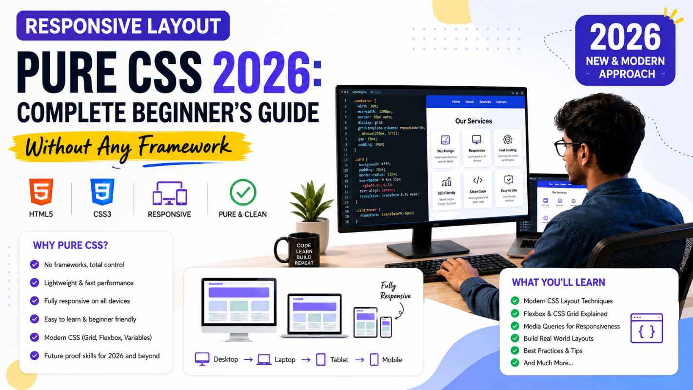
Every beginner eventually hears the same advice: “Just use Bootstrap.” And honestly, for getting something on screen quickly, that’s not terrible advice. But here’s what that shortcut costs you — you never really understand what’s happening underneath, and the moment Bootstrap’s grid doesn’t do exactly what you need, you’re stuck. Learning responsive layout pure CSS from the ground up is slower at first and significantly more valuable in the long run.
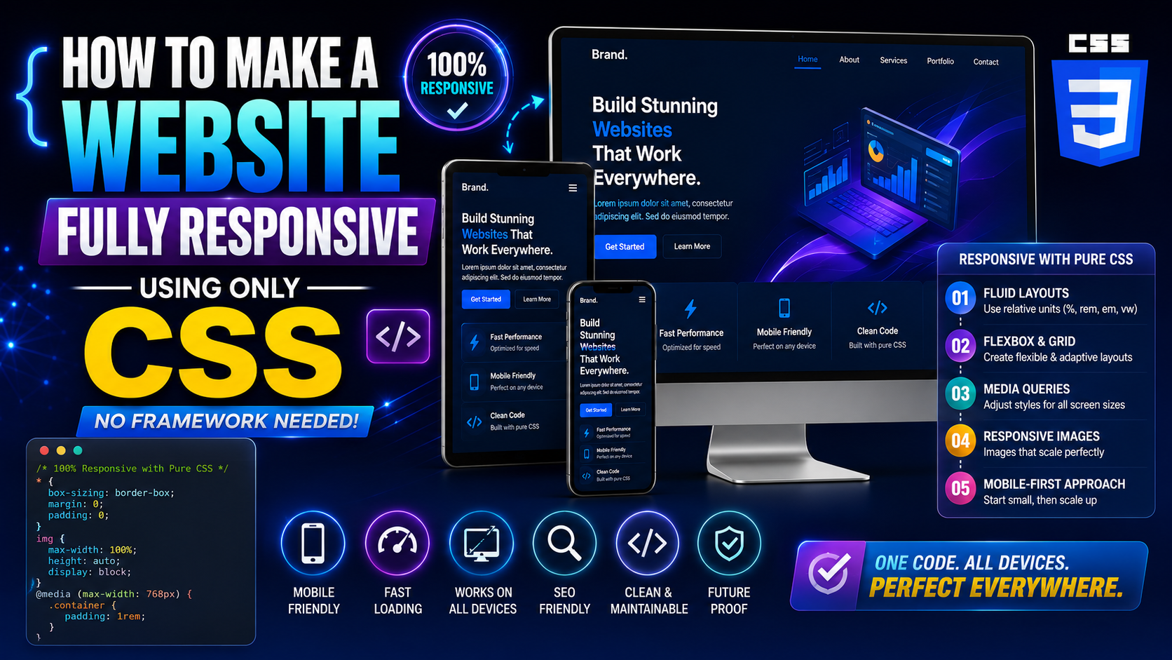
This guide builds a complete responsive layout using nothing but CSS. No Bootstrap. No Tailwind. No external dependencies at all. Just HTML, CSS, and a clear understanding of how browsers actually handle responsive layout pure CSS techniques. By the end, you’ll know how to make any layout adapt to any screen size — and more importantly, you’ll understand why it works.
What “Responsive” Actually Means in Practice
Before writing a single line of CSS, it helps to be precise about what responsive actually means — because it’s not just “looks okay on mobile.”
A truly responsive layout pure CSS approach means the design adapts fluidly to different viewport sizes without breaking, hiding content arbitrarily, or requiring horizontal scrolling. It means text remains readable without zooming. It means touch targets are large enough to tap. It means images scale without distorting their containers.
The three technical foundations that make this possible are flexible containers, fluid sizing units, and media queries. Everything else in this guide is an application of those three ideas.
Setting Up the HTML Foundation
Good responsive CSS starts with correct HTML — specifically one line that most beginners miss entirely:
html
<!DOCTYPE html>
<html lang="en">
<head>
  <meta charset="UTF-8">
  <meta name="viewport" content="width=device-width, initial-scale=1.0">
  <title>Responsive Layout</title>
  <link rel="stylesheet" href="styles.css">
</head>
<body>

  <header class="site-header">
    <nav class="nav">
      <a href="#" class="nav-logo">MySite</a>
      <ul class="nav-links">
        <li><a href="#">Home</a></li>
        <li><a href="#">About</a></li>
        <li><a href="#">Work</a></li>
        <li><a href="#">Contact</a></li>
      </ul>
    </nav>
  </header>

  <main>
    <section class="hero">
      <h1>Build Without Limits</h1>
      <p>No frameworks. Just clean, honest CSS.</p>
    </section>

    <section class="content-grid">
      <article class="card">Card One</article>
      <article class="card">Card Two</article>
      <article class="card">Card Three</article>
    </section>

    <section class="two-column">
      <div class="main-content">Main Content Area</div>
      <aside class="sidebar">Sidebar</aside>
    </section>
  </main>

  <footer class="site-footer">
    <p>Footer content here</p>
  </footer>

</body>
</html>
The meta name="viewport" line is the critical one. Without it, mobile browsers render your page at desktop width and scale it down — making your responsive layout pure CSS work completely irrelevant on phones. That one line tells the browser to use the device’s actual width as the viewport width.
Starting With a CSS Reset and Base Styles
Before any layout code, establish a consistent baseline. Different browsers have different default styles, and those inconsistencies create unpredictable layouts.
css
*, *::before, *::after {
  box-sizing: border-box;
  margin: 0;
  padding: 0;
}

html {
  font-size: 100%;
  scroll-behavior: smooth;
}

body {
  font-family: system-ui, -apple-system, sans-serif;
  line-height: 1.6;
  color: #1f2937;
  background-color: #ffffff;
}

img, video {
  max-width: 100%;
  display: block;
}
box-sizing: border-box is arguably the most important line here. By default, CSS adds padding and border to an element’s specified width — so a width: 300px element with padding: 20px actually renders at 340px. border-box changes this so padding is included within the specified width. Every responsive layout pure CSS project should start with this.
max-width: 100% on images ensures they never overflow their containers on smaller screens — one of the simplest and most effective responsive techniques available.
Building a Mobile-First Navigation
Mobile-First Means Starting Small
The mobile-first approach means writing your base CSS for small screens first, then adding complexity for larger screens using min-width media queries. This is the correct approach for responsive layout pure CSS development because mobile CSS is almost always simpler — and it’s easier to add complexity than to remove it.
css
/* Base styles - mobile first */
.site-header {
  background-color: #1f2937;
  padding: 1rem;
  position: sticky;
  top: 0;
  z-index: 100;
}

.nav {
  display: flex;
  justify-content: space-between;
  align-items: center;
  flex-wrap: wrap;
  gap: 1rem;
}

.nav-logo {
  color: #ffffff;
  text-decoration: none;
  font-size: 1.25rem;
  font-weight: 700;
}

.nav-links {
  display: flex;
  list-style: none;
  gap: 1.5rem;
  flex-wrap: wrap;
}

.nav-links a {
  color: #d1d5db;
  text-decoration: none;
  font-size: 0.95rem;
  transition: color 0.2s ease;
}

.nav-links a:hover {
  color: #ffffff;
}
flex-wrap: wrap on both the nav and nav-links allows items to wrap to the next line on very small screens rather than overflowing. Combined with gap, this creates a navigation that degrades gracefully on narrow viewports without requiring JavaScript or a hamburger menu implementation.
Creating a Fluid Hero Section
css
.hero {
  padding: clamp(3rem, 8vw, 6rem) 1.5rem;
  text-align: center;
  background: linear-gradient(135deg, #667eea 0%, #764ba2 100%);
  color: #ffffff;
}

.hero h1 {
  font-size: clamp(2rem, 5vw, 4rem);
  line-height: 1.2;
  margin-bottom: 1rem;
}

.hero p {
  font-size: clamp(1rem, 2.5vw, 1.35rem);
  max-width: 600px;
  margin: 0 auto;
  opacity: 0.9;
}
clamp() handles fluid sizing for both the padding and typography simultaneously. The hero section automatically scales between mobile and desktop without a single media query. This is one of the most practical responsive layout pure CSS techniques available in 2026 — fluid by nature rather than fluid by breakpoint.
max-width: 600px with margin: 0 auto on the paragraph keeps line length readable on wide screens — an often-overlooked aspect of responsive design that affects readability significantly.
Building a Responsive Card Grid With CSS Grid
This is where CSS Grid genuinely shines for responsive layout pure CSS work:
css
.content-grid {
  display: grid;
  grid-template-columns: repeat(auto-fill, minmax(280px, 1fr));
  gap: 1.5rem;
  padding: 3rem 1.5rem;
  max-width: 1200px;
  margin: 0 auto;
}

.card {
  background-color: #f9fafb;
  border: 1px solid #e5e7eb;
  border-radius: 8px;
  padding: 1.5rem;
  min-height: 200px;
  transition: transform 0.2s ease, box-shadow 0.2s ease;
}

.card:hover {
  transform: translateY(-4px);
  box-shadow: 0 10px 25px rgba(0, 0, 0, 0.1);
}
repeat(auto-fill, minmax(280px, 1fr)) is doing several things simultaneously. auto-fill creates as many columns as fit in the available width. minmax(280px, 1fr) ensures each column is at least 280px wide but expands to fill available space. On a mobile screen, this produces one column. On a tablet, two or three. On desktop, three or four. Zero media queries required.
max-width: 1200px with margin: 0 auto constrains the grid on very wide screens so content doesn’t stretch uncomfortably across ultrawide monitors.
A Two-Column Layout That Stacks on Mobile
The classic content-plus-sidebar layout — responsive without any framework:
css
.two-column {
  display: grid;
  grid-template-columns: 1fr;
  gap: 2rem;
  padding: 3rem 1.5rem;
  max-width: 1200px;
  margin: 0 auto;
}

.main-content {
  background-color: #f9fafb;
  border-radius: 8px;
  padding: 2rem;
  min-height: 400px;
}

.sidebar {
  background-color: #f3f4f6;
  border-radius: 8px;
  padding: 1.5rem;
}

/* Switch to two columns on wider screens */
@media (min-width: 768px) {
  .two-column {
    grid-template-columns: 1fr 300px;
  }
}
On mobile, grid-template-columns: 1fr stacks both sections vertically — main content first, sidebar below. At 768px and wider, the grid switches to a two-column layout with the sidebar fixed at 300px and the main content taking the remaining space.
This is the responsive layout pure CSS pattern for sidebars — clean, readable, and requiring exactly one media query to implement completely.
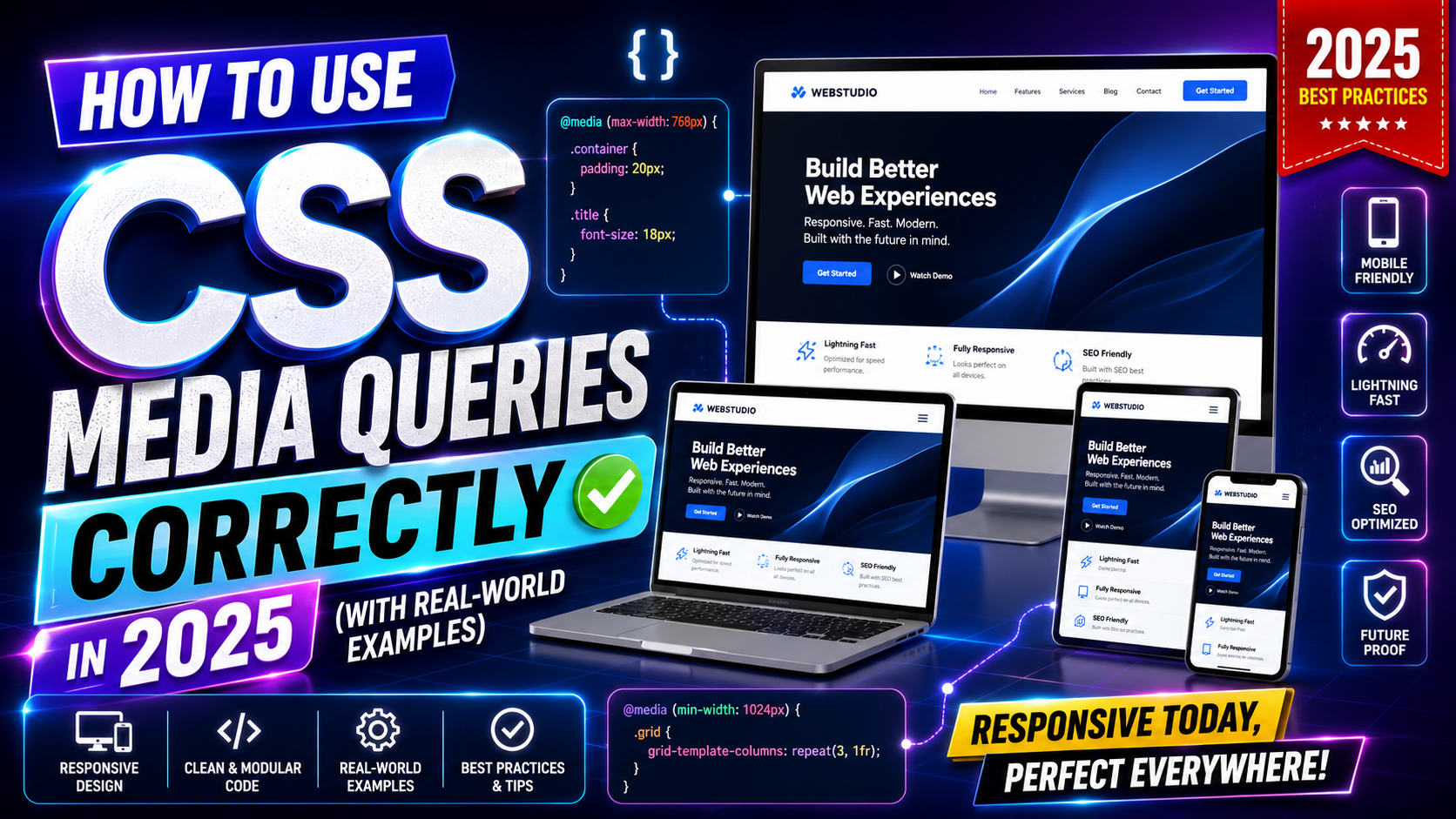
Media Queries Done Properly
Min-Width vs Max-Width: Which to Use
Mobile-first means using min-width media queries — you start with mobile styles and add styles for larger screens. max-width queries work in the opposite direction and make mobile an afterthought.
css
/* Mobile first - base styles apply to all screens */

/* Small tablets and up */
@media (min-width: 480px) {
  .nav-links {
    gap: 2rem;
  }
}

/* Tablets and up */
@media (min-width: 768px) {
  .content-grid {
    padding: 4rem 2rem;
  }
}

/* Desktops and up */
@media (min-width: 1024px) {
  .content-grid {
    padding: 5rem 2rem;
  }
}
Notice how each breakpoint only adds or adjusts styles — it doesn’t override everything. That’s the key to keeping media queries manageable in a responsive layout pure CSS project. Each breakpoint has one clear job.
Common breakpoints for 2026: 480px (large phones), 768px (tablets), 1024px (small desktops), 1280px (standard desktops). These aren’t rules — they’re starting points. Let your content determine where breakpoints actually belong.
Fluid Spacing With Custom Properties
Combine custom properties with clamp() for a spacing system that scales across all screen sizes:
css
:root {
  --space-sm: clamp(0.5rem, 1.5vw, 0.75rem);
  --space-md: clamp(1rem, 3vw, 1.5rem);
  --space-lg: clamp(1.5rem, 5vw, 3rem);
  --space-xl: clamp(2rem, 8vw, 5rem);
}

.section {
  padding: var(--space-xl) var(--space-md);
}
Define your spacing scale once, reference it everywhere. This is how responsive layout pure CSS projects stay consistent across hundreds of selectors — the spacing adapts automatically, and you never have to write the same clamp() call twice.
Responsive Footer
css
.site-footer {
  background-color: #1f2937;
  color: #9ca3af;
  text-align: center;
  padding: var(--space-lg) var(--space-md);
  margin-top: auto;
}

.site-footer p {
  font-size: 0.9rem;
}
Simple, clean, and using the custom spacing variables already defined. The footer doesn’t need media queries because centered text and fluid padding handle everything automatically.
Testing Your Responsive Layout
Building a responsive layout pure CSS project without testing it properly is like cooking without tasting. Use Chrome or Firefox DevTools — press F12, then click the device toolbar icon (or press Ctrl+Shift+M on Windows, Cmd+Shift+M on Mac). This lets you preview your layout at any viewport width.
Test at 320px (older small phones), 375px (iPhone SE), 768px (iPad), 1024px (small laptop), and 1440px (standard desktop). If it looks correct at all five, you’ve built something genuinely responsive.
The MDN guide on responsive design is the most thorough free reference for understanding the concepts behind what you’ve just built — worth reading after you’ve finished your first layout.
For testing across real devices and browsers, BrowserStack offers tools for checking how your responsive layout pure CSS work renders on actual iOS and Android devices.
Final Conclusion
Building a responsive layout pure CSS from scratch teaches you things that no framework ever will — how the browser actually calculates widths, how Grid and Flexbox handle space distribution, how clamp() eliminates unnecessary media queries, and how a mobile-first approach keeps your CSS maintainable as projects grow.
The techniques covered here — viewport meta, box-sizing reset, CSS Grid with auto-fill, clamp() for fluid sizing, mobile-first media queries, and custom property spacing systems — are the same ones used in production websites that don’t need Bootstrap to look professional.
Start with this structure, build something real with it, and the concepts will solidify faster than any tutorial alone could achieve. Responsive layout pure CSS is a skill that compounds — every layout you build makes the next one faster and cleaner.