 Mukesh1@gmail.com
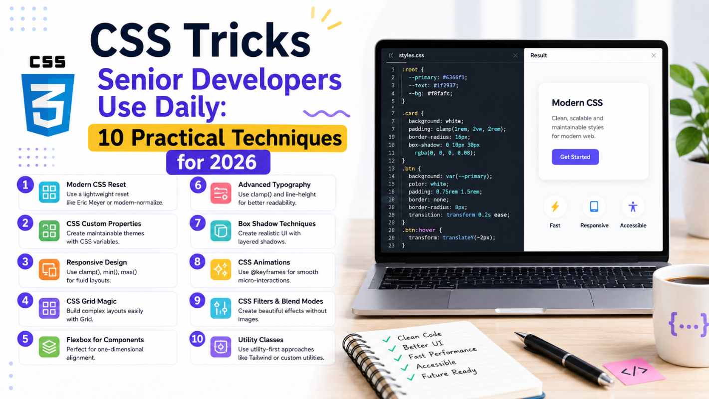
If you’ve ever looked at a senior developer’s stylesheet and wondered how their code looks so clean compared to yours — you’re not imagining things. There’s a real gap, and it’s not about knowing more CSS properties. It’s about knowing which CSS tricks senior developers reach for automatically, without thinking twice, because they’ve seen what happens when you don’t use them.
This guide covers ten of those techniques. Not obscure properties nobody uses — actual CSS tricks senior developers apply in real projects, on real deadlines, every single working day. Each one is explained with enough context that you’ll understand not just what it does, but why it exists and when to reach for it.
1. CSS Custom Properties for Consistent Design Tokens
The Trick That Changes Everything
Most beginners hardcode color values — #3b82f6 scattered across thirty different selectors. Senior developers define everything once using custom properties and reference it everywhere else.
css
:root {
  --color-primary: #3b82f6;
  --color-text: #1f2937;
  --spacing-md: 1rem;
  --border-radius: 8px;
}

.button {
  background-color: var(--color-primary);
  padding: var(--spacing-md);
  border-radius: var(--border-radius);
}
When the client wants to change the brand color, you update one line instead of hunting through hundreds. This is among the most fundamental CSS tricks senior developers use — treating CSS like a system rather than a collection of one-off rules.
Custom properties also work inside media queries, can be updated with JavaScript, and cascade like any other CSS value. They’re not just convenient — they’re the foundation of maintainable stylesheets.
2. The clamp() Function for Fluid Typography
Responsive typography used to mean writing multiple font-size declarations inside multiple media queries. Senior developers use clamp() instead — one line that handles everything.
css
h1 {
  font-size: clamp(1.5rem, 4vw, 3rem);
}
This sets a minimum size (1.5rem), a preferred size that scales with the viewport (4vw), and a maximum size (3rem). The browser handles everything in between automatically.
No media queries. No breakpoint math. No maintenance headache. Among CSS tricks senior developers reach for when working with typography, clamp() has become essentially standard practice in 2026 — and once you start using it, writing fixed font sizes feels genuinely backwards.
3. Logical Properties for International-Ready Layouts
This one trips up a lot of intermediate developers because it solves a problem they haven’t encountered yet. Logical properties replace directional terms like left and right with logical equivalents like inline-start and inline-end.
css
/* Old way */
margin-left: 1rem;
padding-right: 2rem;

/* Logical properties */
margin-inline-start: 1rem;
padding-inline-end: 2rem;
In left-to-right languages like English, these behave identically. But in right-to-left languages like Arabic or Hebrew, logical properties automatically flip — so your layout works correctly without writing any additional CSS.
CSS tricks senior developers who work on international products use logical properties by default. Even if your current project is English-only, building the habit now prevents painful refactoring later.
4. The :is() and :where() Pseudo-Classes
Before these existed, targeting multiple elements with the same styles meant repetitive selectors:
css
h1 a, h2 a, h3 a, h4 a {
  color: inherit;
}
With :is(), that collapses into one clean rule:
css
:is(h1, h2, h3, h4) a {
  color: inherit;
}
:where() works identically but with zero specificity — useful when you want styles that are easy to override without fighting the cascade. These are among the CSS tricks senior developers use specifically to keep stylesheets readable and maintainable at scale. Less repetition means fewer places for bugs to hide.
5. aspect-ratio for Consistent Proportions
Maintaining consistent aspect ratios used to require the infamous “padding-top hack” — a workaround so unintuitive that explaining it to junior developers took longer than building the feature.
css
/* Old padding hack - avoid this */
.video-wrapper {
  padding-top: 56.25%; /* 16:9 ratio */
  position: relative;
}

/* Modern approach */
.video-wrapper {
  aspect-ratio: 16 / 9;
}
aspect-ratio is direct, readable, and works for images, videos, cards, avatars — anything where you need consistent proportions regardless of the container width. Among CSS tricks senior developers keep in their regular toolkit, this one eliminates an entire category of layout bugs that used to appear consistently across different screen sizes.
6. Flexbox Gap Instead of Margin Hacks
For years, creating space between flex items required workarounds — negative margins on containers, margin rules with :first-child and :last-child exceptions, or wrapper elements. Senior developers now use gap directly on the flex container.
css
.card-grid {
  display: flex;
  flex-wrap: wrap;
  gap: 1.5rem;
}
gap applies spacing between items only — not on the outer edges — which is almost always what you actually want. It works in both Flexbox and Grid, and it’s one of those CSS tricks senior developers adopted immediately when browser support became solid because it replaced several lines of workaround code with one clean property.
7. CSS Grid’s minmax() and auto-fill for Responsive Grids
This combination creates responsive grid layouts without a single media query:
css
.grid {
  display: grid;
  grid-template-columns: repeat(auto-fill, minmax(250px, 1fr));
  gap: 1rem;
}
auto-fill creates as many columns as fit in the available space. minmax(250px, 1fr) ensures each column is at least 250px wide but expands to fill available space. The grid reflows automatically as the viewport changes.
This is one of the CSS tricks senior developers use almost reflexively for card layouts, product grids, and image galleries — situations where content count varies and you want the layout to adapt without breakpoint management. The result is more flexible than anything you could write with explicit media queries.
8. scroll-behavior and scroll-margin for Smooth Navigation
Two properties that work together and are consistently overlooked by beginners:
css
html {
  scroll-behavior: smooth;
}

.section {
  scroll-margin-top: 80px;
}
scroll-behavior: smooth makes anchor link navigation animate rather than jump. scroll-margin-top offsets the scroll target — essential when you have a fixed header that would otherwise cover the top of the section you’re scrolling to.
Among the CSS tricks senior developers apply to nearly every project with a fixed header, this combination solves a user experience problem that otherwise requires JavaScript. Pure CSS, two properties, and your navigation feels noticeably more polished.
9. The currentColor Keyword
currentColor references the element’s current text color anywhere a color value is accepted. It’s one of those CSS tricks senior developers use to keep component styles coherent with minimal code.
css
.icon-button {
  color: #3b82f6;
  border: 2px solid currentColor;
  background: transparent;
}

.icon-button:hover {
  color: #1d4ed8;
  /* Border automatically updates too */
}
When the text color changes — on hover, on focus, in a different theme — the border, shadow, or SVG fill that uses currentColor updates automatically. No need to update multiple properties separately. This keeps components self-contained and reduces the number of things that can get out of sync.
10. will-change for Performance-Critical Animations
Used carefully, will-change is one of the CSS tricks senior developers reach for when animations are causing frame drops or jank on lower-end devices.
css
.animated-element {
  will-change: transform, opacity;
}
It tells the browser in advance that this element is about to be animated, allowing it to optimize rendering — often by moving the element to its own GPU layer. The result is smoother animation, especially for transforms and opacity changes.
The important caveat: don’t apply will-change to everything. It consumes memory and can actually hurt performance if overused. Senior developers apply it surgically — only to elements that are genuinely causing performance problems, and ideally adding and removing it dynamically through JavaScript around the animation itself.
For a deeper understanding of rendering performance and when to use this property, the MDN will-change documentation is the most thorough reference available.
Putting These Tricks Into Practice
Knowing these techniques is one thing. Using them consistently is another. The way senior developers actually internalize CSS tricks senior developers use is by applying them in real projects — not just reading about them.
Pick two or three from this list and deliberately use them in your next project. Get comfortable with custom properties first — they unlock everything else. Then add clamp() for your typography. Then replace your margin hacks with gap. Each one you internalize makes the next one easier to adopt.
The CSS specification on the MDN Web Docs is worth bookmarking as your primary reference — it’s accurate, well-maintained, and covers browser support clearly for every property mentioned here.
Final Conclusion
The CSS tricks senior developers use daily aren’t secrets — they’re just patterns that come from building enough projects to understand which tools consistently produce cleaner, more maintainable results. Custom properties, clamp(), logical properties, :is(), aspect-ratio, gap, CSS Grid’s auto-fill, scroll behavior, currentColor, and will-change — each one solves a real problem that beginners typically solve with more code, more workarounds, or more media queries.
The gap between a junior and senior stylesheet isn’t the number of properties used. It’s the judgment to reach for the right property at the right moment — and that judgment develops one project at a time. Start using these CSS tricks senior developers rely on today, and your code will reflect it.