 Mukesh1@gmail.com
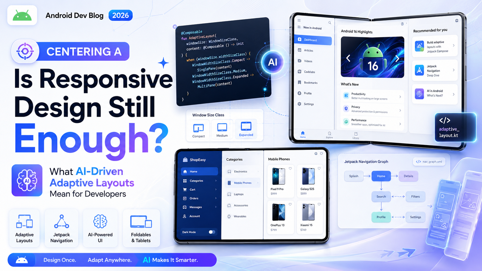
future of responsive design AI adaptive layouts
Responsive design has been the backbone of front-end development for over a decade. Write your CSS, set your breakpoints, test on a few screen sizes, ship. It was never perfect, but it worked well enough for most situations.
In 2025, that “well enough” is starting to feel a little strained.
Not because responsive design is broken — it isn’t. But the way people interact with the web has gotten more complicated. Foldable phones. Embedded browsers inside apps. Voice-driven interfaces. Screens on refrigerators, car dashboards, watches. And now, a growing conversation about whether AI can — or should — be making layout decisions that developers used to handle manually.
This article tries to answer that honestly. Is responsive design still enough? And what does “AI-driven adaptive layout” actually mean in practice for someone writing front-end code today?
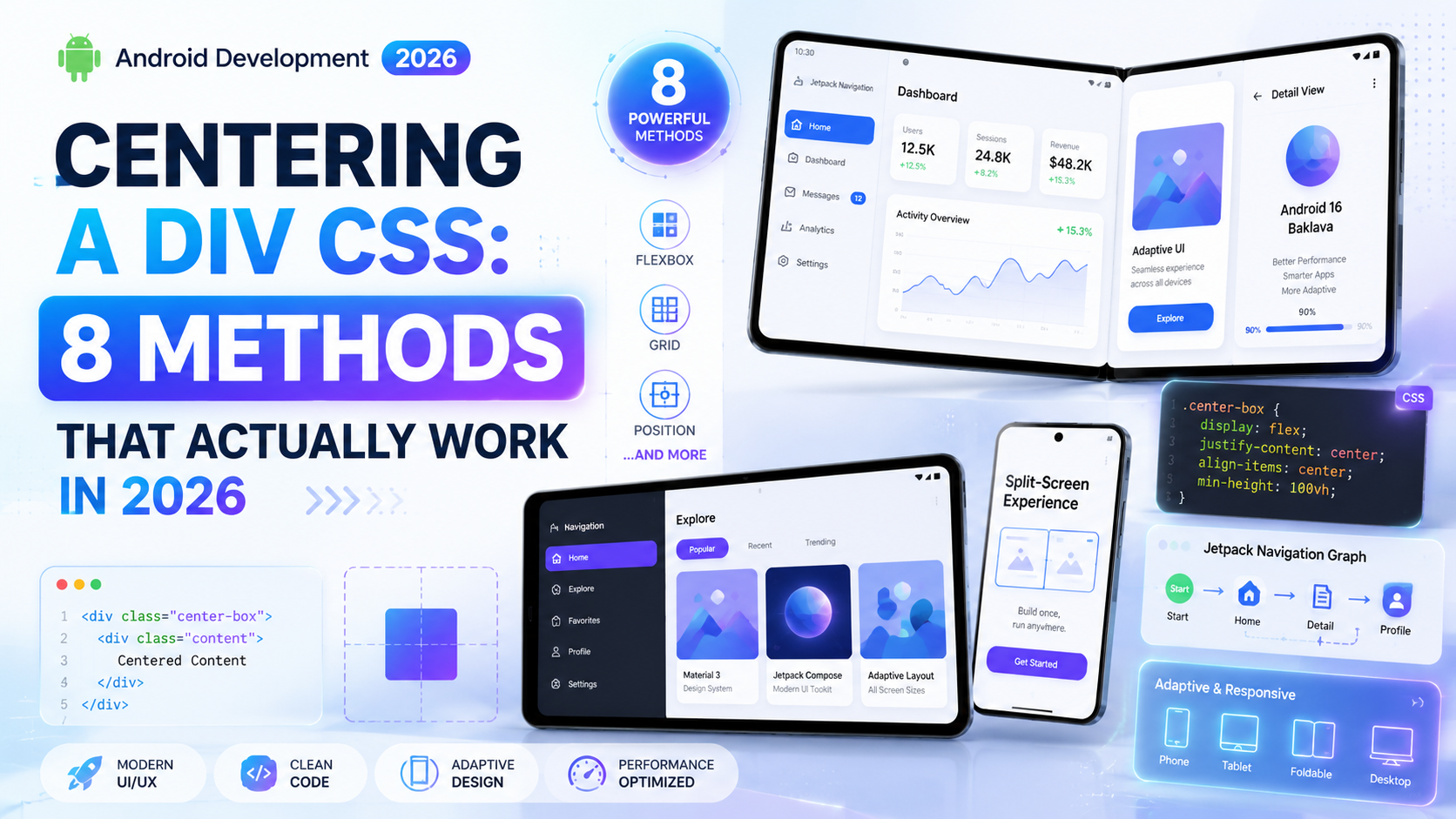
What Responsive Design Was Built to Solve
To understand where the gaps are, it helps to remember what responsive design was originally solving.
Back when Ethan Marcotte introduced the concept formally in 2010, the problem was simple: websites built for desktop looked broken on the then-new smartphones. The solution was fluid grids, flexible images, and media queries — design that responds to the device.
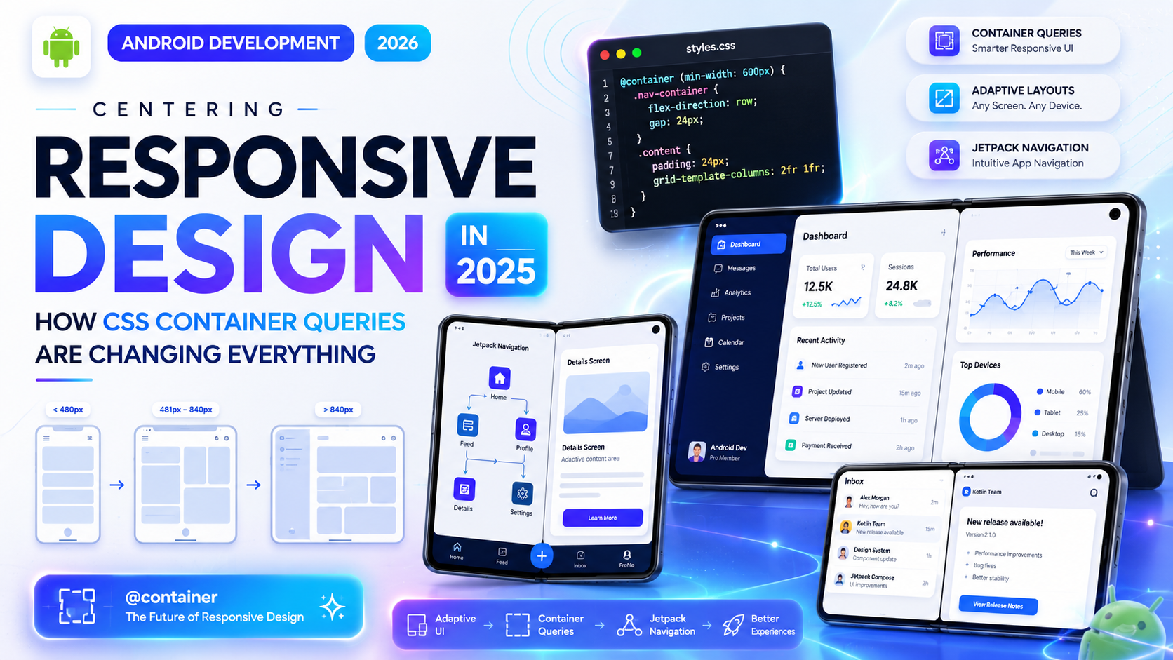
That approach scaled well for years. Phones got bigger, tablets arrived, and the combination of percentage-based layouts and breakpoints handled most of it. CSS eventually gave us Flexbox, Grid, and Container Queries — all of which made responsive work smarter and more component-aware.
But here’s what responsive design was always doing: it was responding to static conditions. Screen width, pixel density, orientation — inputs that don’t change while you’re using the page. The design adapts at load time or on resize, and that’s it.
What it doesn’t do is respond to behavior. It doesn’t know that this particular user always skips the hero image and jumps to the content. It doesn’t know that someone is using the site with one hand while commuting. It doesn’t know that a user with low vision has increased their system font size and now your fixed-height card is clipping text.
Those gaps are what the conversation about AI-driven adaptive layouts is starting to address.
What “AI-Driven Adaptive Layout” Actually Means
The phrase sounds futuristic, but the ideas behind it aren’t entirely new. Personalization has existed on the web for a long time — recommendation engines, A/B testing, user preference systems. What’s changing is the granularity and speed at which adaptation can happen.
AI-driven layout adaptation, in practical terms, means using machine learning signals to make layout and presentation decisions dynamically — not just at breakpoints, but continuously, based on real user behavior.
Some real examples of what this looks like today:
Content prioritization based on engagement data. If analytics show that 80% of users on mobile never scroll past the first two sections, an adaptive system might reorder the content to surface what matters most to mobile users specifically — not just resize it.
Font size and contrast adjustment. Systems that observe user behavior (zooming in frequently, using accessibility tools) and proactively adjust type size or color contrast without the user having to find a settings menu.
Component density adaptation. Showing a compact, scannable layout to a user who moves through pages quickly, versus a more detailed layout for someone who lingers and reads everything.
Predictive prefetching based on navigation patterns. Not strictly a layout decision, but part of the adaptive experience — the interface predicts where you’re going and prepares for it.
These aren’t theoretical. Parts of this are already in production at large platforms. What’s new in 2025 is that the tooling is becoming accessible enough that smaller teams can start implementing pieces of it.
Where Standard Responsive Design Still Holds Up Fine
Before getting too deep into what’s changing, it’s worth being honest about what hasn’t broken.
For the majority of websites — informational sites, blogs, documentation, small e-commerce, portfolios — traditional responsive design is completely sufficient. A well-built responsive layout using modern CSS (Grid, Flexbox, Container Queries) is genuinely excellent. It handles a huge range of devices with relatively little code.
The limitations of responsive design don’t show up at the small scale. They show up at complexity and scale — large applications with diverse user bases, platforms where personalization has measurable business impact, interfaces where content volume and type vary significantly between users.
If you’re building a recipe blog or a freelance portfolio, you don’t need AI-driven layout adaptation. You need good CSS and thoughtful design decisions. The conversation about adaptive layouts is most relevant for application-scale interfaces, not every website on the internet.
The Developer’s Role When Layouts Start Adapting
Here’s where things get interesting for anyone writing front-end code.
As layout systems become more adaptive, the developer’s job shifts. Less time specifying every breakpoint behavior, more time defining the range of possibilities that an adaptive system can work within.
Think of it like this: instead of saying “at 768px, the sidebar collapses,” you might define “the sidebar can exist at any width between 200px and 400px, and can be hidden entirely — here’s what the content looks like in each state.” Then a system decides which state to use based on user signals.
This is actually closer to how design systems and component libraries are already evolving. The concept of component variants — different visual configurations of the same component — has been growing in tools like Figma, Storybook, and design token frameworks. AI-driven layout can be thought of as runtime variant selection based on behavioral data rather than manual choice.
For developers, this means a few practical things:
Writing more robust components. Components need to handle more layout states gracefully, because the system might switch between them in ways a single developer didn’t explicitly anticipate. CSS Container Queries (covered well in MDN’s container query documentation) become even more valuable here — components that respond to their own context rather than hardcoded breakpoints are naturally more adaptable.
Thinking about layout as data. In a genuinely adaptive system, layout decisions are being recorded and analyzed. That means the structure of your HTML and the semantic meaning of your components matters more than ever — not just for accessibility, but for the system’s ability to understand what each piece of content is.
Understanding the boundaries between CSS and logic. Some adaptation decisions belong in CSS. Others belong in JavaScript or in a server-side rendering layer. As these systems get more sophisticated, knowing which layer handles which kind of decision becomes an important skill.
What AI Tools Are Actually Doing to Front-End Workflows Right Now
Separate from adaptive layouts in the browser, AI has already changed front-end development workflows considerably — and this is worth discussing because it’s already real, not speculative.
Tools like GitHub Copilot, Cursor, and various AI-assisted design-to-code pipelines are being used daily by front-end developers to generate boilerplate, scaffold components, write utility functions, and even suggest responsive CSS. The productivity gains are real, but so are the failure modes.
AI-generated CSS in particular tends to be verbose, uses patterns it learned from older codebases, and often defaults to layout approaches that aren’t the best modern choice. Flexbox used where Grid would be cleaner. Fixed breakpoints where container queries would be more appropriate. Inline styles where custom properties would be more maintainable.
This isn’t an argument against using these tools — they’re useful. But it is an argument for developers maintaining strong foundational knowledge. CSS-Tricks’ guide to modern layout techniques remains one of the most-referenced resources for understanding what good CSS actually looks like, and that judgment is hard to delegate to an autocomplete tool.
The Personalization vs. Consistency Tension
Any serious discussion of AI-driven adaptive layouts has to reckon with this: when interfaces adapt significantly between users, you lose the shared experience that designers and developers have traditionally been able to test and verify.
QA becomes harder. “Does it look right?” becomes “does it look right for whom?” Support becomes harder when users see different layouts. Accessibility testing, which already requires careful attention, gets more complex when the interface has multiple states that might each need to be evaluated.
There’s also a subtler issue around user trust. Most people have a reasonable expectation that a website looks a certain way. When a layout changes significantly between visits — even for good reasons — it can feel disorienting rather than helpful. The adaptation has to be smooth enough that users perceive a “better experience,” not a “broken experience.”
These aren’t unsolvable problems, but they’re real ones. Any team moving toward adaptive layout systems needs to think through the testing and communication implications, not just the technical implementation.
What Developers Should Actually Be Learning Right Now
Given all of this — what’s worth investing time in as a front-end developer in 2025?
The fundamentals of modern CSS are not going anywhere. Grid, Flexbox, Container Queries, custom properties, logical properties — these are the building blocks of any adaptive system, AI-driven or otherwise. Solid CSS knowledge makes you more effective with or without AI tooling.
Beyond that, understanding data and behavioral signals matters more than it used to. Not every front-end developer needs to be a data scientist, but having a mental model of how user behavior gets measured, analyzed, and fed back into interface decisions is increasingly relevant for working on larger product teams.
And accessibility is only going to grow in importance as interfaces become more dynamic. An adaptive layout that breaks screen reader compatibility in certain configurations, or that doesn’t maintain focus management correctly when it switches states, is worse than a static layout that works reliably every time.
Final Conclusion
Responsive design isn’t dead, and it isn’t going to be replaced overnight. For a huge portion of the web, well-written responsive CSS is still the right solution — and it’s better than it’s ever been thanks to container queries and modern layout tools.
But the ceiling is real. Responsive design answers the question “what does the screen look like?” It doesn’t answer “what does this user need right now?” That second question is where AI-driven adaptive layout is beginning to make inroads — and where the front-end developer’s role is quietly starting to shift.
The developers who navigate this transition well won’t be the ones who hand everything off to AI tools. They’ll be the ones who understand CSS deeply enough to define good layout systems, understand their users well enough to know what adaptation is actually worth doing, and understand the tradeoffs well enough to know when simpler is still better.