 Mukesh1@gmail.com
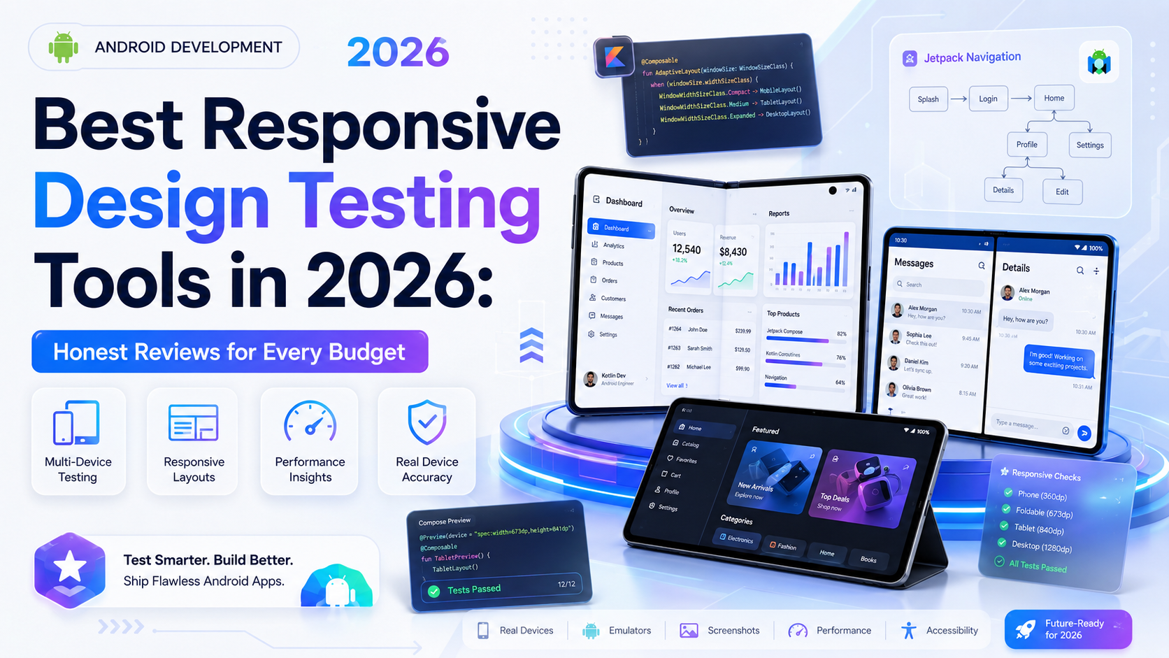
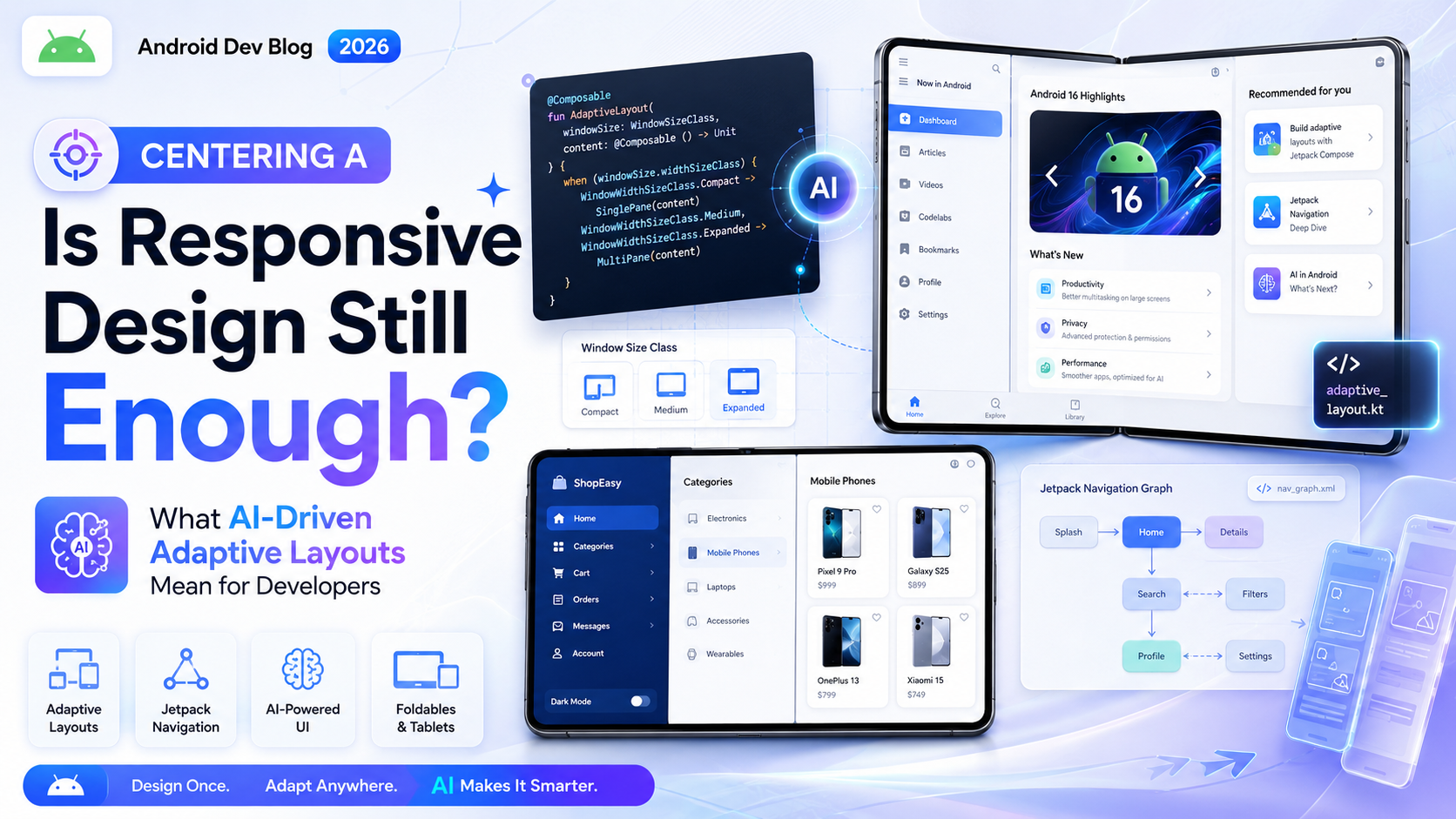
Testing responsive design is one of those tasks that sounds simple until you’re three hours deep into it, wondering why your layout looks perfect in Chrome DevTools but completely broken on your client’s actual phone.
That gap between “looks fine in the browser” and “works on real devices” is where a lot of responsive work falls apart. The tools you use to test matter more than most developers admit. And in 2026, the options range from completely free to enterprise-level — each with real tradeoffs worth understanding before you commit.
Why Testing Responsive Design Is Harder Than It Looks
Before getting into specific tools, it’s worth naming the actual problem.
Browser DevTools give you a resizable viewport. That’s useful for quick checks, but it’s simulating a screen size — not a real device. Real devices have different pixel densities, different rendering engines, different default font sizes, different touch behavior, and different ways of handling things like vh units (which behave notoriously differently on mobile Safari because of the browser chrome).
A layout that passes every DevTools check can still fail on a real Android phone running a mid-range browser, or on an older iPhone that hasn’t updated iOS in two years. The more varied your expected audience, the more seriously you need to take multi-device, multi-browser testing.
The tools below are evaluated on a few honest criteria: how accurately they reflect real device behavior, how much they cost, how much friction they add to your workflow, and whether they’re actually worth using for the use case they advertise.
Free Tools Worth Using
Browser DevTools (Chrome, Firefox, Safari)
Start here. Always. DevTools across all three major browsers have mature responsive testing modes that are genuinely useful for day-to-day layout work.
Chrome DevTools’ device mode lets you toggle between preset device profiles, set custom dimensions, simulate touch input, and throttle network speed. Firefox has a similar responsive design mode with a slightly cleaner UI for quick dimension switching. Safari’s Web Inspector is essential if you’re testing anything that needs to run on actual Apple hardware — it’s the only way to remotely debug a real iPhone or iPad from a Mac.
The limitation, as mentioned, is that these are viewport simulations — not actual rendering engines. Chrome DevTools uses Chrome’s Blink engine regardless of which device profile you select. If you need to see how something behaves in Safari’s WebKit or an older Android browser, DevTools won’t tell you that.
Honest verdict: Indispensable for development workflow, Responsive Design insufficient as your only testing method.
Responsively App
This is a free, open-source desktop app that shows your site simultaneously across multiple device viewports — all synced together. When you scroll in one panel, all panels scroll. When you click a link, all panels follow. It’s designed specifically for responsive design development, and it does that one thing very well.
For a solo developer or small team building sites where cross-device visual consistency matters, Responsively App is genuinely excellent. It’s faster than manually resizing your browser and easier than juggling multiple windows.
The catch: it’s running everything through Chromium. So you’re not getting true Safari or Firefox rendering. It’s best understood as a visual consistency checker across screen sizes, not a cross-browser compatibility tool.
Honest verdict: Highly recommended for visual layout work during development. Free, low friction, actively maintained.
Google Chrome’s Lighthouse
Built into Chrome DevTools, Lighthouse audits your page for performance, accessibility, best practices, and SEO — and it runs a mobile simulation as part of the process. It won’t show you how your layout looks on a phone, but it’ll flag things like tap targets that are too close together, text that’s too small to read without zooming, or content wider than the screen.
These are real responsive design problems, and catching them in Lighthouse before shipping is better than finding them in a bug report.
Honest verdict: Not a visual testing tool, but a valuable complement to one. Free and already in your browser.
Mid-Range Tools Worth Paying For
BrowserStack
BrowserStack is the name most developers encounter eventually, and for good reason — it gives you access to real devices running real operating systems and real browsers, all accessible from your browser. You pick a device, pick an OS version, pick a browser, and get a live interactive session.
The device catalog is substantial. You can test on a Samsung Galaxy running Android 11 with Chrome 108, or on an iPhone 14 Pro running iOS 16 with Safari, or on a Windows machine running Edge. These aren’t emulators — BrowserStack maintains a physical device lab, which means the rendering behavior matches what actual users experience.
Their Automate product lets you run Selenium or Playwright tests across multiple device/browser combinations simultaneously, which is where it becomes genuinely powerful for teams with test suites.
The pricing is the sticking point. Individual plans are manageable; team plans add up quickly. And the live testing sessions can have a bit of latency, which makes fine interaction testing occasionally frustrating.
Honest verdict: The most credible real-device testing service available. Worth the cost if cross-device accuracy matters for your project. BrowserStack’s documentation covers their device lab and automation setup thoroughly Responsive Design.
LambdaTest
LambdaTest positions itself as a more affordable alternative to BrowserStack, and in several ways it delivers. The device and browser coverage is comparable, the interface is clean, and their pricing tiers are generally lower for similar feature sets.
Where LambdaTest has invested recently is in AI-assisted testing features — things like visual regression testing that automatically flags layout differences between builds, and smart test analytics that help identify which tests are worth running based on what changed in your code.
The visual regression feature specifically is useful for responsive work. If you push a CSS change and want to know whether anything broke across your defined set of device viewports, automated visual diffing is a significant time saver compared to manually checking each one.
Honest verdict: A solid BrowserStack alternative with competitive pricing and genuinely useful visual regression tooling. Worth evaluating if BrowserStack’s pricing is a barrier.
Polypane
Polypane is a browser built specifically for web developers and designers, and it takes a different approach than most tools on this list. Rather than device testing, it focuses on helping you build responsive designs correctly in the first place.
You work in a multi-pane environment that shows your site at multiple breakpoints simultaneously — similar to Responsively App, but with significantly more depth. Polypane includes accessibility checks, design reference overlay tools, meta tag previews, and a “full page” screenshot mode that captures every viewport at once.
It’s more of a development environment than a testing tool, which means it fits differently in a workflow. If you’re the kind of developer who wants continuous visual feedback across breakpoints while you code, Polypane is excellent. If you need real-device testing, it doesn’t replace BrowserStack or LambdaTest.
Honest verdict: Genuinely well-built and worth the subscription for developers who do heavy responsive layout work. Less useful if your priority is cross-browser accuracy over development workflow Responsive Design.
Tools for Specific Problems
axe DevTools (Accessibility Testing)
Responsive design and accessibility overlap more than many developers treat them. A layout that reflows incorrectly on mobile can make content inaccessible to screen reader users. Tap targets that are too small fail WCAG guidelines. Text that clips inside fixed-height containers becomes unreadable.
axe DevTools, available as a browser extension, runs automated accessibility audits against your page and flags specific violations with clear explanations and references to the relevant guidelines. It’s one of the most accurate automated accessibility checkers available and is used widely enough that its output is well understood by accessibility auditors.
For responsive work specifically, running axe across your key breakpoints and device emulations catches a meaningful percentage of accessibility issues before they reach real users.
Honest verdict: Free browser extension, essential complement to visual responsive testing. Deque’s axe documentation covers the full rule set and how violations map to WCAG criteria.
Percy (Visual Regression Testing)
Percy, now part of BrowserStack’s product suite, specializes in visual regression testing integrated into your CI/CD pipeline. You run your test suite, Percy captures screenshots, and it shows you pixel-level diffs between the current build and your baseline.
For teams that deploy frequently and need confidence that layout changes haven’t broken anything unexpected, Percy is one of the cleaner implementations of this concept. It’s designed to plug into GitHub, GitLab, or Bitbucket workflows, so reviews happen in the same place as code reviews.
The cost scales with snapshot volume, so smaller teams with infrequent deployments may find it more cost-effective than teams shipping multiple times a day.
Honest verdict: Strong choice for teams who’ve felt the pain of visual regressions slipping through code review. Not necessary for solo developers or projects with infrequent deployments.
What Most Developers Get Wrong About Responsive Testing
A few patterns come up repeatedly that are worth naming directly.
Testing only at “standard” breakpoints. The breakpoints in your CSS — 768px, 1024px, 1280px — are where you’ve defined changes, not necessarily where problems appear. Users have screens at every possible width. Testing at 700px, 900px, or 1100px might reveal issues your breakpoints never covered.
Skipping real device testing entirely. DevTools are fast and convenient. Real devices reveal problems DevTools don’t. For any project where mobile users are a significant portion of traffic, investing time — or money — in real device testing pays for itself in reduced bug reports.
Not testing with actual content. Responsive layouts that work beautifully with placeholder text sometimes break with real-world content — longer headlines, names in other languages, product descriptions that run longer than expected. Test with content that resembles what production will actually contain.
Ignoring landscape orientation. Most testing happens in portrait mode. Landscape on a phone creates a wide, short viewport that can expose layout issues you won’t catch any other way — particularly with fixed-height elements and modal dialogs.
Building a Practical Testing Stack
For most developers and teams, a layered approach works better than any single tool.
During development, Responsively App or Polypane gives you continuous visual feedback across breakpoints. Chrome DevTools fills in for quick checks and mobile simulation. Lighthouse catches the technical issues.
Before shipping, a round of real-device testing on BrowserStack or LambdaTest — even just covering your top two or three target devices — catches the things simulation misses. An axe audit catches accessibility issues that visual testing won’t flag.
For teams with automated deployment pipelines, Percy or LambdaTest’s visual regression tooling adds a safety net that catches layout regressions before they reach production.
You don’t need all of these simultaneously. Start with what’s free, add paid tools where your actual gaps are, and resist the impulse to treat any single tool as a complete solution.
Final Conclusion
There’s no perfect responsive testing tool — there’s just the right combination of tools for your project, your budget, and your users. Free tools like DevTools, Responsively App, and Lighthouse cover a surprising amount of ground and should be part of every developer’s workflow regardless of budget.
When accuracy really matters — when your site needs to work correctly on real devices across real browsers — BrowserStack and LambdaTest are the honest answer. They’re not cheap, but they’re the closest thing to actually putting your site in front of users before you ship.
The broader point is that responsive testing deserves deliberate attention, not just a quick resize before pushing to production. The devices your users actually hold in their hands will reveal things no simulator will catch. Building that real-device check into your workflow, even occasionally, is one of the more valuable habits a front-end developer can develop.