 Mukesh1@gmail.com
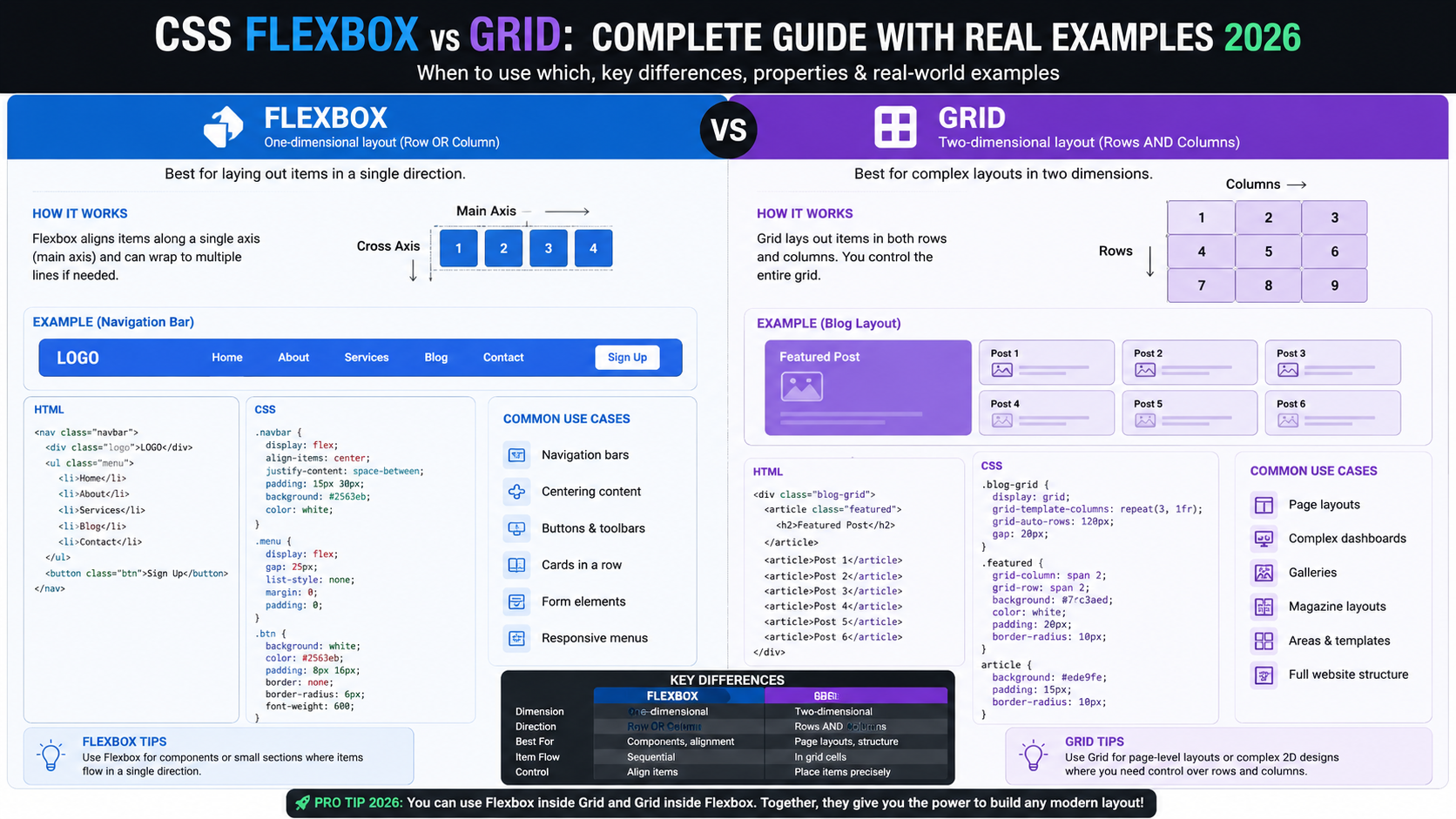
If you’ve spent any time writing CSS, you’ve probably stared at a layout problem and wondered — should I use Flexbox here, or Grid? And if you Googled it, you likely got a bunch of theoretical answers that didn’t quite help you make the call.
CSS Flexbox vs Grid is one of the most genuinely useful things to understand as a web or Android developer. Not because one is better than the other — they’re not — but because they solve different problems. And once that clicks, your layout decisions become a lot faster and more confident.
What Problem Does Each One Actually Solve?
Here’s the clearest way I’ve found to think about it.
Flexbox works in one direction at a time — either a row or a column. It’s about distributing space among items in a line and controlling how they align within that line.
Grid works in two directions simultaneously — rows and columns together. It’s about placing things into a defined two-dimensional structure.
That’s really the core of CSS Flexbox vs Grid. One dimension vs two. Everything else flows from that.
CSS Flexbox: What It’s Actually Good At
Flexbox isn’t just “the simpler one.” It’s genuinely the right tool for specific layout jobs — and forcing Grid into those situations makes your CSS harder to read and maintain.
Navigation Bars
This is probably the most classic Flexbox use case. You’ve got a logo on the left, navigation links in the middle or right, and maybe a button at the end.CSS Flexbox vs Grid
css
.navbar {
  display: flex;
  justify-content: space-between;
  align-items: center;
  padding: 0 24px;
}
That’s it. Three lines (plus padding) and your navbar is sorted. Flexbox handles the horizontal distribution naturally, and align-items: center vertically centers everything without any height gymnastics.
Trying to do this in Grid would work, but it’s overkill. You’d be defining column templates for something Flexbox handles in seconds.
Button Groups and Pill Tags
When you have a row of items — filter buttons, tag chips, social icons — and you want them to sit side by side with consistent spacing, Flexbox is the right pick.CSS Flexbox vs Grid
css
.tag-group {
  display: flex;
  flex-wrap: wrap;
  gap: 8px;
}
The flex-wrap: wrap line is doing real work here. When the screen narrows (say, on a budget Android phone with a 360px viewport), the tags wrap to the next line automatically. No media query needed for that behavior.
Card Action Rows
Inside a card component — think a product card with a price on the left and an “Add to Cart” button on the right — Flexbox keeps things clean.
css
.card-footer {
  display: flex;
  justify-content: space-between;
  align-items: center;
}
This pattern shows up constantly in Android WebView apps, e-commerce UIs, and dashboards. Simple, readable, effective.
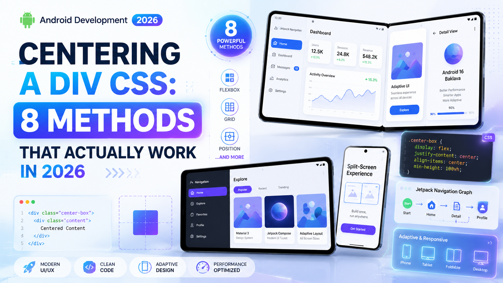
Vertical Centering (The Old Pain Point)
For years, vertically centering something in CSS was a meme-level frustration. Flexbox fixed it properly.
css
.hero-section {
  display: flex;
  justify-content: center;
  align-items: center;
  min-height: 100vh;
}
That’s a full-screen hero section with its content perfectly centered — horizontally and vertically. Clean.
CSS Grid: What It’s Actually Good At
Grid gets more powerful the more complex your layout becomes. It’s designed for situations where you’re thinking about the whole page structure — not just a row of items.
Page-Level Layout
The classic Grid use case. You’ve got a header, sidebar, main content area, and footer. Defining this with Grid is genuinely elegant.
css
.page-layout {
  display: grid;
  grid-template-areas:
    "header header"
    "sidebar main"
    "footer footer";
  grid-template-columns: 240px 1fr;
  grid-template-rows: auto 1fr auto;
  min-height: 100vh;
}

.header  { grid-area: header; }
.sidebar { grid-area: sidebar; }
.main    { grid-area: main; }
.footer  { grid-area: footer; }
Try doing that cleanly in Flexbox. You’d be nesting containers three or four levels deep and fighting alignment across them. Grid lets the layout live in one place — the parent — which is how it should be.
Responsive Card Grids
You know the pattern — a grid of product cards, blog post thumbnails, or app icons that adjusts column count as the screen width changes.
css
.card-grid {
  display: grid;
  grid-template-columns: repeat(auto-fill, minmax(220px, 1fr));
  gap: 20px;
}
That one line — repeat(auto-fill, minmax(220px, 1fr)) — creates a fully responsive grid that adds and removes columns based on available space. On a wide desktop you might get four columns. On an Android phone you might get one or two. No media queries required.
This is one of those CSS Grid tricks that, once you use it, you can’t believe you used to do it any other way.
Overlapping Elements
Grid lets elements occupy the same cell or overlapping cells intentionally. This is great for image-with-caption layouts, stacked visual effects, or hero banners with overlaid text.
css
.hero {
  display: grid;
}

.hero-image,
.hero-text {
  grid-column: 1;
  grid-row: 1;
}
Both the image and the text live in the same grid cell and overlap. You control the stacking with z-index. Doing this in Flexbox requires position: absolute workarounds that feel fragile.
Asymmetric Layouts
Editorial-style layouts — like a magazine or a news site — often have items that span different numbers of columns. A featured article might span three columns while regular articles take one each.
css
.featured {
  grid-column: span 3;
}

.regular {
  grid-column: span 1;
}
CSS Grid handles this naturally. Flexbox has no concept of spanning across a defined track system — it just distributes items in a line.
Real-World Scenario: Building an App Dashboard
Let’s say you’re building a simple Android app dashboard with a WebView. Here’s how the layout decision breaks down in practice.
Outer page structure — header, sidebar, content area: Use Grid. You need two-dimensional control from the start.
Items inside the sidebar navigation — vertical list of menu links: Use Flexbox (column direction). It’s a single-axis list.
Stats row inside the content area — four metric cards side by side: Use Grid (repeat(4, 1fr)). Consistent column widths across the row.
Inside each metric card — icon on the left, number and label stacked on the right: Use Flexbox (row direction with align-items: center).
Card footer with a label and a link: Use Flexbox with justify-content: space-between.
You see the pattern? A real UI uses both — constantly. CSS Flexbox vs Grid isn’t an either/or choice in production. It’s a layered decision made at each level of your component tree.
The Nesting Reality
One thing beginners sometimes miss: you can and should nest Flexbox inside Grid, and vice versa.
A Grid container defines the macro layout. Inside a Grid cell, a Flexbox container handles the micro layout of that cell’s content. This is normal, clean, and exactly how production CSS is written.
Don’t feel like you have to pick one globally. Pick the right one at each level.
Common Mistakes With Each
With Flexbox
Using Flexbox for a two-dimensional layout — like a card grid — and then fighting with it when rows don’t align. That’s a sign you need Grid. Flexbox rows are independent; they don’t share column widths across rows.
With Grid
Over-engineering simple single-axis layouts. A row of buttons doesn’t need a grid. A nav bar doesn’t need named template areas. Reaching for Grid when Flexbox is simpler adds unnecessary cognitive overhead.
With Both
Not using gap. Both Flexbox and Grid support the gap property now — use it instead of margins between items. It’s cleaner and doesn’t create edge-case spacing issues at the start and end of a container.
Quick Reference: CSS Flexbox vs Grid Decision Guide
| Layout Situation | Use |
|---|---|
| Items in a single row or column | Flexbox |
| Page-level structure (header, sidebar, content) | Grid |
| Navigation bar | Flexbox |
| Responsive card grid | Grid |
| Vertically centering content | Flexbox |
| Items spanning multiple columns | Grid |
| Tag/chip groups with wrapping | Flexbox |
| Overlapping elements | Grid |
| Simple button row | Flexbox |
| Asymmetric editorial layout | Grid |
Keep this somewhere handy when you’re starting a new layout.
Browser Support in 2026
Both CSS Flexbox vs Grid are fully supported across all modern browsers and Android WebView versions in 2026. There’s no meaningful compatibility concern for either one at this point.
If you’re building for very old Android WebViews (pre-Android 5), Flexbox has slightly broader legacy support — but that’s an edge case most teams don’t need to worry about anymore.
For current specs and browser compatibility tables, MDN Web Docs on CSS Grid and MDN’s Flexbox guide are the most reliable references you’ll find.
Learning Both Properly
If you’ve mostly been using Flexbox so far, the best way to get comfortable with Grid is to rebuild something you already built — a layout you know well — using Grid instead. See where it feels natural and where it fights you.
If you want more depth on responsive layout patterns for Android web projects, check out our guide on [building responsive layouts for Android WebView] — it covers practical breakpoints and component patterns that pair naturally with what you’ve learned here.
Final Conclusion
The CSS Flexbox vs Grid question doesn’t need to cause friction anymore. Flexbox owns single-axis layouts — rows and columns of items, nav bars, button groups, centered content. Grid owns two-dimensional structure — page layouts, card grids, overlapping elements, and anything where rows and columns need to work together.
In practice, you’ll use both in the same project, often in the same component. The skill isn’t choosing one over the other — it’s recognizing which problem you’re solving at each level of your UI.
Start with the layout question: am I arranging items in a line, or am I placing things into a structure? That answer points you to the right tool almost every time.