 Mukesh1@gmail.com
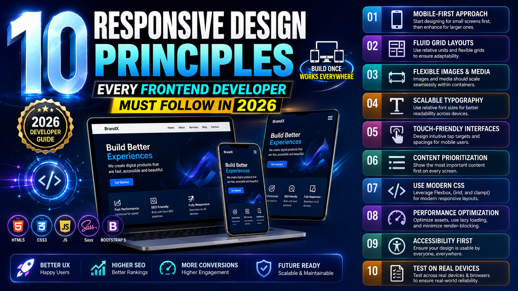
Introduction
Building a website that looks good on every screen size sounds simple on paper. In practice, it is one of the trickiest ongoing challenges in frontend development. Screens come in dozens of sizes. Users have different expectations. Browsers behave slightly differently. And what worked three years ago does not always hold up today.
Responsive design principles exist to bring order to that chaos. They are not vague design theories — they are practical guidelines that shape how you write CSS, structure your HTML, choose your units, and test your work. Follow them consistently and your layouts become predictable, maintainable, and genuinely pleasant to use across every device.
In 2026, with mobile traffic dominating web usage globally, responsive design principles are no longer optional knowledge. They are foundational. Whether you are just starting out or have been building websites for years, getting these right changes the quality of everything you ship.
This article walks through the 10 most important responsive design principles that every frontend developer should understand and apply — explained clearly, practically, and with real examples throughout.
Why Responsive Design Principles Matter More Than Ever in 2026
Before diving into the list, it helps to understand why these responsive design principles carry so much weight right now.
Google switched to mobile-first indexing years ago. That means search engines crawl and rank the mobile version of your site, not the desktop version. A site that is difficult to use on a phone is not just a UX problem — it is an SEO problem that directly affects your visibility in search results.
On top of that, user expectations have risen sharply. People use their phones for everything now — banking, shopping, reading, working. A clunky mobile experience feels careless and unprofessional. Users leave fast, and they rarely come back.
Responsive design principles give you a framework to build things right the first time rather than patching problems after launch. Let us get into them.
Principle 1 – Always Start with a Mobile-First Approach
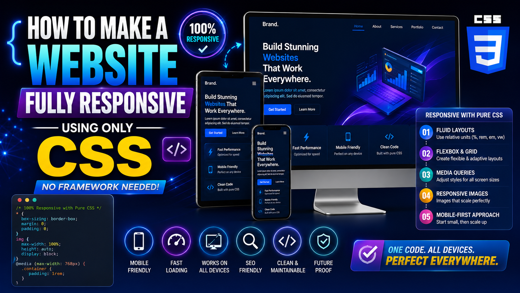
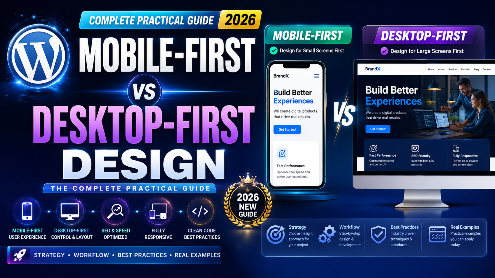
The first and arguably most important of all responsive design principles is to design and code for mobile screens before anything else. This is called mobile-first development, and it fundamentally changes how you write CSS.
Instead of writing desktop styles and then overriding them with media queries to shrink things down, you write the smallest, simplest version of the layout first. Then you use min-width media queries to progressively add complexity as the screen gets larger.
/* Mobile base styles — written first */
.card {
  display: flex;
  flex-direction: column;
  padding: 1rem;
}

/* Tablet enhancement */
@media (min-width: 768px) {
  .card {
    flex-direction: row;
    padding: 1.5rem;
  }
}

/* Desktop enhancement */
@media (min-width: 1200px) {
  .card {
    max-width: 960px;
    margin: 0 auto;
  }
}
This approach produces cleaner code, fewer overrides, and a layout that naturally handles small screens without fighting against default browser behavior. It is the foundation that all other responsive design principles build on top of.
Principle 2 – Use Relative Units Instead of Fixed Pixels
One of the most practical responsive design principles is this: stop using fixed pixel values for everything. Pixels are absolute. They do not scale. A 960px wide container on a 375px phone creates horizontal overflow and broken layouts.
Relative units respond to their environment. Here is how each one works in practice:
% — relative to the parent element’s size. Great for widths. em — relative to the current element’s font size. Useful for spacing. rem — relative to the root font size (usually 16px). Consistent and predictable. vw / vh — relative to the viewport width or height. Powerful but needs constraints. ch — relative to the width of the “0” character. Excellent for line length control.
A common pattern that applies these responsive design principles well is using rem for font sizes, % or Flexbox/Grid fractions for widths, and em for padding and margins tied to the component’s own text size.
Fixed pixels are still fine for things like borders, box shadows, and icons. But for anything structural — widths, font sizes, spacing — relative units are the professional default.
Principle 3 – Implement Fluid Typography with CSS Clamp
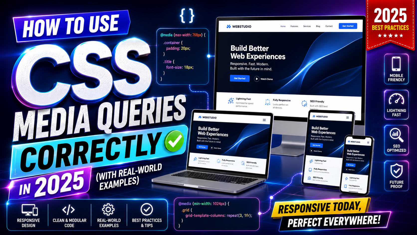
Typography is where a lot of responsive layouts quietly break down. Text that looks perfect at 1440px can feel too large at 768px or unreadably small at 375px. Manually adjusting font sizes at every breakpoint gets tedious fast and is one of the areas where clean responsive design principles can save you real time.
The modern solution is CSS clamp() for fluid typography. It lets you define a minimum size, a preferred scaling size, and a maximum size — all in one line.
h1 {
  font-size: clamp(1.75rem, 5vw, 3rem);
}

p {
  font-size: clamp(1rem, 2.5vw, 1.25rem);
}
This means your heading will never shrink below 1.75rem on tiny screens, never grow beyond 3rem on large screens, and scale fluidly between those bounds based on viewport width. No media queries needed for typography.
Apply this principle to headings, subheadings, and body text. Combined with a solid line-height value (aim for 1.5 to 1.7 on body text), it creates a reading experience that feels natural on any device — which is exactly what responsive design principles are designed to achieve.
Principle 4 – Design with Touch Interactions in Mind
Responsive design principles are not just about layout. They are also about interaction. And touchscreens interact very differently from mouse-driven interfaces.
The core rule here is that every interactive element — buttons, links, form controls, dropdowns, menu items — must have a touch target large enough for a real finger to tap accurately. Google recommends a minimum of 48×48 pixels for comfortable tap targets. Anything smaller frustrates users and causes accidental taps on the wrong element.
Beyond size, consider spacing. Touch targets that sit too close together are nearly as bad as ones that are too small. Add enough padding or margin between interactive elements so a tap lands on the right one.
Also remove reliance on hover. This is one of the most commonly violated responsive design principles. Hover states do not exist on touchscreens. Any dropdown, tooltip, or interactive reveal that only activates on :hover simply will not work for mobile users. Redesign those patterns to work on tap and click.
Test your interface with your actual finger on an actual phone. That experience immediately reveals which elements are awkward to use — no analytics tool needed.
Principle 5 – Use CSS Grid and Flexbox for Layout, Not Tables or Floats
Modern responsive design principles are inseparable from modern CSS layout tools. CSS Grid and Flexbox were built specifically to handle responsive layouts cleanly. Tables and floats were not.
Flexbox is ideal for one-dimensional layouts — a row of navigation links, a card row, a toolbar, form fields side by side. It handles alignment, spacing, and wrapping naturally.
CSS Grid is ideal for two-dimensional layouts — full page structures, image galleries, dashboard grids. It lets you define rows and columns explicitly and place items precisely within that structure.
/* Responsive card grid using CSS Grid */
.grid {
  display: grid;
  grid-template-columns: repeat(auto-fit, minmax(280px, 1fr));
  gap: 1.5rem;
}
That single grid-template-columns line creates a fully responsive card grid. Cards sit side by side when there is room. They wrap to new rows when the screen is small. No media queries needed for the basic behavior.
This is one of the responsive design principles that has the most visible immediate impact. If you are still using floats or inline-block tricks for layout in 2026, switching to Grid and Flexbox will immediately improve both your code quality and your layout’s responsiveness.
Principle 6 – Optimize Images for Every Screen Size
Images are among the heaviest assets on most web pages. Serving the wrong size image to the wrong device is both a layout problem and a performance problem — and it violates one of the most practical responsive design principles around.
The srcset and sizes attributes on the HTML <img> element allow you to define multiple image versions and let the browser pick the most appropriate one for the current screen and resolution.
<img
  src="image-800.webp"
  srcset="image-400.webp 400w, image-800.webp 800w, image-1600.webp 1600w"
  sizes="(max-width: 600px) 400px, (max-width: 1200px) 800px, 1600px"
  width="800"
  height="500"
  alt="A descriptive alt text"
  loading="lazy"
>
A few things happening here worth noting. The srcset tells the browser which file corresponds to which width. The sizes attribute tells the browser how wide the image will be displayed at each viewport size. The loading="lazy" attribute defers loading of off-screen images, which speeds up initial page load. And the width and height attributes prevent layout shift while the image loads.
Use modern image formats too. WebP and AVIF compress significantly better than JPEG or PNG without visible quality loss. Smaller files, faster loads, better mobile performance — this is what following responsive design principles actually looks like in practice.
Principle 7 – Never Forget the Viewport Meta Tag
This sounds almost too basic to include in a list of responsive design principles. But it appears here because missing or incorrect viewport configuration still shows up regularly in 2026, especially in CMS-built sites, custom templates, and older codebases.
<meta name="viewport" content="width=device-width, initial-scale=1.0">
Without this tag, mobile browsers render the page at a virtual desktop width (often 980px) and then zoom it out to fit the screen. Everything appears tiny. Text is unreadable. Your carefully written responsive CSS does absolutely nothing because the browser is treating the page as a zoomed-out desktop view.
With the tag in place, the browser matches the layout width to the actual device width and renders at a 1:1 scale. Every responsive layout depends on this working correctly.
Check this tag in every project you work on. Check templates and themes you inherit. It is a one-line fix that has massive impact — and forgetting it effectively disables all your other responsive design principles at once.
Principle 8 – Test on Real Devices, Not Just Browser Resize
Here is a responsive design principle that lives more in your workflow than your code: always test on actual physical devices, not just a resized browser window.
Browser DevTools responsive mode is useful. It helps you quickly check different screen widths and spot obvious layout problems. But it does not perfectly simulate real devices. It does not account for:
- How the device’s own browser chrome (address bar, bottom navigation bar) affects visible height
- How system fonts render at that screen density
- How the on-screen keyboard shifts the layout when a form field is focused
- How slow mobile networks affect the perceived load experience
- How fat-finger navigation actually feels on a small touchscreen
Real testing on real phones catches these issues in ways that resized browser windows simply cannot. If you only have one device to test on, supplement it with services like BrowserStack or Google’s real device testing tools to cover a broader range of screen sizes and operating systems.
Making real-device testing a regular part of your workflow is one of the responsive design principles that separates developers who build sites that work from developers who build sites that look like they work.
Principle 9 – Build Accessible Layouts That Work for Everyone
Accessibility and responsive design principles overlap more than most people realize. A layout that is genuinely accessible tends to also be genuinely responsive — and vice versa.
Some specifics to follow:
Readable text contrast — small screens are often viewed in varying light conditions. Strong color contrast between text and background is even more important on mobile.
Logical focus order — when users navigate with a keyboard or assistive technology, elements should receive focus in a sensible reading order. Flexbox and Grid order properties can visually reorder elements without changing the DOM order, which can break focus flow if you are not careful.
Descriptive alt text on images — this serves screen reader users and also helps when images fail to load on slow mobile connections.
Scalable font sizes — avoid setting font sizes in fixed px values that prevent users from adjusting text size through their browser or system settings. Using rem units respects user preferences automatically.
These are not extra tasks bolted onto responsive design — they are part of it. Well-applied responsive design principles naturally result in a more accessible product.
Principle 10 – Measure and Monitor Performance as Part of Responsive Design
The final entry on this list of responsive design principles is about performance — specifically, treating performance as a built-in concern rather than a final polish step.
A page that loads in 8 seconds on a desktop Wi-Fi connection might load in 20+ seconds on a mid-range Android phone on a 4G connection. That is not the same experience. And for many users worldwide, that slower scenario is their everyday reality.
Core Web Vitals — Google’s set of user experience metrics — measure performance in terms that directly relate to responsive design:
Largest Contentful Paint (LCP) — how fast does the main content appear? Images and large text blocks are often the culprit here.
Cumulative Layout Shift (CLS) — does the page jump around as it loads? Unsized images and late-loading fonts cause this.
Interaction to Next Paint (INP) — how quickly does the page respond to taps and clicks? Heavy JavaScript and render-blocking resources slow this down.
Use Google PageSpeed Insights (available at web.dev/measure) and Lighthouse audits regularly to track these numbers. They directly reflect how your responsive design decisions are playing out in the real world, on real devices, for real users.
Treat performance as part of your responsive design principles workflow — not something you check once before launch.
How to Apply These Responsive Design Principles Together
Reading through ten principles can feel like a lot. But in practice, these ideas reinforce each other. Start mobile-first, use relative units, apply fluid typography, build with Grid and Flexbox, optimize your images, verify your viewport tag, test on real devices, and keep an eye on performance. They fit together naturally once you internalize them.
The biggest shift is mindset. Stop thinking of mobile as a second consideration. Build with small screens first, enhance upward, and test at every stage. That workflow makes all ten of these responsive design principles practical habits rather than theoretical rules.
For up-to-date reference material, two resources stand out above the rest.
MDN Web Docs at developer.mozilla.org covers every CSS property mentioned in this article with thorough documentation, browser compatibility tables, and live examples. It is the most reliable frontend reference available.
Google’s web.dev at web.dev covers Core Web Vitals, performance auditing, accessibility, and modern responsive techniques — all with practical guidance. The Lighthouse tool and PageSpeed Insights both live under this umbrella.
Both are free, regularly maintained, and worth having open as you build.
Final Conclusion
Responsive design principles are not a checklist you complete once and forget. They are the foundation your work stands on — shaping how your layouts hold up across hundreds of device sizes, connection speeds, and user behaviors.
The ten principles covered here — mobile-first thinking, relative units, fluid typography, touch-aware interactions, modern layout tools, image optimization, proper viewport configuration, real-device testing, accessibility, and performance monitoring — each address a real part of the responsive design challenge. Together they form a complete approach to building websites that genuinely work everywhere.
In 2026, users expect their phone experience to be seamless. The developers who consistently deliver that are the ones who treat these responsive design principles not as occasional reminders but as daily practice. Start applying them one at a time, and the improvement in your work will be noticeable — to you, and to every user who visits on a phone.